Abe Schrader
The Seventh Avenue dressmaker behind decades of American mid-priced dresses and suits. The 'Abe' over 'Schrader' wordmark and union label date the piece.
- Origin
- USA
- Founded
- 1932
- Category
- Designer & Casual
- Documented eras
- 4
How Abe Schrader labels evolved over time. Match the markers below against the tag in hand to place a garment in its era.
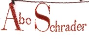
1950–1959
Union-Made Serif Tags
Serif lettering with the 'Abe' set above 'Schrader', usually paired with a small blue or teal 'Union Made' label stitched alongside.
- Tags from this era feature serif lettering with intricate and elegant font styling.
- The labels often include the mention of “Union Made” with a small blue or teal label alongside the main brand tag, indicating garment worker union involvement.
- The text is typically centered, with “Abe” in a smaller font compared to “Schrader.”
How to spot it
Centred serif logo with a 'Union Made' label.
Value signal
Solid; 50s American union-made dressmaking has a steady following.
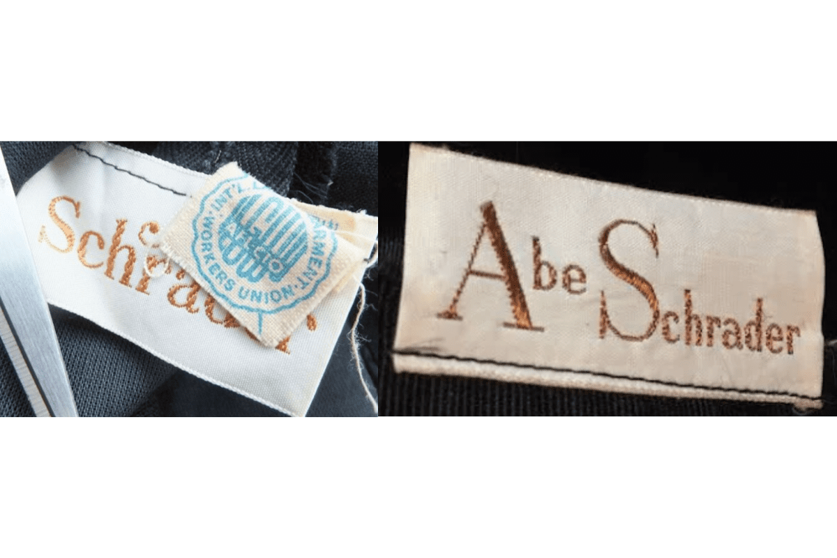
1960–1969
Gold-Thread White Tags
Bolder serif on white grounds with gold or brown thread, 'Abe' in delicate cursive over a classic serif 'Schrader'.
- The serif lettering becomes bolder, maintaining the elegance associated with the brand.
- Tags generally feature white backgrounds with gold or brown thread for the lettering.
- “Abe” appears in a delicate, cursive style, while “Schrader” is often rendered in a more classic serif font.
- Some tags begin to include subtle decorative flourishes, reflecting the fashionable trends of the 1960s.
How to spot it
White tag with gold or brown thread.
Value signal
Solid; condition-driven resale.
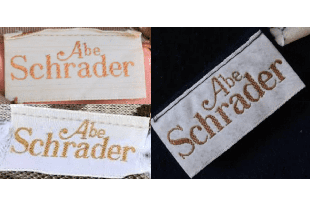
1970–1979
'New York' Cursive Tags
Refined layouts with the cursive 'Abe' clearly contrasted against a larger 'Schrader'; tags begin naming 'New York'.
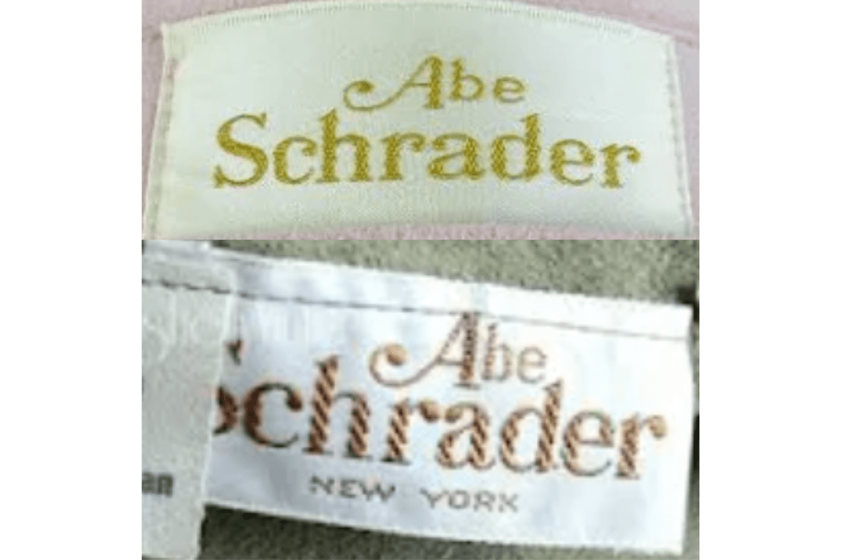
- The font styling remains similar to the 1960s, but the tags display a more refined and simpler design.
- Labels often feature a clear contrast between the “Abe” in a smaller, elegant font and “Schrader” in a larger, more prominent font.
- Brown and gold threads continue to dominate, with slight shifts in layout for readability.
- Tags begin incorporating mentions of the brand’s location, such as “New York,” enhancing the sense of place and heritage.
How to spot it
Cursive 'Abe' over serif 'Schrader', often 'New York'.
Value signal
Common; the dress holds the value.
1980–1989
Modernised ® Tags
Cleaner bold serif with 'Schrader' taking the lead and the ® mark appearing next to the name.
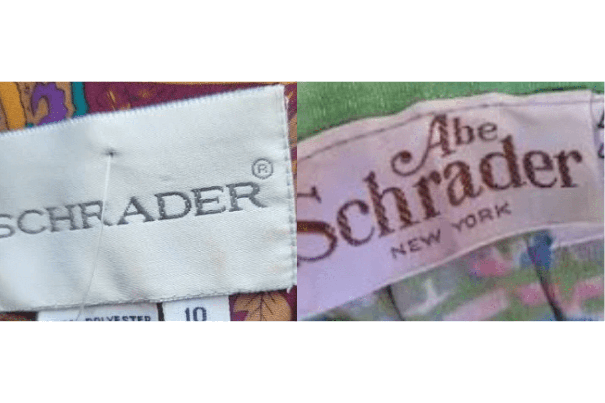
- More modernized tags with clean, bold serif fonts.
- Focus on a minimalistic design, often with “Schrader” taking prominence in larger, simple lettering.
- Tags sometimes introduce registered trademark symbols (®) next to the brand name, indicating legal protection of the brand.
- Various tag designs include references to “New York,” with some garments showing a more detailed, modern label structure.
How to spot it
Modernised 'Schrader' tag with ® mark.
Value signal
Common; modest resale.