Alex Colman
Mid-century California sportswear maker. The lowercase 'alex colman' over a smaller spaced-out 'CALIFORNIA' is the unmistakable marker.

- Origin
- USA
- Founded
- 1953
- Category
- Designer & Casual
- Documented eras
- 4
How Alex Colman labels evolved over time. Match the markers below against the tag in hand to place a garment in its era.
1950–1959
Plain Lowercase Tags
Simple straightforward tags, 'alex colman' in plain lowercase with 'California' below — clean mid-century branding.
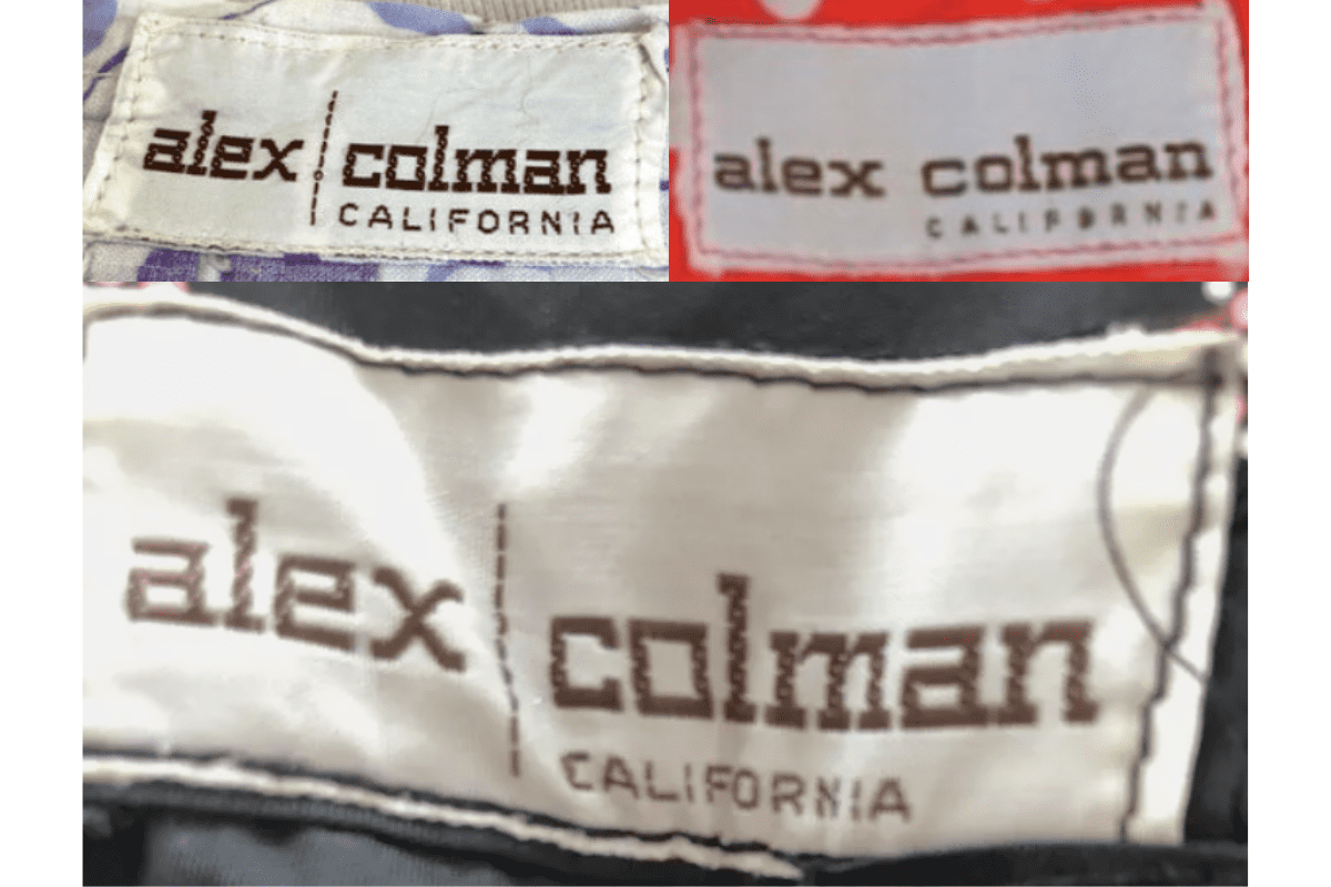
- Tags from this era are simple and straightforward.
- Features “alex colman” in lowercase, often in a plain font.
- The word “California” is commonly included, emphasizing the brand’s origins.
How to spot it
Plain lowercase 'alex colman' with 'California'.
Value signal
Strong; 50s California sportswear is a sought era.
1960–1969
Bolder Lowercase Tags
More stylish look, still lowercase but with slightly bolder fonts, 'California' kept in a distinct position under the main name.
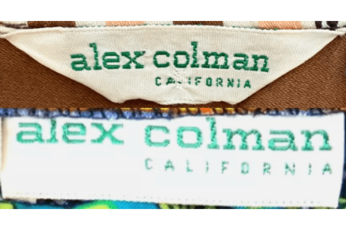
- Tags begin to reflect a more modern and stylish look.
- Still predominantly lowercase, but with a slightly bolder font.
- “California” remains a key part of the branding, often in a distinct position under the main name.
How to spot it
Bolder 60s lowercase tag.
Value signal
Solid; 60s Cal sportswear sells well.
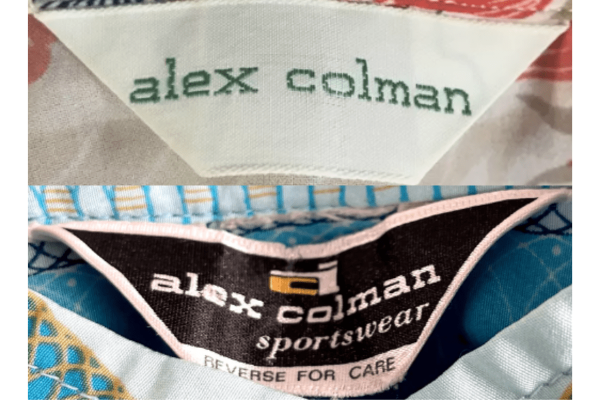
1970–1979
Triangular Stylised Tags
Colourful unusual shapes — triangular tags appearing — sometimes a stylised 'a' icon, 'California' in italicised smaller font below.
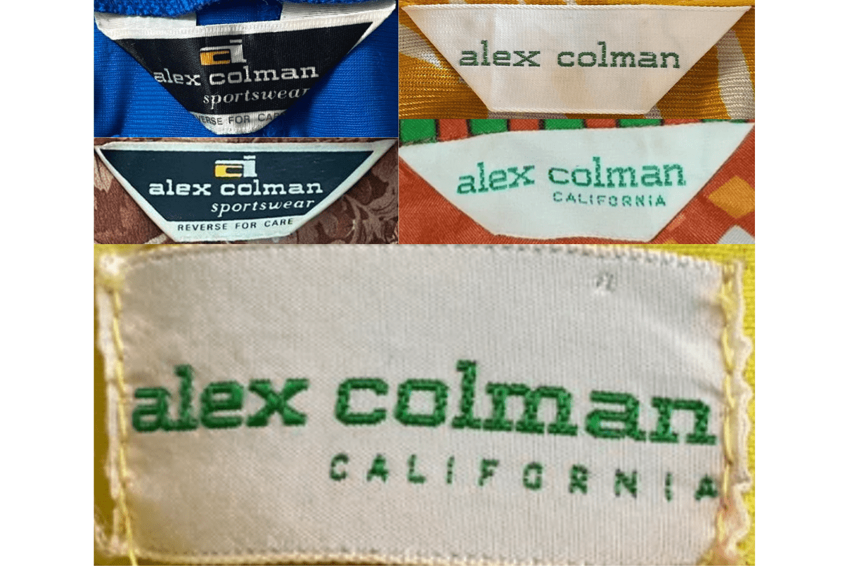
- The design becomes more distinctive, with colorful and unique tag shapes.
- Includes “alex colman” in bold lettering, sometimes with a stylized “a” icon.
- Tags often have a triangular or unusual shape, adding to the brand’s unique appeal.
- “California” is often in a smaller, italicized font under the main logo.
How to spot it
An unusual shape, sometimes with a stylised 'a'.
Value signal
Strong; 70s Alex Colman is collector-grade for the graphics.
1980–1989
Serif Refined Tags
A shift to a refined serif font, 'California' still present, on rectangular tags with clean elegant layouts.
- Tags from this decade show a shift towards a more sophisticated design.
- Features “alex colman” in a serif font, often with a more refined appearance.
- The inclusion of “California” continues, maintaining the brand’s heritage.
- Tags are typically rectangular, with a clean and elegant layout.
How to spot it
Refined serif 'alex colman' on a rectangular tag.
Value signal
Common; modest resale.