Ann Demeulemeester
The Antwerp Six founding member, known for asymmetric black-and-white tailoring. The black tag with bold white serif lettering is the constant marker.
- Origin
- Belgium
- Founded
- 1985
- Category
- High Fashion
- Documented eras
- 3
How Ann Demeulemeester labels evolved over time. Match the markers below against the tag in hand to place a garment in its era.
1990–1999
Hand-Stitched Black Tags
Simple black tags with bold white serif lettering, the brand name stitched directly into the fabric on rectangular grounds.
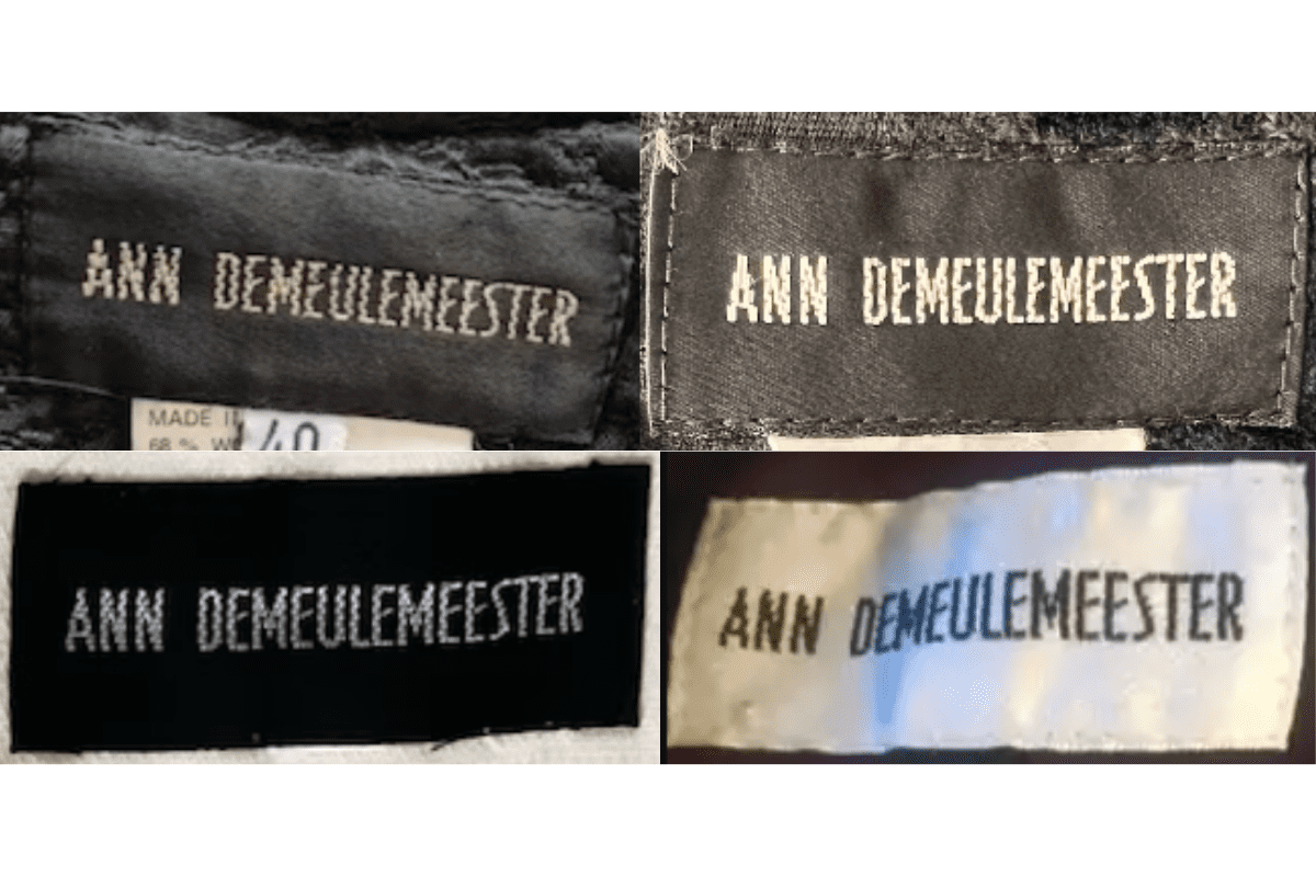
- Features simple black tags with white, bold serif lettering.
- Often the brand name is stitched directly onto the fabric.
- Tags are typically rectangular in shape.
How to spot it
Black tag, hand-stitched white serif.
Value signal
Strong; 90s Demeulemeester is a sought avant-garde era.
2000–2009
Refined Black-and-White Tags
Same monochrome scheme with a slightly more modern font; care instructions appear on a separate tag, finer stitching.
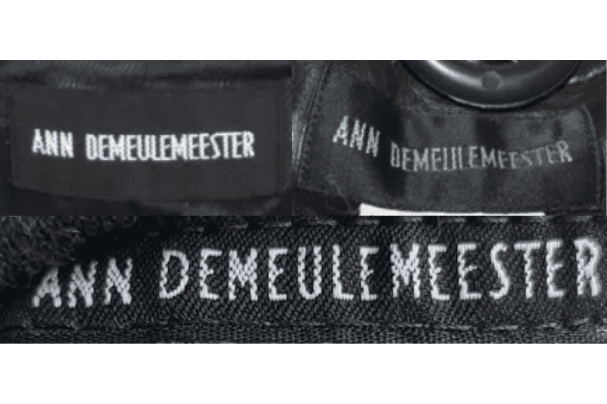
- Continues with the black and white color scheme but with a slightly more modern font.
- Tags may include additional elements such as care instructions on a separate tag.
- Introduction of tags that are more refined and neatly stitched.
How to spot it
Refined modern font, still all black-and-white.
Value signal
Strong; 2000s Demeulemeester resells well.
2010–2019
Detailed Monochrome Tags
More diverse materials and layouts while keeping the classic black-and-white aesthetic, finer stitching and variations in font size.
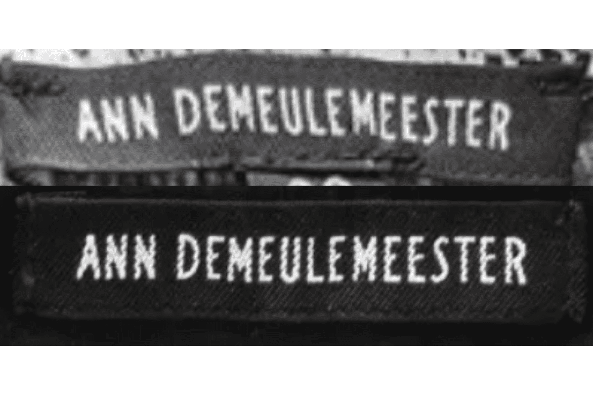
- More diverse use of materials and layouts while maintaining the brand’s classic black and white aesthetic.
- Tags are often more detailed with finer stitching and sometimes additional branding elements.
- Continues to use bold serif lettering but with variations in font size and placement.
How to spot it
Detailed monochrome tag, finer stitch.
Value signal
Modern; the brand keeps resale steady.