Anne Klein
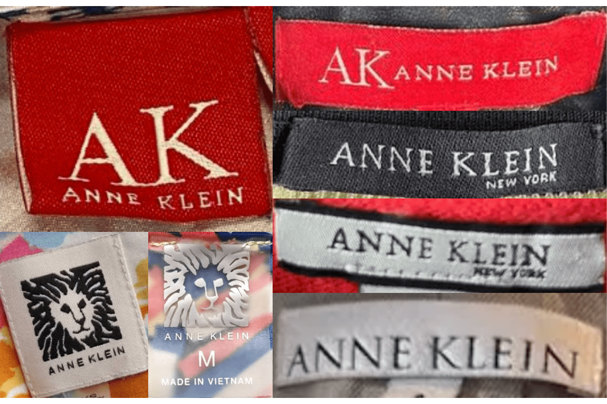
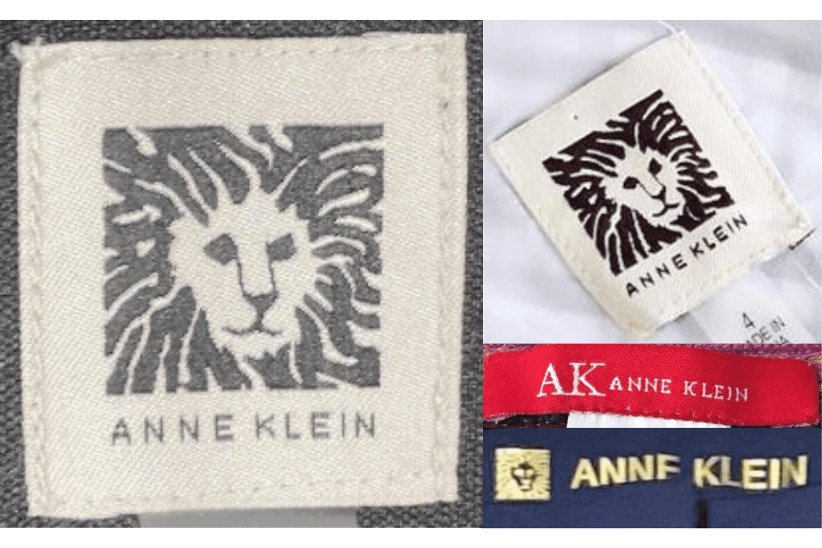
The American sportswear pioneer behind menswear-inspired tailoring for women. The lion's-head emblem is the constant marker; sub-lines like 'Anne Klein II' and 'AK' date the tag.

- Origin
- USA
- Founded
- 1968
- Category
- Designer & Casual
- Documented eras
- 6
How Anne Klein labels evolved over time. Match the markers below against the tag in hand to place a garment in its era.
1968–1969
Early 'Classics' Script Tags
Minimalist 'Anne Klein' or 'Classics by Anne Klein' in script or serif fonts, sometimes 'Anne Klein for Mallory' for the earliest collaborations.
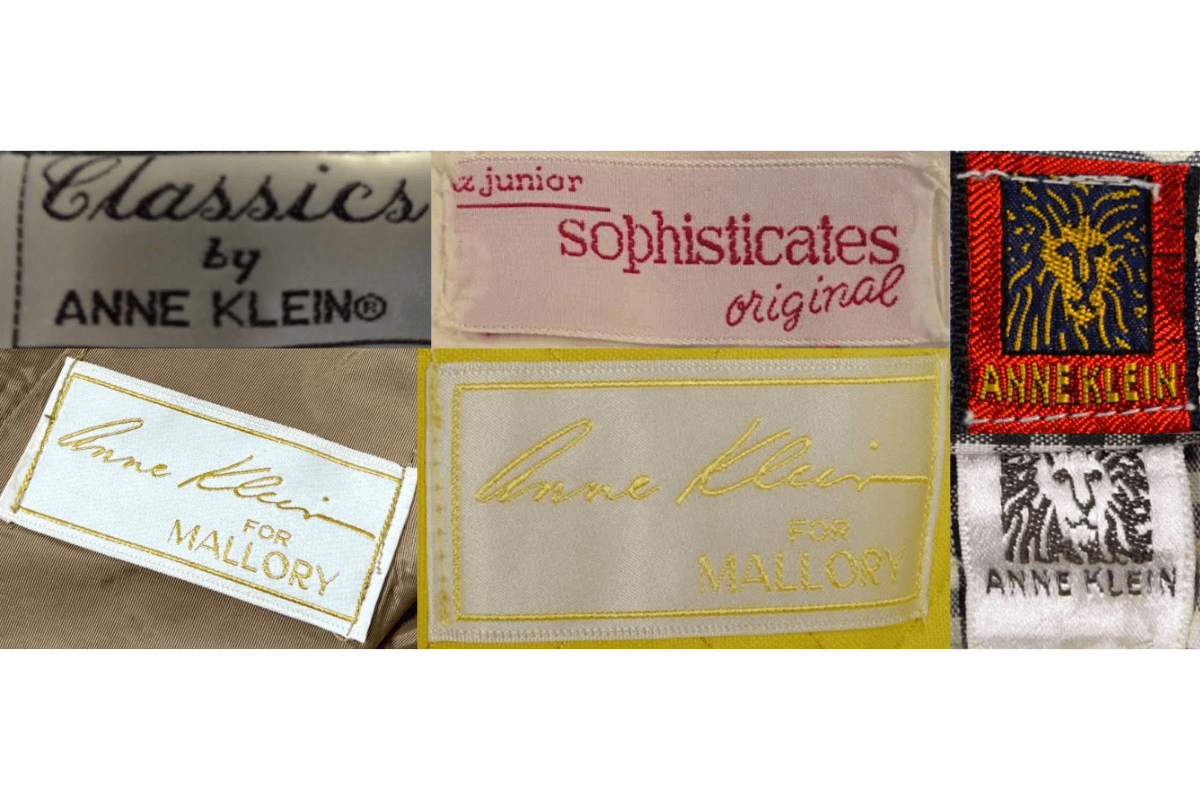
- Early tags are minimalist with simple text such as “Anne Klein” or “Classics by Anne Klein.
- The fonts used are elegant, typically in script or serif styles, reflecting the refined fashion of the time.
- Tags may include sub-brand information, such as “Anne Klein for Mallory,” indicating collaborations.
How to spot it
Plain script, sometimes 'for Mallory'.
Value signal
Strong; the earliest Anne Klein is collector-grade.
1970–1979
Lion's-Head Logo Tags
The iconic lion's head joins the brand name in bold serif, often next to or above the logo, some still carrying 'Anne Klein for Mallory'.
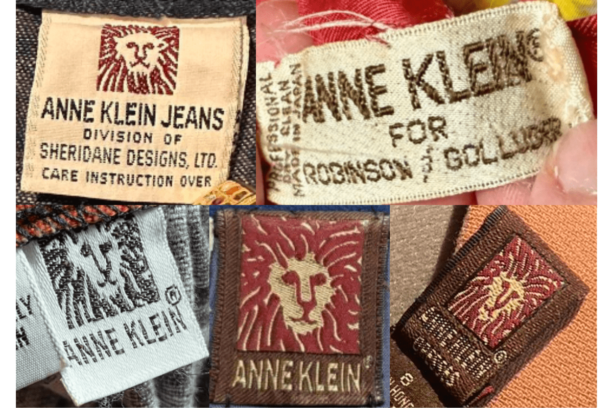
- Tags often feature the iconic lion’s head logo, symbolizing the brand’s strength and sophistication.
- Text is usually bold and straightforward, often in serif fonts, with the lion’s head logo either next to or above the brand name.
- Some tags include additional branding such as “Anne Klein for Mallory,” indicating the brand’s continued collaborations and expansions.
How to spot it
Lion's-head logo with the brand name.
Value signal
Strong; 70s Anne Klein is a sought era.
1980–1989
'Anne Klein II' Diffusion Tags
The lion's head kept, 'Anne Klein II' and 'Anne Klein for new aspects' sub-brand labels common, cleaner lines and simplified typography.
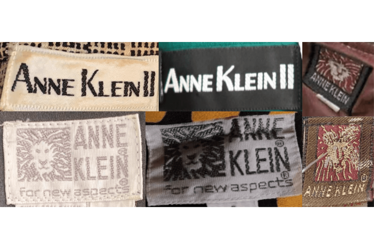
- The lion’s head logo continues to be prominent, often accompanied by the brand name in bold text.
- Tags frequently include sub-brand labels like “Anne Klein II” and “Anne Klein for new aspects,” indicating the expansion of the brand into different markets.
- The design of the tags begins to incorporate more modern elements, with cleaner lines and simplified typography.
How to spot it
'Anne Klein II' wording.
Value signal
Solid; 80s Anne Klein blazers sell well.
1990–1999
Refined Lion Tags
More intricate lion's-head detailing, 'Anne Klein II' often in bold block letters, sleek modern typography reflecting 90s trends.
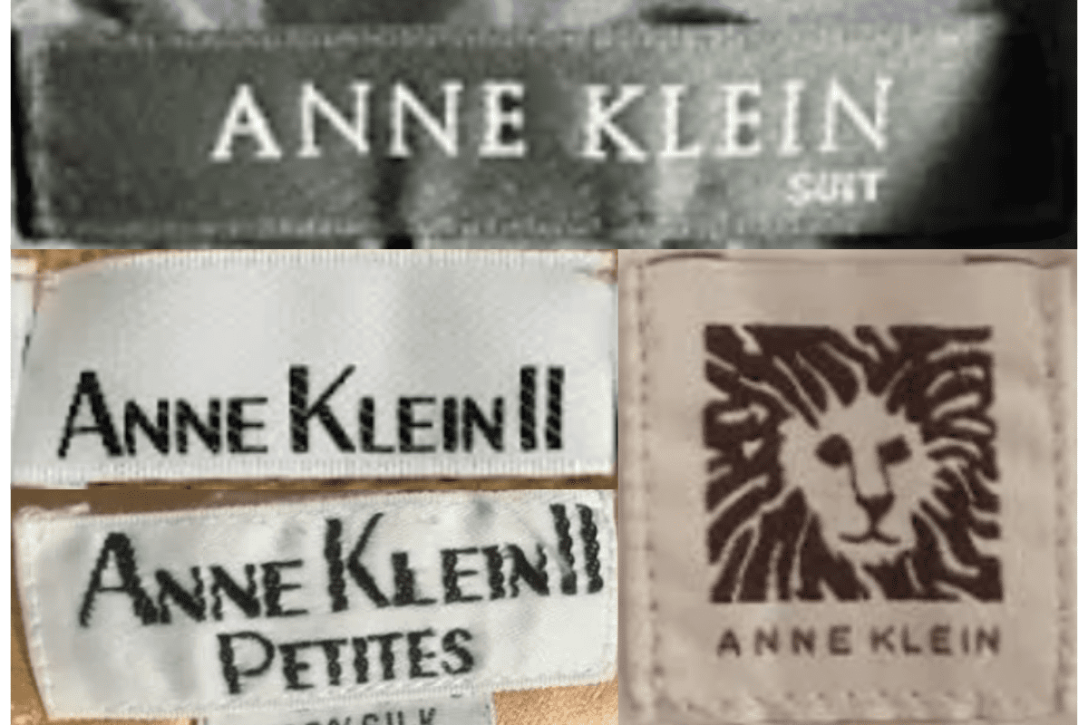
- Tags from this era often showcase a more refined lion’s head logo, with more intricate detailing.
- The “Anne Klein II” sub-brand remains prominent, often in bold, block letters with the lion’s head logo nearby.
- Typography is sleek, with an emphasis on modernity, reflecting the fashion trends of the 1990s.
How to spot it
Refined lion's head, often 'Anne Klein II'.
Value signal
Solid; 90s Anne Klein has steady demand.
2000–2009
'AK Anne Klein' Tags
Minimalist tags with simpler fonts and the 'AK Anne Klein' branding more prevalent, country-of-origin detail standard.
- Tags start to feature a more minimalist design, with simpler fonts and less emphasis on the lion’s head logo.
- The “AK Anne Klein” branding becomes more prevalent, marking a shift towards a more casual and accessible brand image.
- Tags often include country of origin details, reflecting the globalization of the fashion industry during this period.
How to spot it
'AK Anne Klein' on a minimalist tag.
Value signal
Common; modest resale.
2010–2019
Sans-Serif AK Tags
Modern sans-serif fonts dominate, the lion's head heavily simplified or omitted, 'AK Anne Klein' branding persisting.
- Tags from this period continue with the minimalist trend, often using modern, sans-serif fonts.
- The lion’s head logo is either very simplified or omitted entirely in favor of a text-only design.
- AK Anne Klein” branding persists, indicating the brand’s continued focus on accessible fashion.
How to spot it
A text-only sans-serif AK tag.
Value signal
Modern; priced on the piece.