Bench
Manchester streetwear brand defined by its distinctive 'Bench.' wordmark — the full stop at the end is the signature tell. Red accent panels and the 'Bench.' period-logo mark its 1990s peak.

- Origin
- England
- Founded
- 1989
- Category
- Designer & Casual
- Documented eras
- 3
How Bench labels evolved over time. Match the markers below against the tag in hand to place a garment in its era.
1990–1999
Period-Logo Red-Accent Tags
Bold 'Bench.' wordmark — the full stop at the end is the signature tell — often with red accent panels on woven tags.
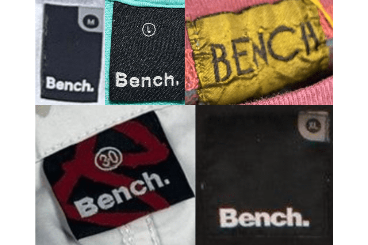
- Bold 'Bench.' logo with a period at the end.
- Red accent elements are common on 1990s pieces.
- Woven tags with clear size information.
How to spot it
The full-stop period after 'Bench' — the brand's consistent signature.
Value signal
Strong for early 1990s UK streetwear collectors.
2000–2009
White-on-Dark Refined Tags
The 'Bench.' logo appears in white or silver text on darker backgrounds, maintaining the brand's clean modern aesthetic.
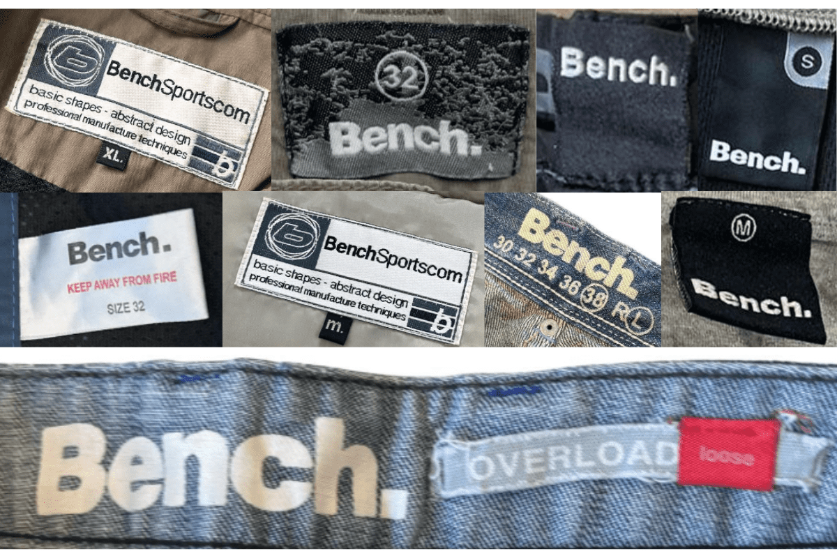
- 'Bench.' logo often in white or silver on darker backgrounds.
- More detailed manufacturing and composition information.
- Clean, modern aesthetic consistent with 2000s streetwear.
How to spot it
White or silver 'Bench.' on a dark ground.
Value signal
Moderate; condition-driven.
2010–present
Streamlined Minimalist Tags
Contemporary minimalist tag designs with streamlined 'Bench.' branding in varied materials.
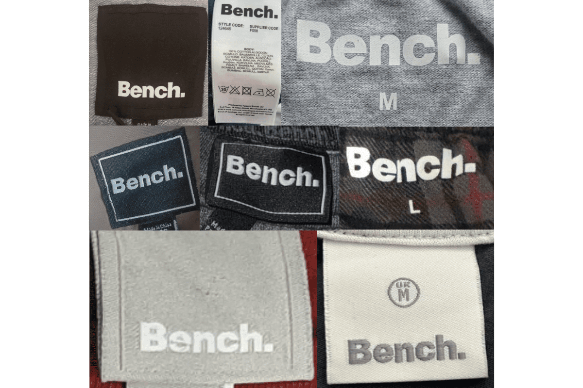
- Minimalist streamlined 'Bench.' logo.
- More contemporary materials and finishes.
- Varied colour options in tag construction.
How to spot it
Minimalist modern 'Bench.' tag.
Value signal
Modern; minimal vintage premium.