BHS
British Home Stores, a high-street institution operating 1928–2016. Tags evolve from the full 'British Home Stores' serif wordmark through the bold blue 'BHS' to the multicoloured ribbon logo of 1986, making the logo the primary dating tool.
- Origin
- England
- Founded
- 1928
- Category
- Designer & Casual
- Documented eras
- 4
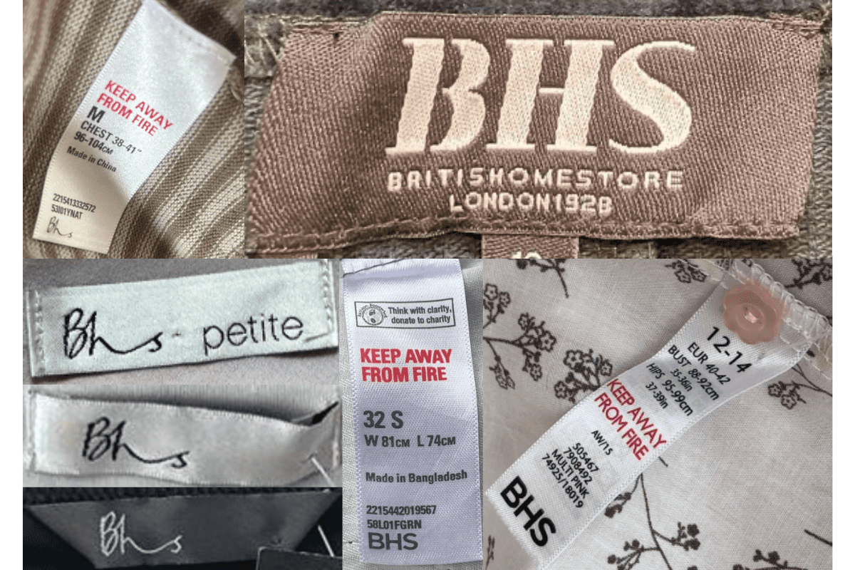
How BHS labels evolved over time. Match the markers below against the tag in hand to place a garment in its era.
1980–1989
Serif BHS High-Street Tags
Clean 'BHS' in serif or sans-serif; size information in bold typeface; early care instruction details.
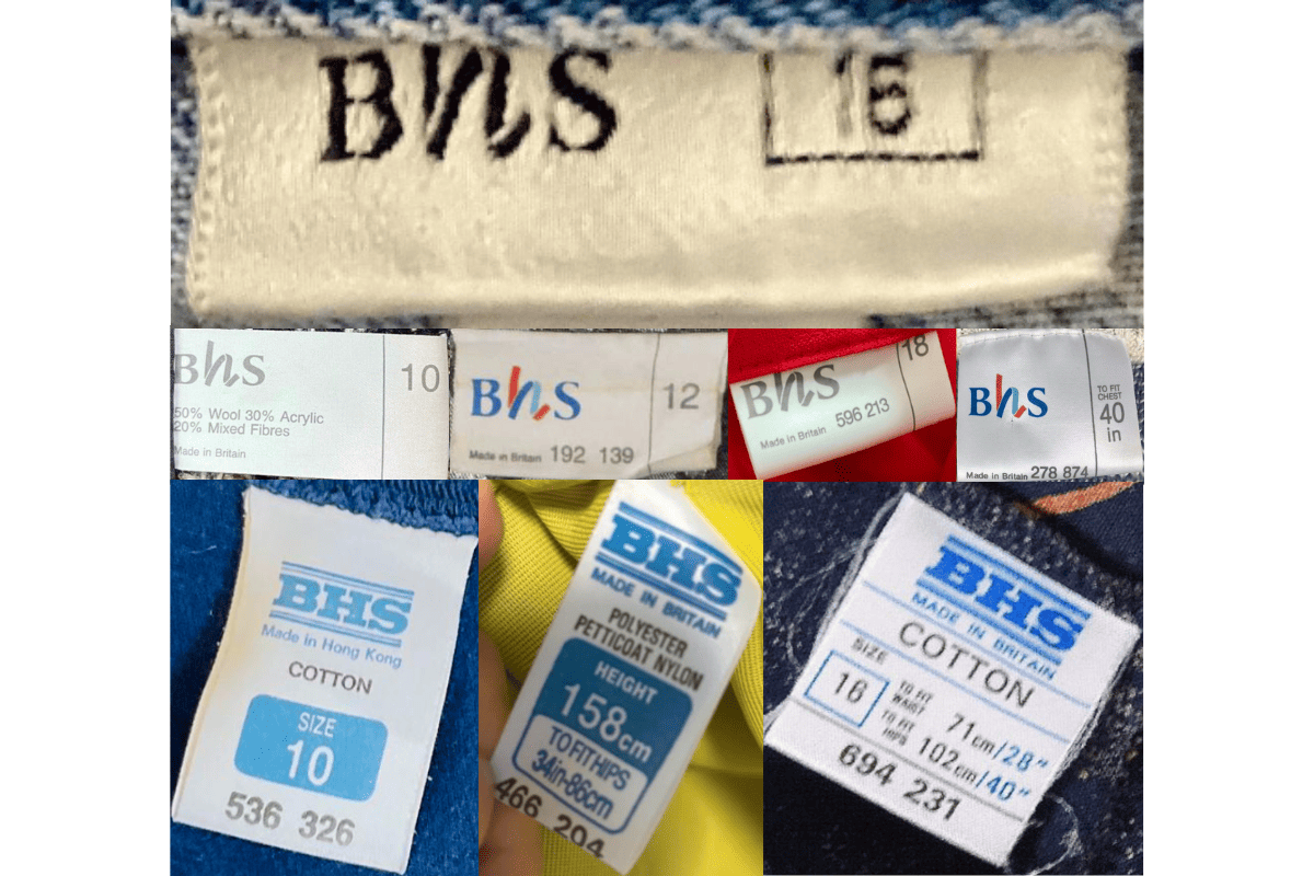
- 'BHS' in serif or sans-serif fonts.
- Bold, clear size information.
- Some care instructions included.
How to spot it
Straightforward 'BHS' tag — pre-redesign era.
Value signal
Modest; condition-driven.
1990–1999
British Home Stores Branded Tags
'British Home Stores' text added beneath the 'BHS' logo; size labels standardised with measurements.
- 'British Home Stores' wording added beneath the logo.
- Standardised size labels with measurements.
- More consistent branding across product lines.
How to spot it
'British Home Stores' spelled out below the 'BHS' abbreviation.
Value signal
Common; little resale premium.
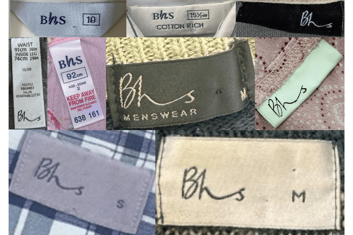
2000–2009
Contemporary-Font BHS Tags
A more contemporary font update; a mix of loop and sewn-in tag formats with a modernised 'BHS' logo.
- Modernised contemporary 'BHS' font.
- Mix of loop and sewn-in tag formats.
- Varied coloured backgrounds and finishes.
How to spot it
Modernised 'BHS' wordmark in a contemporary font.
Value signal
Common; nominal resale.
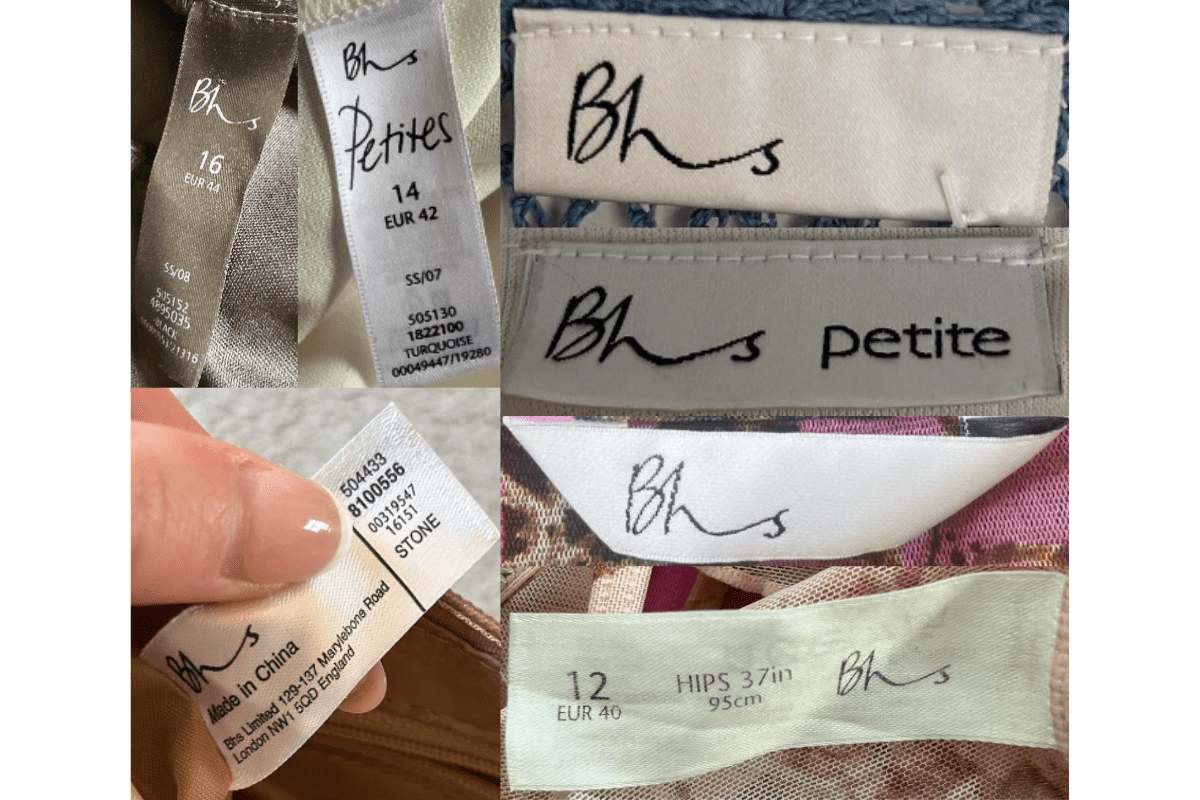
2010–2016
Minimalist Final-Era Tags
Minimalist approach with simple fonts; 'Keep Away From Fire' in bold red — a legal requirement on UK labels — becomes prominent.
- Simple, minimalist fonts and tag designs.
- 'Keep Away From Fire' in bold red lettering.
- Focus on clarity and detailed care information.
How to spot it
'Keep Away From Fire' in red — standard on 2010s UK high-street tags.
Value signal
Common; no meaningful vintage premium.