C&A
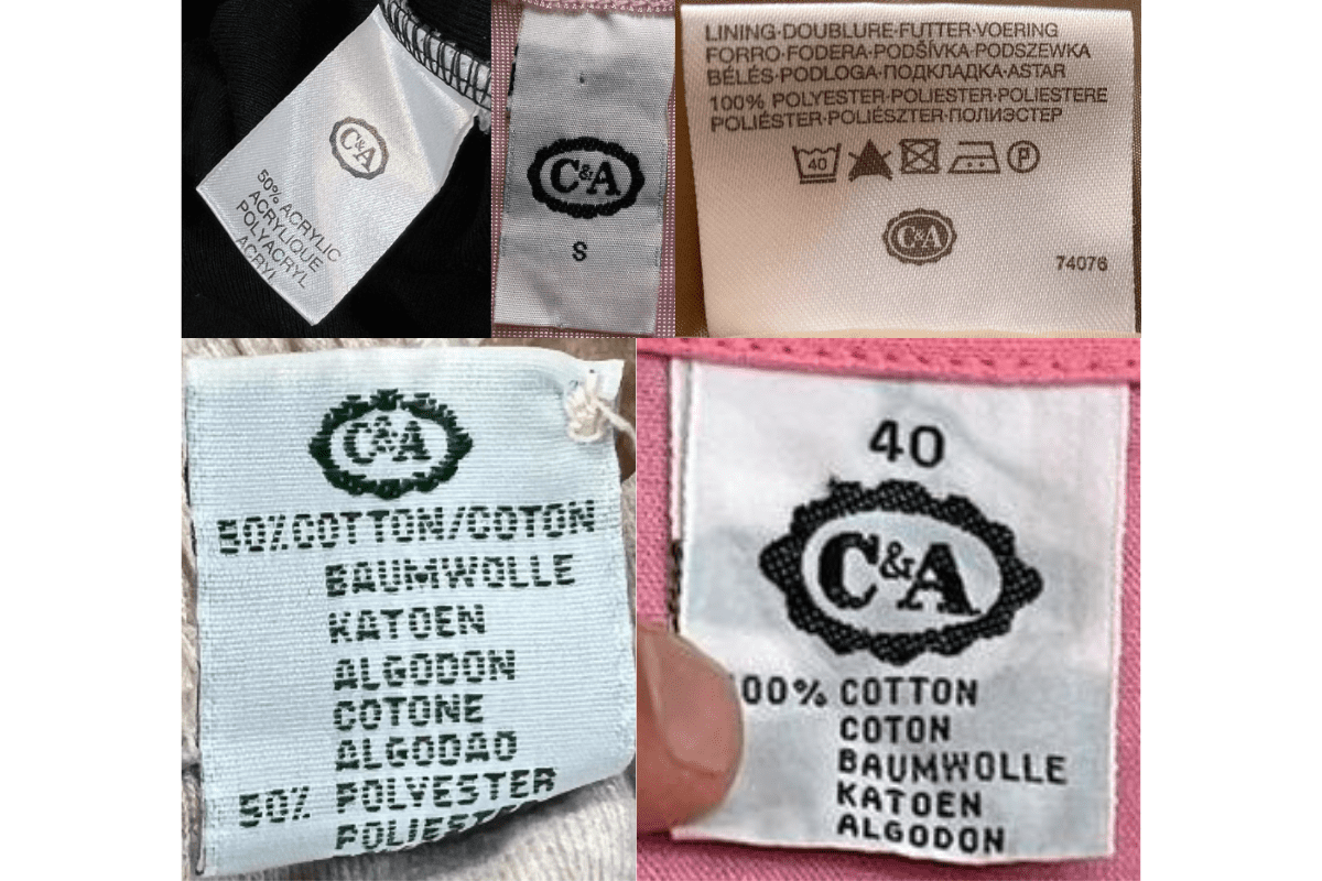
The Dutch-German fashion chain founded by the Brenninkmeyer brothers. The scalloped-edge oval logo evolves from ornate Victorian lettering through blue-and-white to the red-outlined modern version; tag language and care symbols date the decade.
- Origin
- Netherlands
- Founded
- 1841
- Category
- Designer & Casual
- Documented eras
- 4
How C&A labels evolved over time. Match the markers below against the tag in hand to place a garment in its era.
1970–1979
Oval-Border Serif Tags
'C&A' in a serif font with oval border; text-heavy labels with detailed fabric content and European country of manufacture.
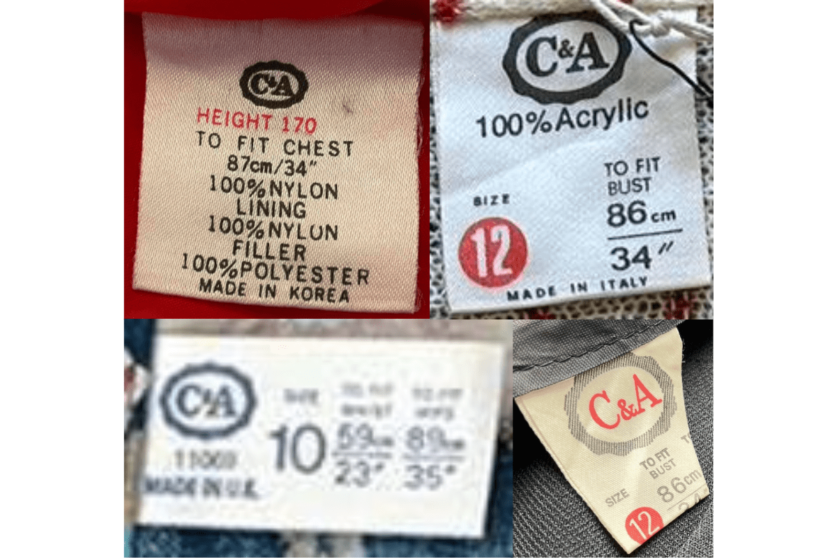
- 'C&A' in serif font inside an oval border.
- Detailed fabric content and care instructions.
- European countries of manufacture noted.
How to spot it
Serif 'C&A' in an oval border — the classic 1970s form.
Value signal
Moderate; C&A vintage is a growing niche.
1980–1989
Consistent Oval Multilingual Tags
Consistent serif oval logo; multilingual care instructions reflect pan-European retailing.
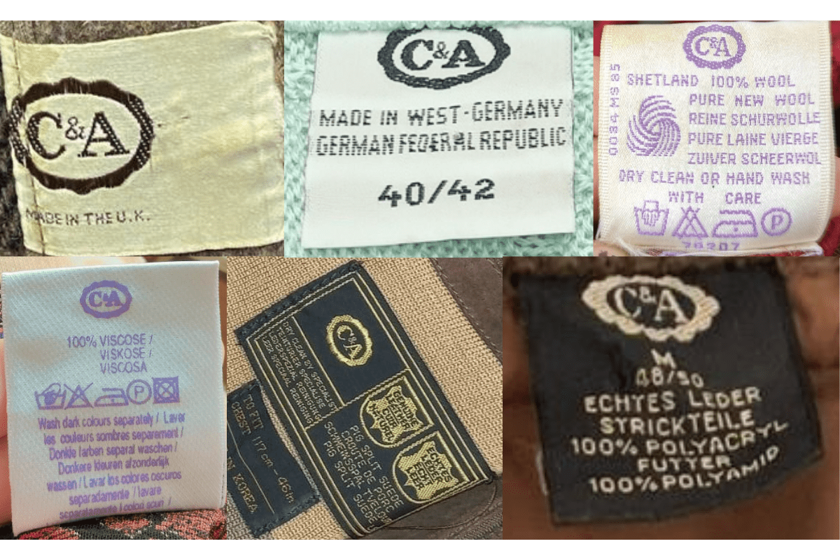
- Consistent serif 'C&A' logo with oval border.
- Multilingual care and fabric instructions.
- Country of manufacture specified.
How to spot it
Multilingual care instructions alongside the oval 'C&A' logo.
Value signal
Moderate.
1990–1999
Synthetic-Fibre Detail Tags
Oval logo maintained; increased emphasis on synthetic fibre content; care symbols gain prominence.
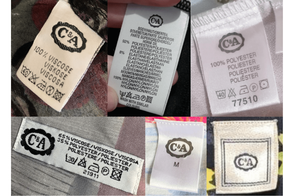
- Oval 'C&A' logo retained.
- Increased synthetic fibre content details.
- Detailed care symbols alongside written instructions.
How to spot it
Oval logo with synthetic fibre callout — 1990s modernisation.
Value signal
Common.
2000–present
Modernised Traditional Tags
The oval logo is modernised; satin and woven tag materials appear; fabric and care details remain detailed.
- Modernised version of the oval 'C&A' logo.
- Satin and woven tag materials.
- Continued detailed care and fabric information.
How to spot it
Modernised oval logo in satin or woven material.
Value signal
Common.