Carhartt
Detroit workwear that's been a thrift-store staple forever. The quick tells for vintage: a union label, a 'Made in U.S.A.' stamp, and heavy duck canvas. Once production moved overseas around 2000 the union tag disappears — that's your line between vintage and modern.
- Origin
- USA
- Founded
- 1889
- Category
- Workwear
- Documented eras
- 5
How Carhartt labels evolved over time. Match the markers below against the tag in hand to place a garment in its era.
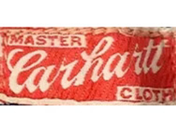
1900–1965
The "Car in Heart"
The earliest versions spelled out "Carhartt" in block letters inside a heart. Script lettering came later. Either way, the logo was everywhere — sewn into garments, printed on letterheads, stamped onto buttons, dropped into ads. In marketing, the heart sometimes carried slogans: "Union Made," "Master Cloth," "8 Hour Work Day," "From Mill to Millions." On clothing, the script could run horizontal or diagonal — the diagonal version showing up around 1950.
How to spot it
The brand name set inside a heart outline — block letters on the earliest pieces, script on later ones.
Value signal
The oldest Carhartt branding there is. Anything carrying the heart is genuinely early and a rare sight on a thrift rack; a diagonal script points to roughly 1950 or later.
1910–1965
Script "Carhartt"
The standalone script ran on the same materials as the heart logo, sometimes reading "Carhartt," sometimes "Carhartt's."
How to spot it
A cursive "Carhartt" script standing on its own, with no heart around it.
Value signal
Vintage-era branding, but hard to date tightly on its own — lean on construction and other tags. A plural "Carhartt's" reading is the quirk worth clocking.
1962–1964
Carhartt Headlight Finck
Carhartt had picked up two other workwear brands — Headlight Overalls and W.M. Finck and Company — and figured the names were worth something. The combined mark ran on marketing materials, labels, and order forms for two years, then quietly disappeared.
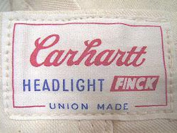
How to spot it
A combined mark naming Headlight and Finck alongside Carhartt.
Value signal
A two-year blip, so it almost never turns up. On an actual garment label it's a genuine rarity.
1965–1966
The First "C"
One rebranding, two different outcomes. Some of what launched alongside this logo didn't survive — Surfers (shorts), Huggers (slim-fit pants). Some did, like the Ranch Wear line. The logo itself appeared on marketing materials and garment labels, and lingered on buttons even after it was replaced.
How to spot it
An early "C" logo on mid-1960s lines — Surfers, Huggers, or the first Ranch Wear pieces.
Value signal
On labels for barely a year, so it's scarce. Check the buttons too — the first "C" lingered on hardware after the label moved on, so a piece can mix a newer label with older buttons.
1966–present
The Current "C"
The new logo brought a change in philosophy: fewer experiments, sharper focus on what Carhartt had always been good at. It came out of a collaboration between company executives and a design agency nobody has been able to identify since. Herbert Jaffe, Inc. in Long Island City, New York, sewed the first physical version. A centennial edition ran on garments in 1989. The label version has barely changed since 1967. Marketing fonts have drifted; the sewn-in logo hasn't.
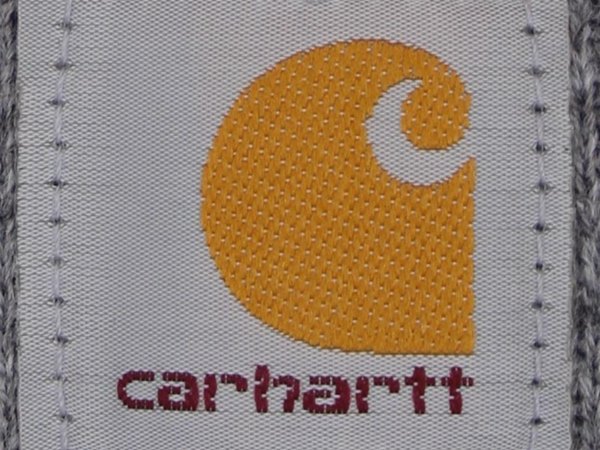
How to spot it
The "C" logo Carhartt still uses — the label version has looked essentially the same since 1967.
Value signal
Common by default after decades in use, so date a piece by its construction, union tag, and country of origin rather than the logo. The 1989 centennial label is the standout to look for.