Carolina Herrera
Venezuelan-American couture house founded in New York. The white rectangular tag with bold serif 'CAROLINA HERRERA' marks the 1980s–90s; the interlocking 'CH' monogram on red identifies the 2000s.
- Origin
- USA
- Founded
- 1981
- Category
- High Fashion
- Documented eras
- 4
How Carolina Herrera labels evolved over time. Match the markers below against the tag in hand to place a garment in its era.
1980–1989
1980s Bold Serif Tags
Rectangular white tags with full brand name in bold caps serif. Clean, classic typography with bold black borders conveying couture confidence.
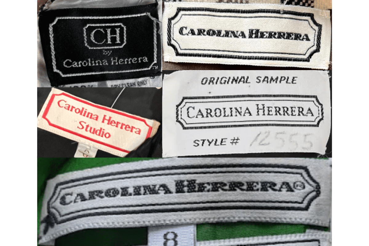
- Full Carolina Herrera name in bold capitalized serif font.
- Rectangular tag with bold black border.
- Simple, elegant design reflecting early New York couture output.
How to spot it
Full 'CAROLINA HERRERA' in bold serif on a white rectangular tag.
Value signal
High — early Herrera pieces are sought-after collector items.
1990–1999
1990s CH Monogram Tags
Introduction of the interlocking CH logo. Tags carry both the monogram and the full brand name together, bridging signature initials with the house name.
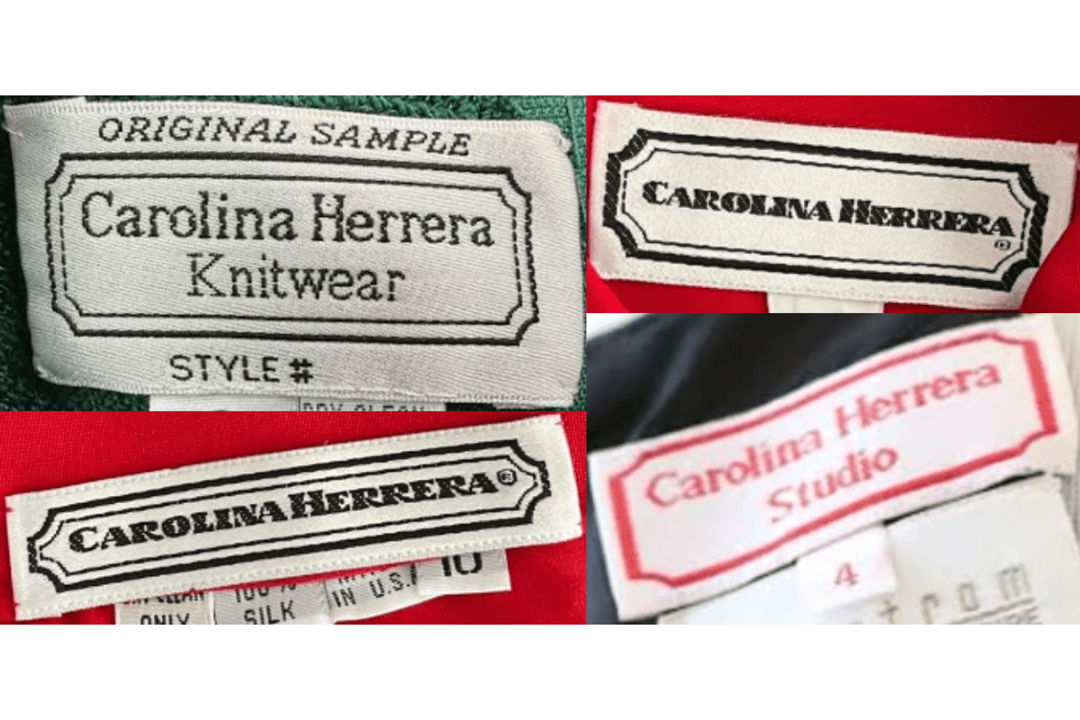
- Interlocking 'CH' logo appears alongside full brand name.
- Clean serif typography on rectangular white or cream tags.
- Tags begin incorporating 'New York' text beneath the brand name.
How to spot it
'CH' monogram + full 'Carolina Herrera' serif text — the 1990s dual-identity tag.
Value signal
Strong — the CH branding era is well-documented and collectible.
2000–2016
2000s Sleek CH Logo Tags
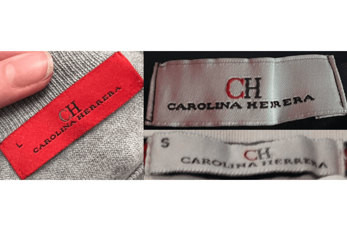
Tags emphasise the CH logo with red backgrounds introduced for select lines. Typography becomes more refined and sleek, with 'New York' text still present.
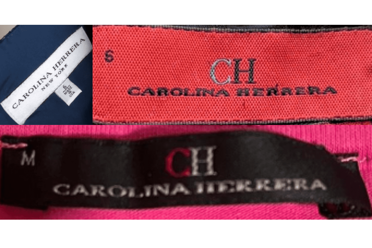
- Prominent CH logo, sleeker and more refined than the 1990s version.
- Red backgrounds introduced on select line tags.
- 'Carolina Herrera New York' text in elegant serif.
How to spot it
Red-background CH logo tag or sleek serif 'CH Carolina Herrera New York'.
Value signal
Moderate to strong.
2017–present
2010s Minimalist Tags
Modern sophisticated approach. Sleek fonts and minimalist layouts with the CH logo remaining prominent; 'New York' text dropped in the 2017 redesign.
- Sleek minimalist fonts with refined CH logo.
- 'New York' text present before 2017, dropped after the rebrand.
- Clean, contemporary rectangular tags.
How to spot it
Minimal sleek tag — no 'New York' text means post-2017.
Value signal
Moderate.