Carven
Parisian couture house founded by Marie-Louise Carven. Tags bearing the full address '6, Rond Point des Champs-Elysees, Paris' date 1960s–70s pieces; tags reading simply 'Carven Paris' in modern serif mark the 1980s–90s.
- Origin
- France
- Founded
- 1945
- Category
- High Fashion
- Documented eras
- 5
How Carven labels evolved over time. Match the markers below against the tag in hand to place a garment in its era.
1960–1969
1960s Address Tags
Elegant serif font with the full couture address: '6, Rond Point des Champs-Elysees, Paris.' Tags convey Parisian prestige with detailed location text and occasional haute couture identifiers.
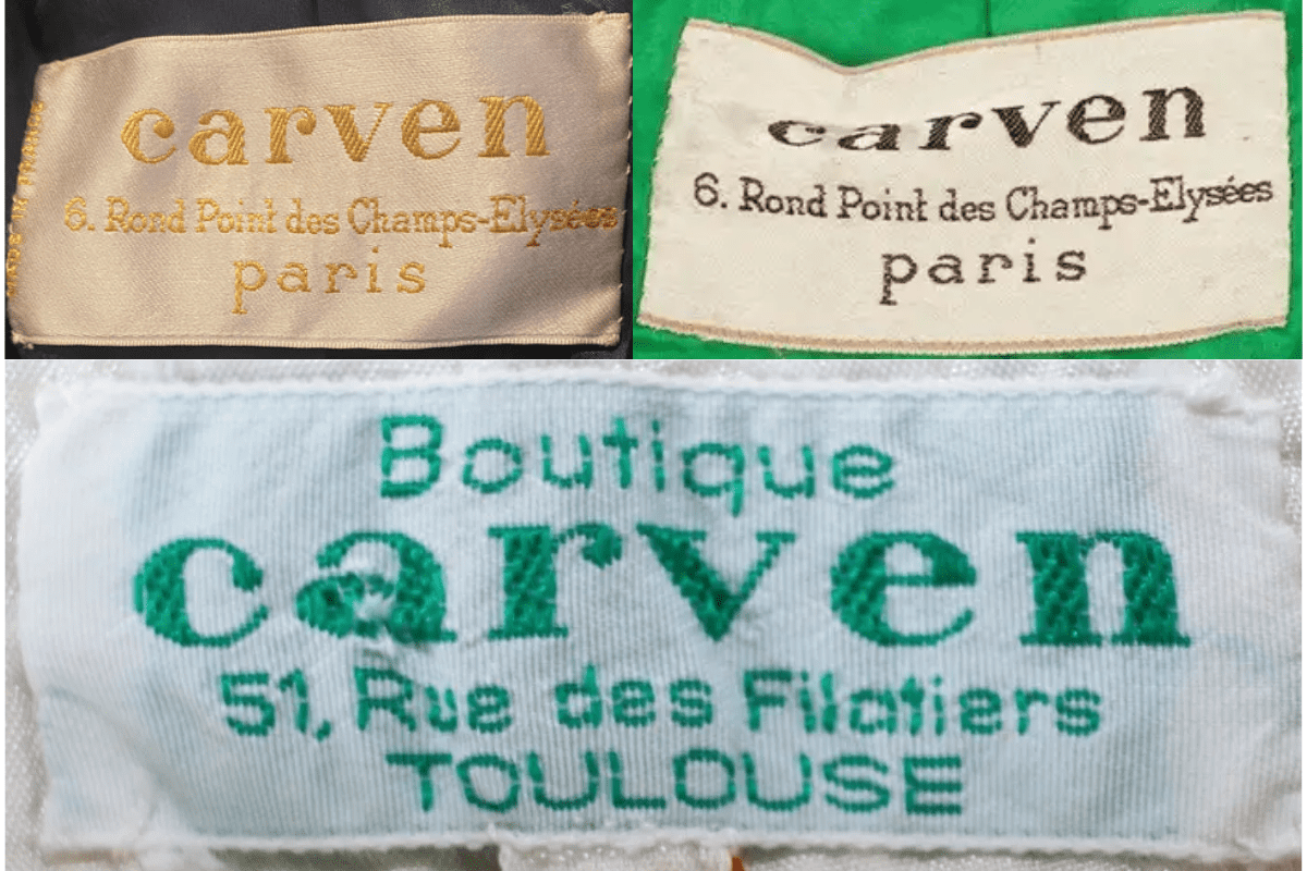
- Full address: '6, Rond Point des Champs-Elysees, Paris.'
- Elegant serif font, typically black on white or cream.
- Occasional 'Haute Couture' or line identifier on the tag.
How to spot it
Full Champs-Elysees address on the tag = 1960s Carven couture.
Value signal
High — 1960s Carven couture with address tags is very collectible.
1970–1979
1970s Address Still Present
Tags retain the detailed address information alongside bold, elegant fonts. The Parisian address remains the key dating marker, though presentation is slightly simplified.
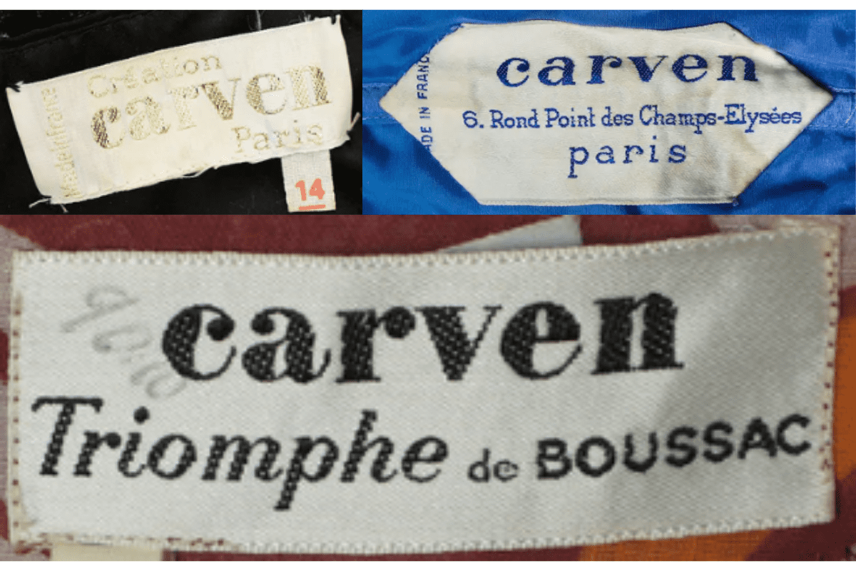
- Champs-Elysees address still displayed.
- Bold elegant fonts on rectangular tags.
- Simpler layout compared to the intricate 1960s tags.
How to spot it
Address present but layout more simplified than 1960s.
Value signal
High.
1980–1989
1980s Cleaner Brand-Focus Tags
Introduction of simpler, cleaner fonts. Less focus on the detailed address — tags shift to emphasising the brand name and 'Paris.' Variations in font weight appear across different product lines.
- Cleaner simpler fonts replacing the ornate earlier style.
- 'Carven Paris' replaces the full address.
- Variations in font weight across different lines.
How to spot it
'Carven Paris' without full street address = 1980s or later.
Value signal
Moderate to strong.
1990–1999
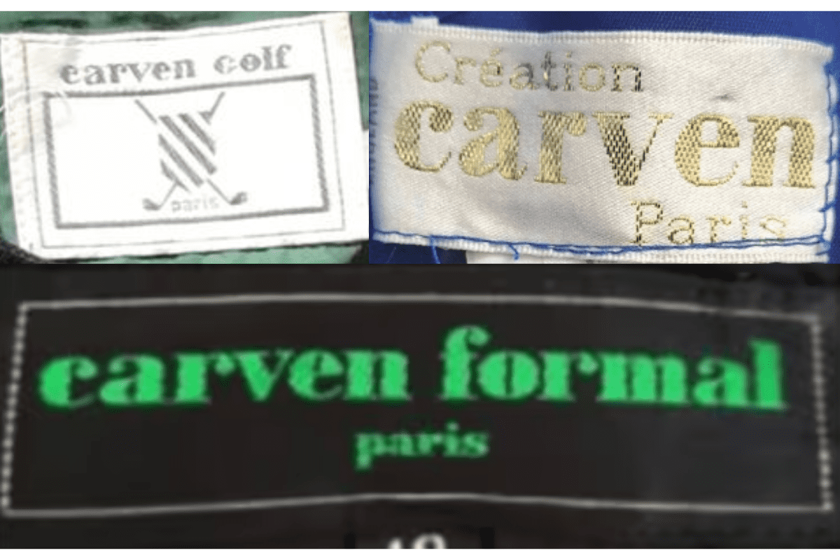
1990s Modern Serif Tags
Modern serif fonts, typically just 'Carven' and 'Paris.' Bold, clear typography. Sub-line tags for 'Formal' and 'Golf' collections appear, distinguishing product categories.
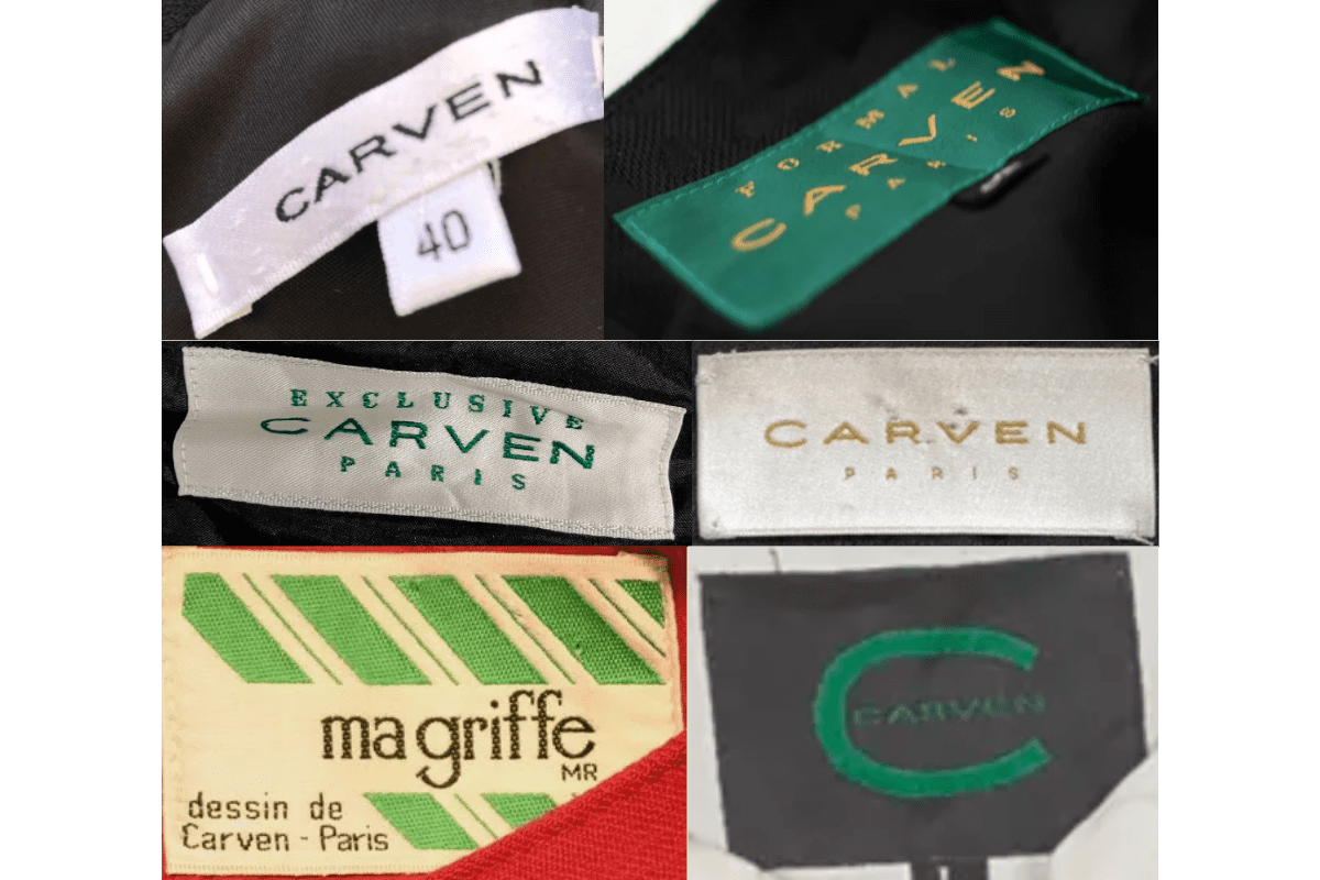
- 'Carven' and 'Paris' in bold modern serif.
- Sub-line tags: 'Carven Formal', 'Carven Golf', etc.
- Clean rectangular tags, monochromatic palette.
How to spot it
'Carven Paris' in bold modern serif, often with a line name.
Value signal
Moderate.
2000–2009
2000s Streamlined Minimalist Tags
Streamlined minimalist design. Introduction of tags with just the brand name in bold letters, minimal additional text. Occasional use of colored backgrounds for product differentiation.
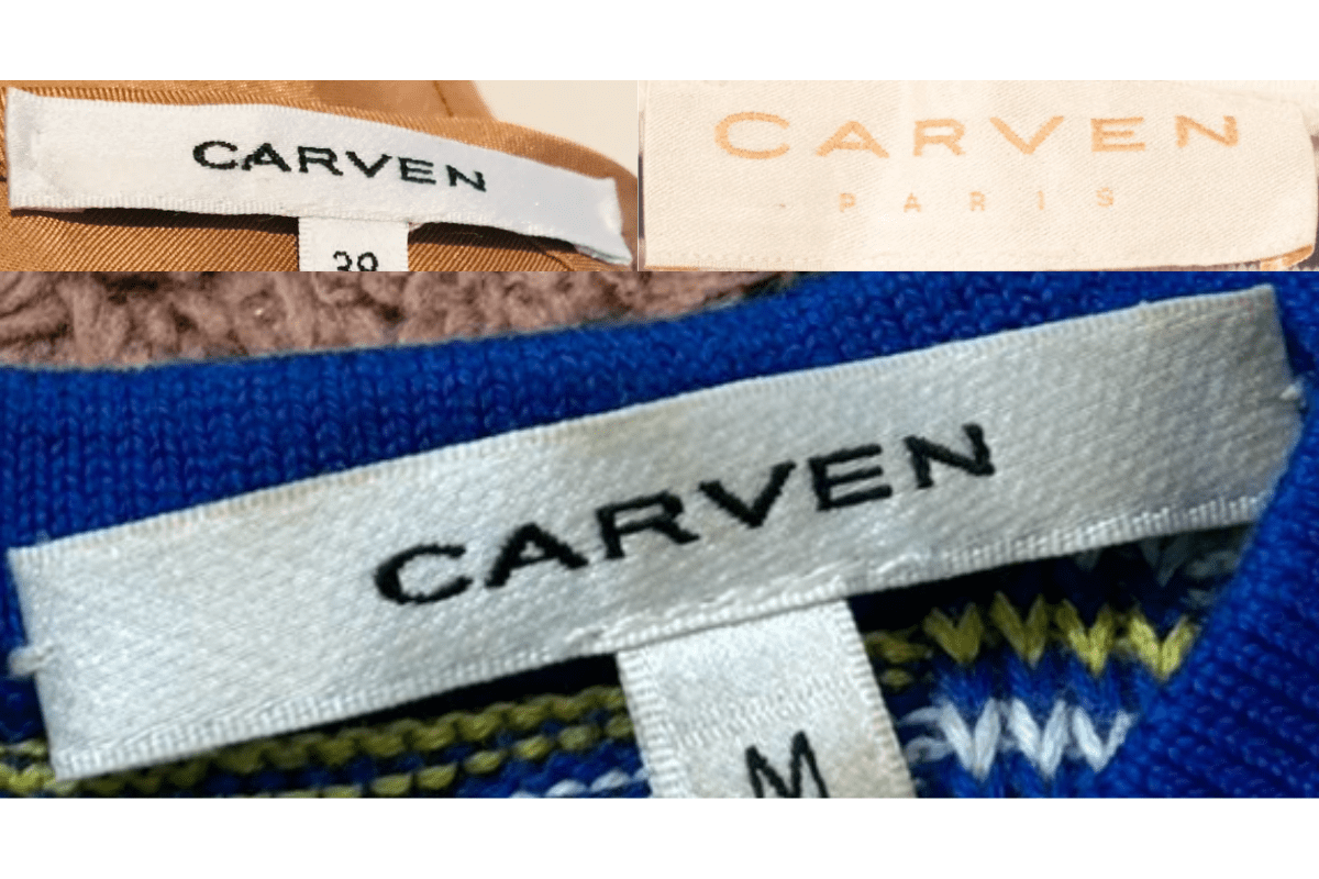
- Just 'Carven' in bold letters, minimal additional text.
- Occasional colored backgrounds for line differentiation.
- Clean, modern rectangular format.
How to spot it
Bare 'Carven' bold tag with no Paris text = post-2000 minimalist era.
Value signal
Lower.