Cathy Hardwick
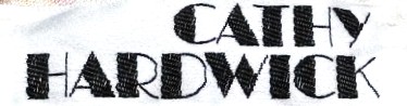
Korean-American designer known for easy sportswear. Bold red or black serif 'Cathy Hardwick' on white tags marks the 1980s; all-caps tags with simpler black lettering identify the 1990s.
- Origin
- USA
- Founded
- 1972
- Category
- Designer & Casual
- Documented eras
- 2
How Cathy Hardwick labels evolved over time. Match the markers below against the tag in hand to place a garment in its era.
1980–1989
1980s Bold Serif Tags
Bold serif font in either black or red showcasing a minimalist style. Most tags are white or off-white, with the brand name as the focal point.
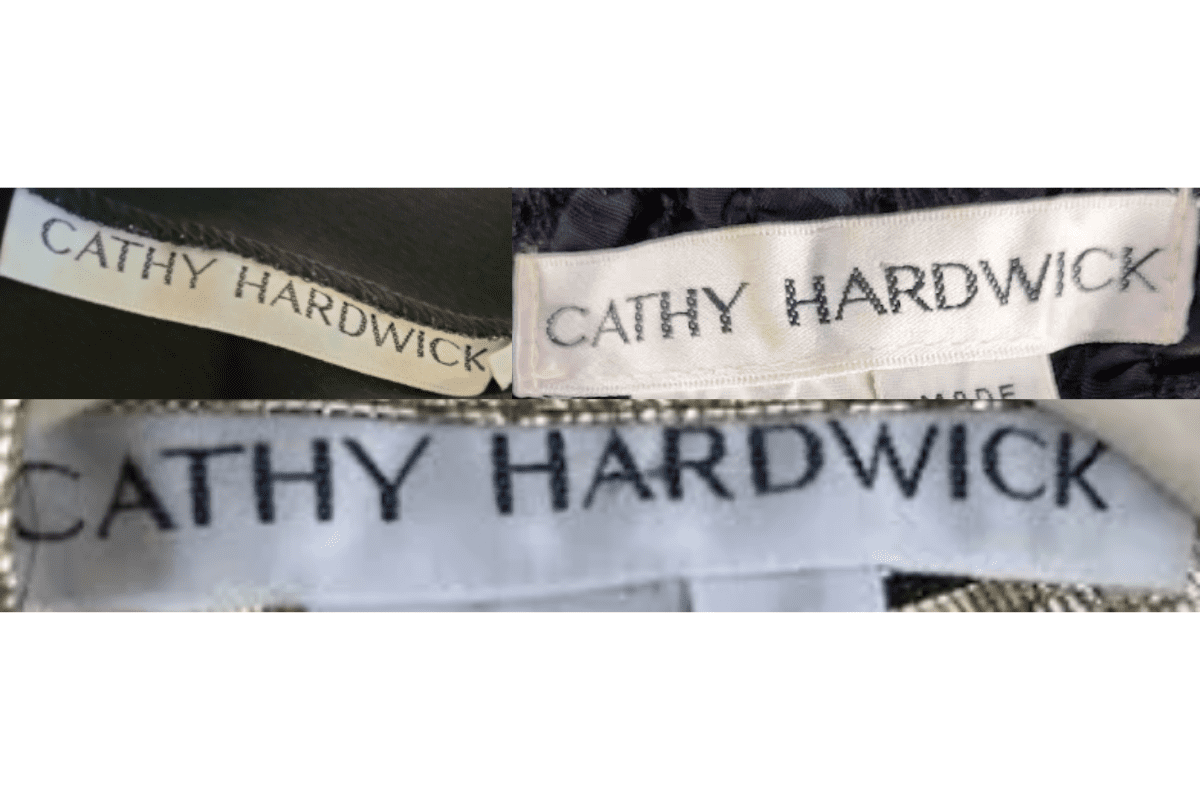
- Bold serif 'Cathy Hardwick' in black or red on white tags.
- Minimalist design focusing on the brand name.
- Clean rectangular tag format.
How to spot it
Bold serif 'Cathy Hardwick' on a clean white tag = 1980s.
Value signal
Moderate.
1990–1999
1990s Minimalist Black Serif Tags
Tags maintain a minimalist approach with simple black serif fonts. The all-caps transition reflects 1990s corporate branding trends, with no extraneous decorative elements.
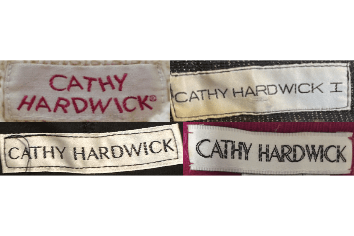
- Minimalist black serif font, often all caps.
- No decorative elements beyond the brand name.
- Clean rectangular white tags.
How to spot it
All-caps 'CATHY HARDWICK' in black sans serif = 1990s version.
Value signal
Lower.