Celine
Parisian luxury house. The horse-drawn carriage logo with 'Marque Deposee' dates pieces to before 1997; tags reading 'CELINE PARIS' in serif without the carriage mark the late 1990s–2010s; all-caps sans-serif identifies post-2018.
- Origin
- France
- Founded
- 1945
- Category
- High Fashion
- Documented eras
- 5
How Celine labels evolved over time. Match the markers below against the tag in hand to place a garment in its era.
1960–1972
1960s Carriage Logo Tags
Features the iconic horse-drawn carriage logo with 'Marque Deposee' certification. Rectangular tags with serif lettering establish the couture-house identity.
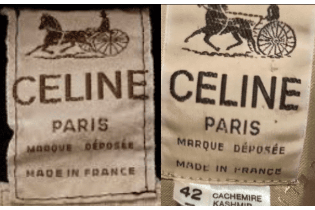
- Horse-drawn carriage logo with 'Marque Deposee' text.
- Rectangular tags with serif lettering.
- 'CELINE PARIS' in bold serif below the carriage emblem.
How to spot it
Horse-drawn carriage + 'Marque Deposee' = pre-1973 Celine.
Value signal
Very high — early Celine with the carriage mark is highly collectible.
1973–1989
1970s-80s Classic Carriage Tags
Continued use of the horse-drawn carriage logo. Tags are rectangular with bold serif 'CELINE PARIS.' Additional quality text and country-of-origin markings included.
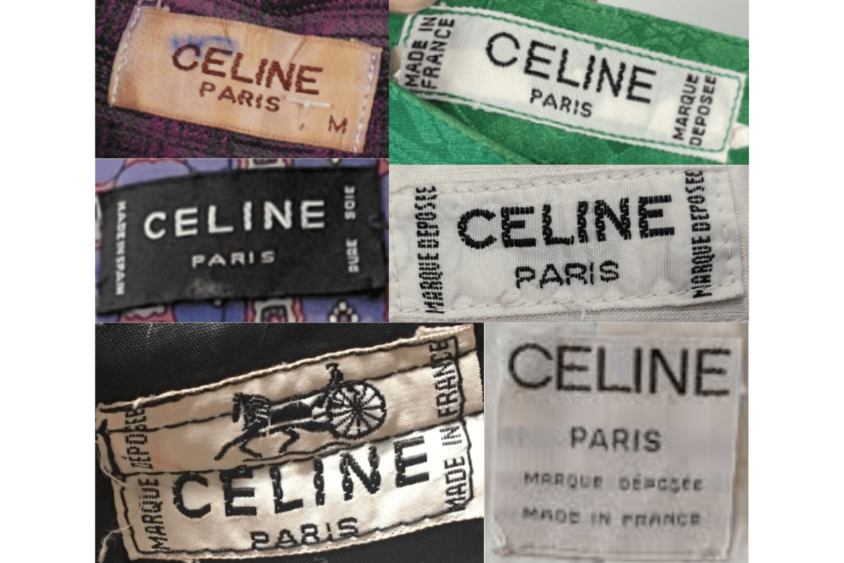
- Continued horse-drawn carriage logo on rectangular tags.
- Bold serif 'CELINE PARIS' text.
- Quality and country-of-origin text included.
How to spot it
Carriage logo on rectangular serif tag = 1970s-80s Celine.
Value signal
Very high.
1990–1996
1990s Refined Carriage Tags
More refined modern serif font for 'CELINE PARIS.' The carriage logo is retained but presented in a cleaner, more contemporary format. Additional detail information included.
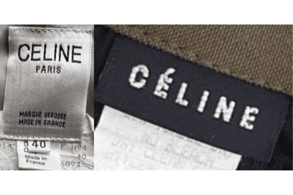
- Refined modern serif 'CELINE PARIS'.
- Carriage logo retained but cleaner presentation.
- Additional detail sub-labels with size and composition.
How to spot it
Refined serif + carriage logo = 1990s pre-Philo Celine.
Value signal
High.
1997–2011
2000s Minimal Sans Tags
Introduction of simpler, cleaner tag designs without the carriage logo. Tags may include 'CELINE NEW YORK' for American-market pieces. Shift toward understated luxury branding.
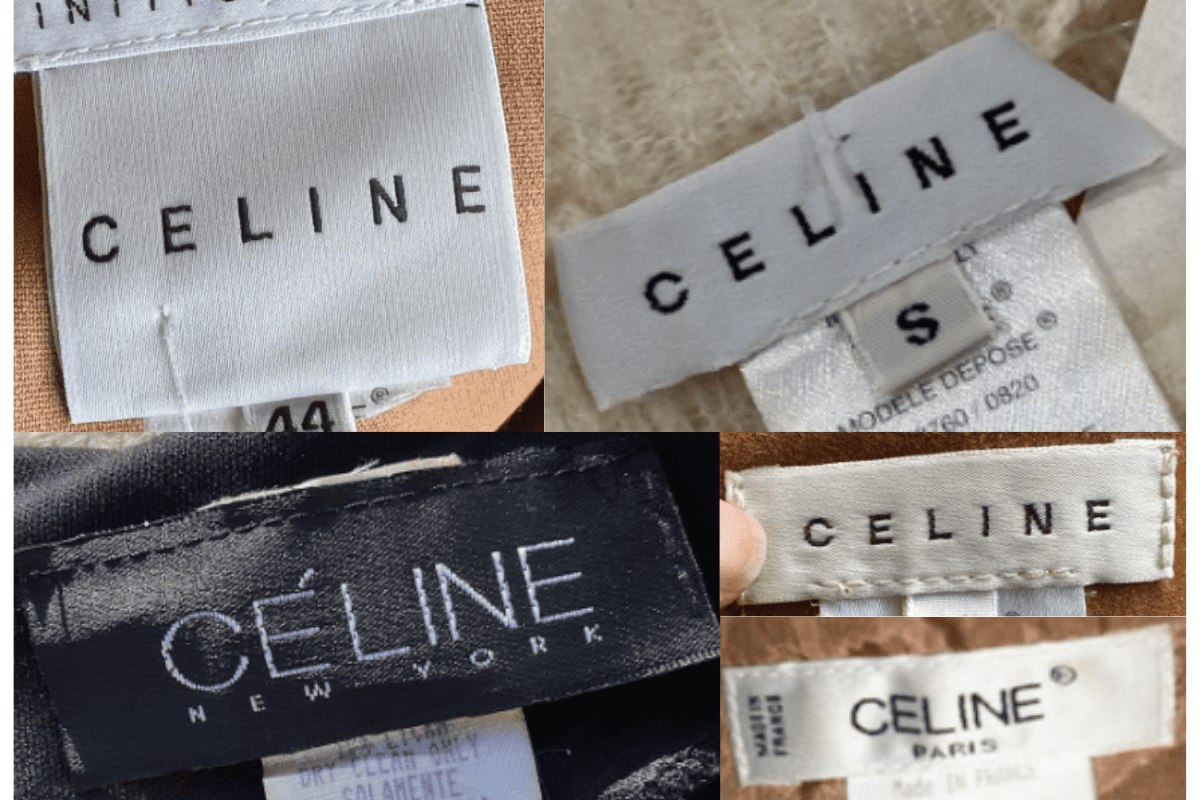
- No carriage logo — text only.
- 'CELINE NEW YORK' on American-market pieces.
- Simpler cleaner tag design.
How to spot it
'CELINE' text tag without carriage logo = post-1997 piece.
Value signal
High.
2012–present
2010s Minimalist All-Caps Tags
Minimalist design with a focus on clean sans-serif fonts. The logo is often just 'CELINE PARIS' without additional graphics, reflecting the Phoebe Philo era's pared-back aesthetic.
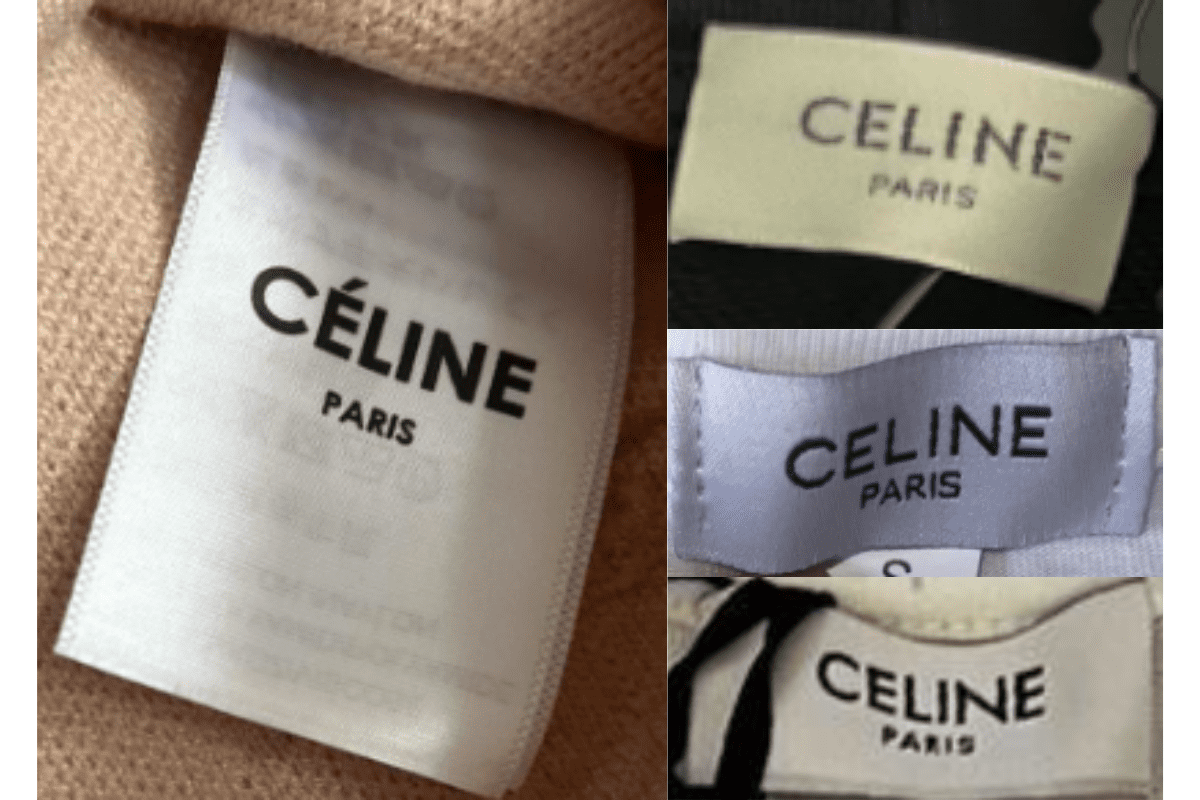
- 'CELINE PARIS' in clean sans-serif, no additional graphics.
- Accent removed from the E in post-2012 pieces.
- Minimal rectangular tag with high-quality materials.
How to spot it
All-caps 'CELINE PARIS' sans-serif without accent = 2012 onward.
Value signal
High — the Philo-era Celine is highly desirable.