Cole of California
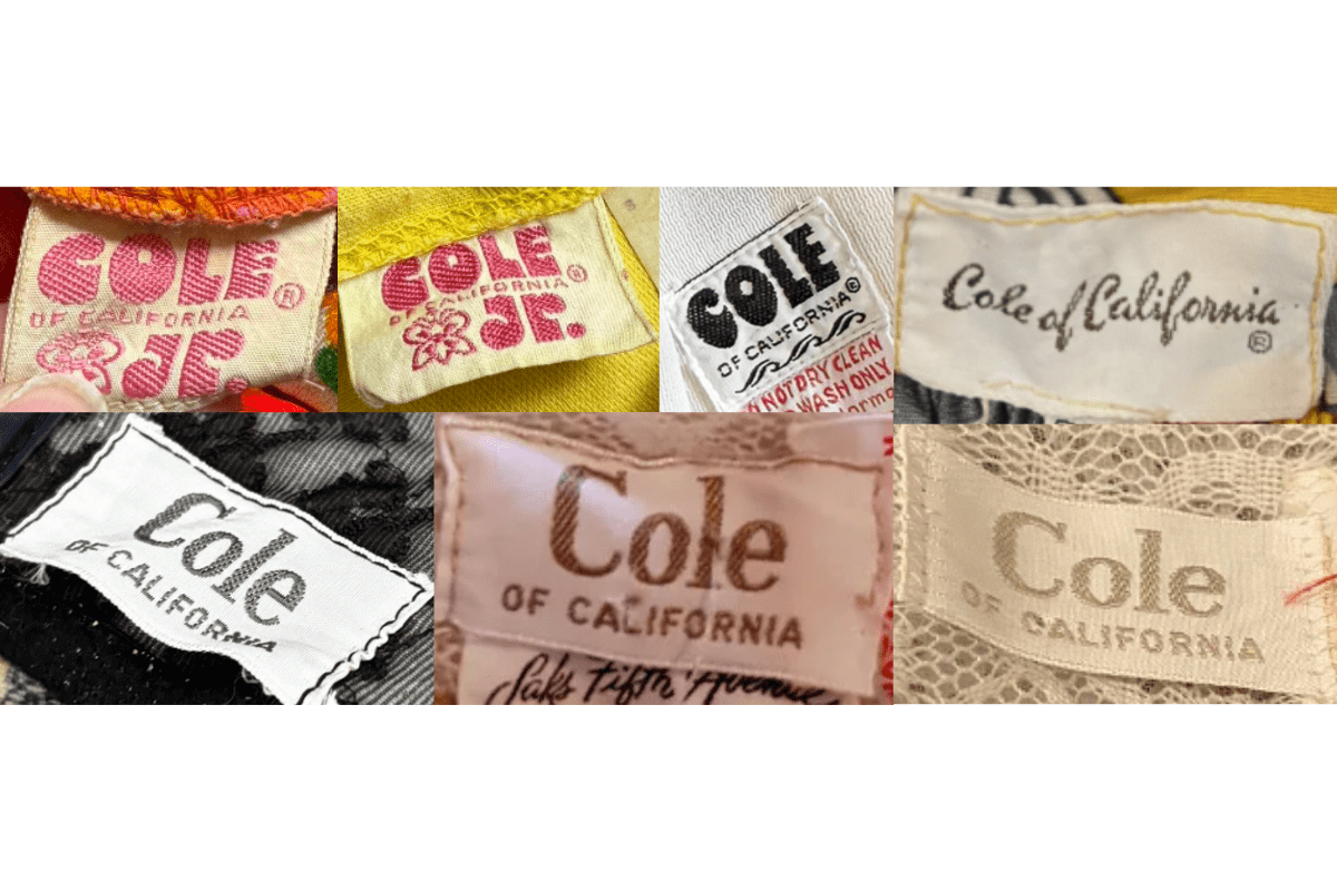
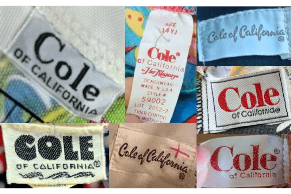
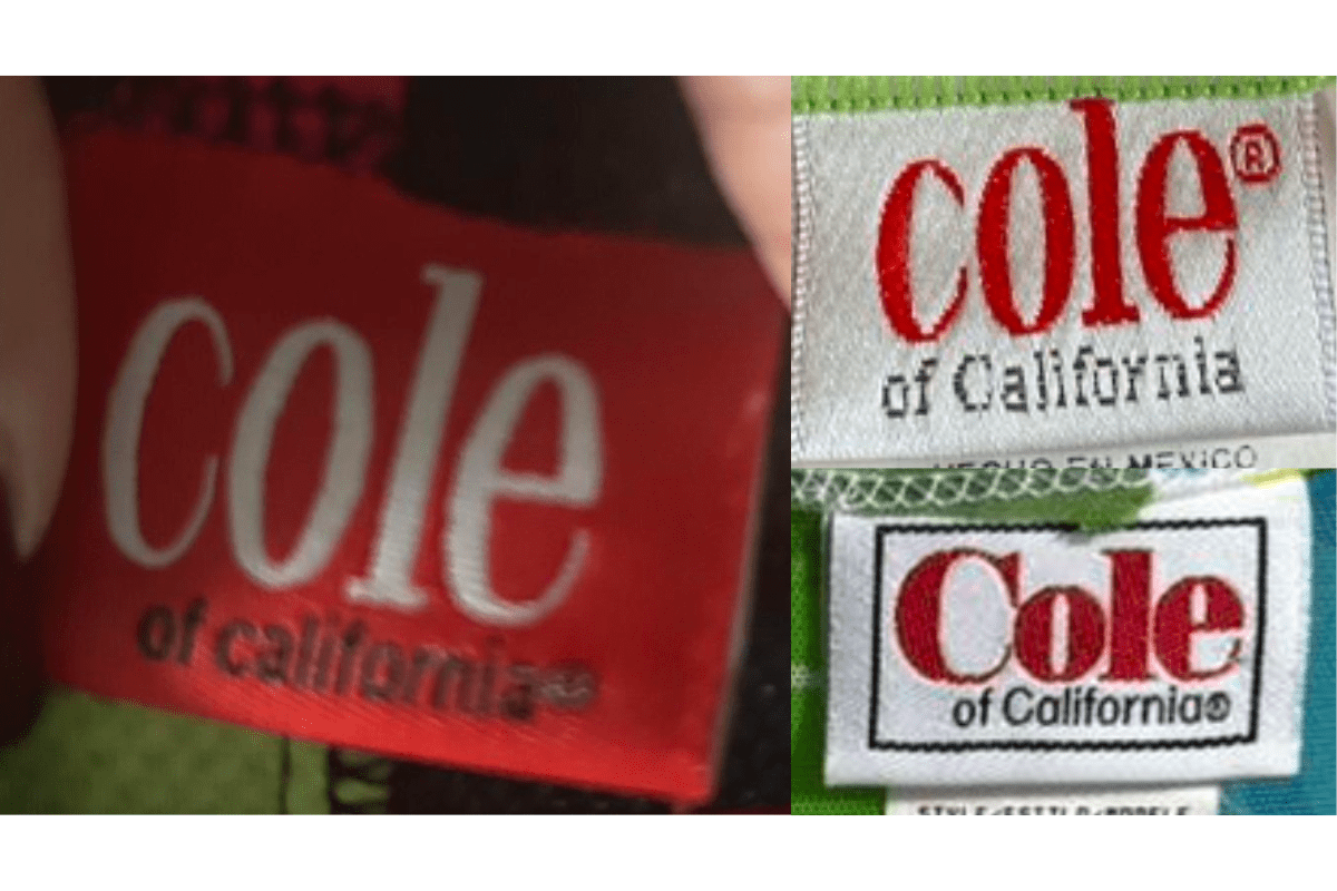
Los Angeles swimwear house. 1940s–50s tags use cursive 'Cole' in brown with blocky 'of California' beneath; 1960s–70s tags adopt bold modern fonts; 1980s–90s tags use a red 'Cole' with clean sans-serif 'of California'.
- Origin
- USA
- Founded
- 1925
- Category
- Designer & Casual
- Documented eras
- 6
How Cole of California labels evolved over time. Match the markers below against the tag in hand to place a garment in its era.
1940–1949
1940s Cursive Cole Tags
Bold serif lettering for the 'Cole' name with 'of California' in smaller font beneath. Square tags often in brown and cream palette. Some early tags include 'Original' to distinguish authentic pieces.
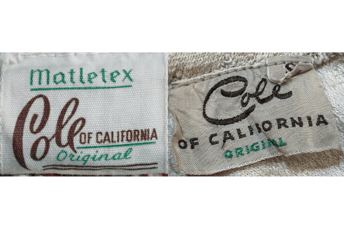
- Cursive 'Cole' in brown with blocky 'of California' beneath.
- Square tags in brown and cream palette.
- 'Original' text on some early pieces.
How to spot it
Cursive brown 'Cole' with small 'of California' = 1940s swimwear.
Value signal
Very high — 1940s Cole of California is premier vintage sportswear.
1950–1959
1950s Playful Bold Tags
Introduces more playful and decorative elements. Square tags with 'Cole' prominently displayed with additional branding elements. Post-war optimism reflected in vibrant design choices.
- 'Cole' prominently displayed in playful bold fonts.
- Additional branding elements alongside the name.
- Square format with more decorative design.
How to spot it
Bold playful 'Cole of California' on square tag = 1950s.
Value signal
High.
1960–1969
1960s Modernist Tags
Reflects the modernist aesthetic with cleaner lines and fonts. Square or rectangular tags, often with simple black and white designs. Focus on the brand name in bold modernist typography.
- Cleaner lines and modernist fonts.
- Black and white or high-contrast design.
- Bold modernist typography for 'Cole of California'.
How to spot it
Modernist black-and-white Cole of California tag = 1960s.
Value signal
High.
1970–1979
1970s Clean Modernist Tags
Continuation of the clean modernist aesthetic. Square or rectangular tags with bold serif 'Cole of California'. The 'of California' component is maintained as a regional identity marker.
- Bold serif 'Cole of California' in clean modernist style.
- Square or rectangular format.
- 'of California' regional identity marker retained.
How to spot it
Bold serif 'Cole of California' = 1970s continuation of modernist era.
Value signal
Moderate to high.
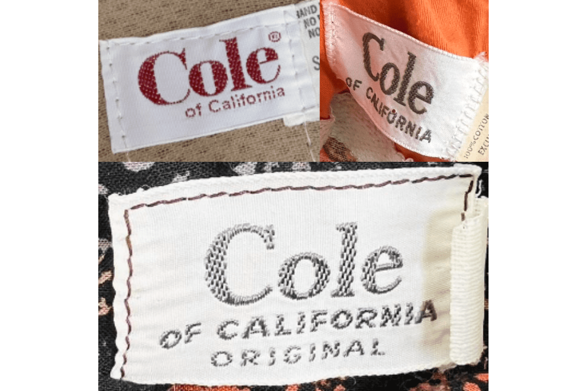
1980–1989
1980s Colorful Red Logo Tags
Tags become more colorful and varied in design. Rectangular tags with 'Cole of California' in bold fonts, using red for 'Cole' — a shift toward the brand's modern signature palette.
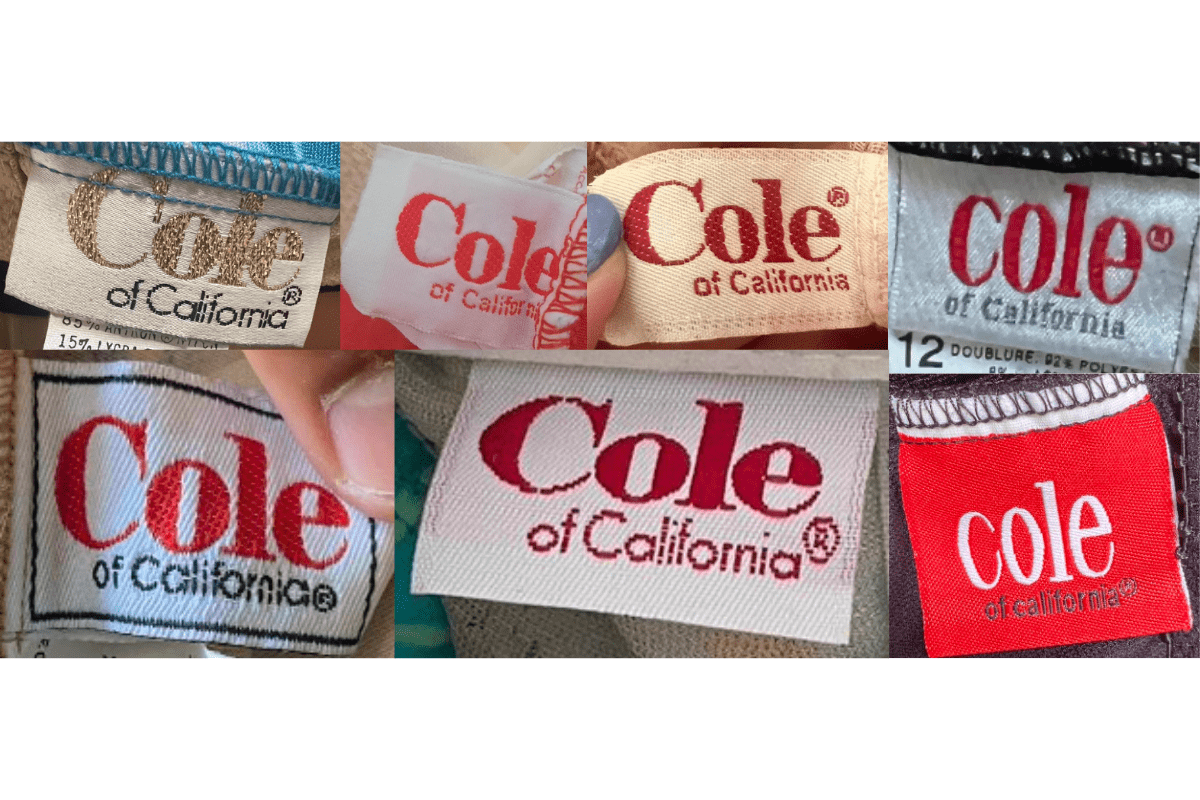
- Red 'Cole' with clean 'of California' in smaller text.
- More colorful rectangular tag designs.
- Additional design elements around the brand name.
How to spot it
Red 'Cole' on rectangular tag = 1980s color-palette shift.
Value signal
Moderate.
1990–1999
1990s Modern Streamlined Tags
Modern and streamlined tag designs with bold colors and fonts. Rectangular tags focus on the brand name with minimal additional elements, reflecting the decade's branding minimalism.
- Modern streamlined 'Cole of California' in bold fonts.
- Minimal additional elements.
- Bold color choices with clean rectangular format.
How to spot it
Streamlined modern 'Cole of California' = 1990s last production era.
Value signal
Lower.