Contempo Casuals
American teen specialty retailer. Bold colorful tags with stylized face graphics and whimsical fonts mark the 1970s–80s; a shift to simple bold lettering in sans-serif or modern serif defines the 1990s.
- Origin
- USA
- Founded
- 1962
- Category
- Designer & Casual
- Documented eras
- 3
How Contempo Casuals labels evolved over time. Match the markers below against the tag in hand to place a garment in its era.
1970–1979
1970s Artistic Graphic Tags
Features bold, colorful graphics often including stylized images of faces or artistic designs. 'Contempo Casuals' in whimsical, decorative fonts on vibrant, often oversized tags.
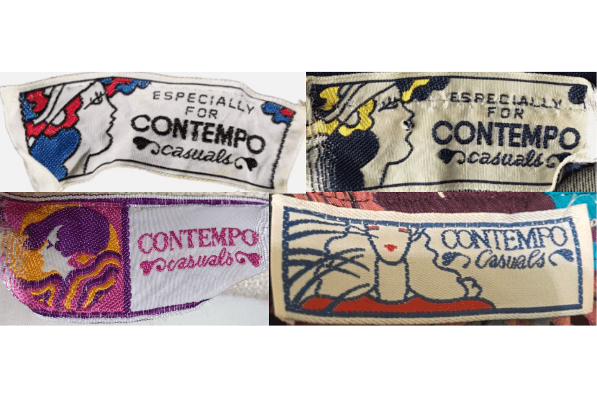
- Stylized face illustrations or artistic graphics.
- Whimsical decorative fonts for 'Contempo Casuals'.
- Vibrant colorful oversized tag format.
How to spot it
Stylized face or artistic graphic on a colorful oversized tag = 1970s Contempo Casuals.
Value signal
Moderate — 1970s Contempo is a fun nostalgia collectible.
1980–1989
1980s Refined Artistic Tags
Continues to use bold, artistic graphics but with a more refined and consistent style. 'Contempo Casuals' is often paired with unique decorative fonts and sometimes accompanied by colorful illustrations.
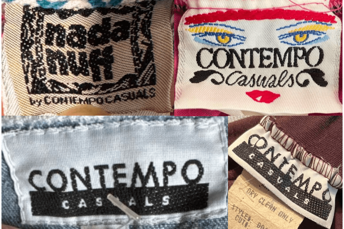
- More refined, consistent artistic graphics.
- Unique decorative fonts paired with illustrations.
- Bold artistic aesthetic maintained.
How to spot it
Refined decorative font with illustration on a Contempo Casuals tag = 1980s.
Value signal
Moderate.
1990–1999
1990s Minimalist Typography Tags
Tags shift to a more minimalistic design with focus on typography. Simple bold lettering with 'Contempo Casuals' often in a sans-serif or modern serif font. Black and white color scheme.
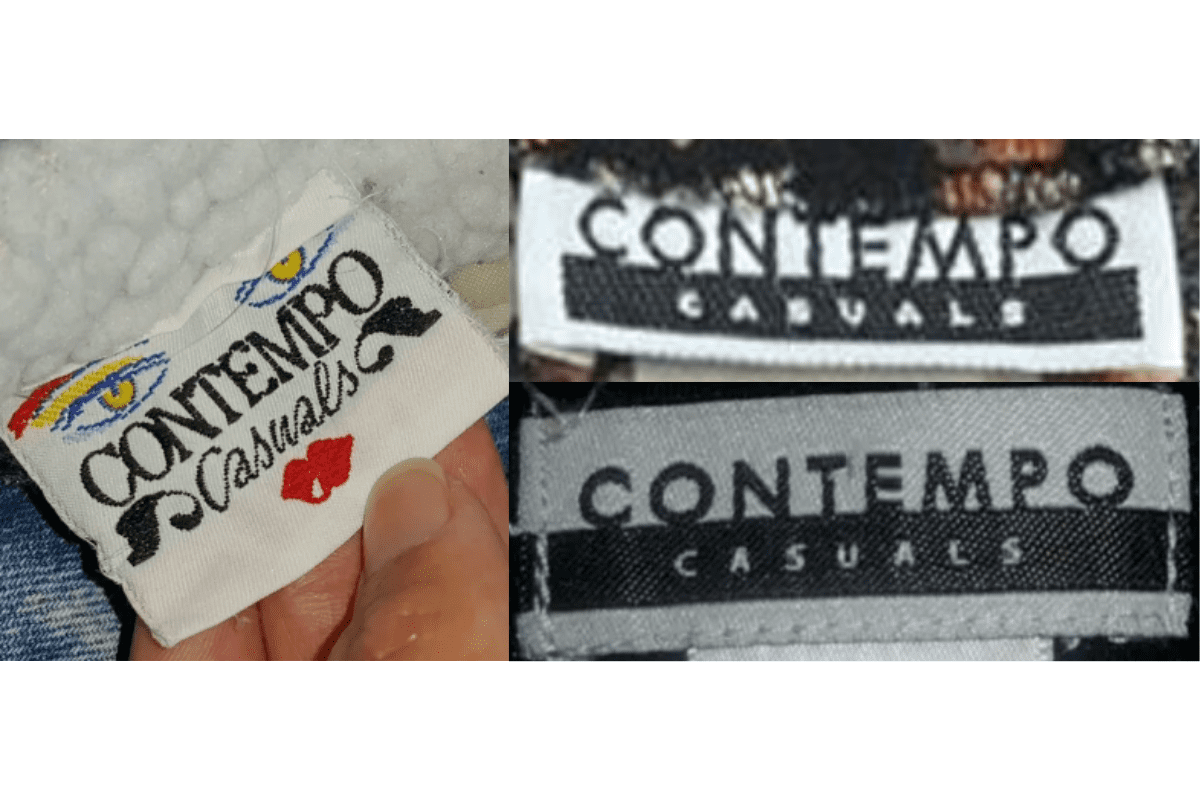
- Simple bold sans-serif or modern serif 'Contempo Casuals'.
- Black and white minimalist design.
- Shift away from decorative graphics.
How to spot it
Plain bold 'Contempo Casuals' text without graphics = 1990s.
Value signal
Lower.