Cortefiel
Spanish menswear chain. 1970s tags read 'Craftsmen for Centuries' with a craftsman illustration; the 1980s–90s adopt the crown logo symbol in a cleaner serif; monochromatic crown-logo tags define the 1990s.

- Origin
- Spain
- Founded
- 1945
- Category
- Designer & Casual
- Documented eras
- 3
How Cortefiel labels evolved over time. Match the markers below against the tag in hand to place a garment in its era.
1970–1979
1970s Craftsmen For Centuries Tags
Tags often feature the phrase 'Craftsmen for Centuries', highlighting the brand's dedication to quality. An illustration of a craftsman accompanies the text with ornate design elements.
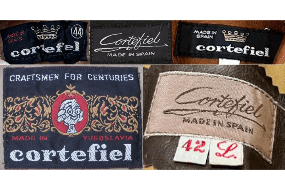
- 'Craftsmen for Centuries' phrase.
- Craftsman illustration on the tag.
- Ornate decorative design elements.
How to spot it
'Craftsmen for Centuries' text on a Cortefiel tag = 1970s.
Value signal
Moderate.
1980–1989
1980s Crown Logo Tags
Shift towards simpler modern typography while retaining a classic look. Tags feature the iconic Cortefiel logo with a crown symbol, emphasizing regal and sophisticated brand image.
- Crown symbol as key logo element.
- Simpler modern typography.
- Classic regal brand aesthetic.
How to spot it
Crown symbol on a Cortefiel tag = 1980s.
Value signal
Lower.
1990–1999
1990s Minimalist Crown Tags
Further simplification of design with minimalistic aesthetics. Continued use of the crown logo, often in monochromatic color schemes. Tags sometimes include additional branding elements.
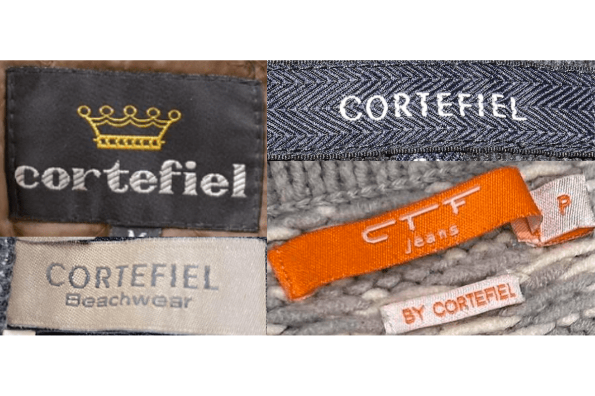
- Crown logo in monochromatic color scheme.
- Minimalistic design aesthetic.
- Additional branding elements on some tags.
How to spot it
Monochromatic crown-logo Cortefiel tag = 1990s.
Value signal
Lower.