Countess Mara
New York neckwear and accessories brand. 1950s–60s tags use elegant cursive with a crown logo on gold and white; 'NEW YORK' appears in the 1970s; block lettering with corporate co-branding like 'FOR JOHN L. ASHE' marks the 1980s–90s.

- Origin
- USA
- Founded
- 1937
- Category
- Designer & Casual
- Documented eras
- 5
How Countess Mara labels evolved over time. Match the markers below against the tag in hand to place a garment in its era.
1950–1959
1950s Crown Cursive Tags
Tags often featured the brand name in cursive, elegant script. Use of the crown logo symbolizing luxury. Simple gold-on-white or black-on-white color schemes.
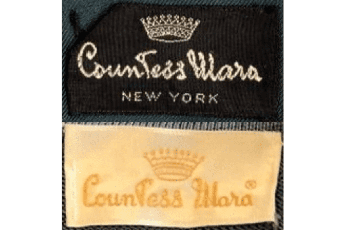
- Cursive 'Countess Mara' in elegant script.
- Crown logo for luxury positioning.
- Gold on white or black on white palette.
How to spot it
Cursive 'Countess Mara' + crown = 1950s neckwear piece.
Value signal
High — 1950s Countess Mara neckwear is collected.
1960–1969
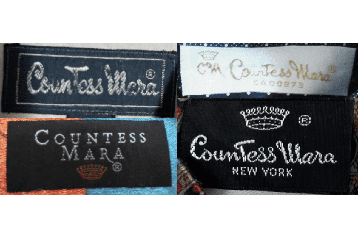
1960s Modern Block Font Tags
Introduction of a more modern, blocky font for the brand name. Crown logo continues as a prominent feature. White tags with gold or black text maintaining classic appearance.
- Modern blocky font replacing earlier cursive.
- Crown logo retained prominently.
- White tags with gold or black text.
How to spot it
Blocky 'Countess Mara' font + crown = 1960s.
Value signal
Moderate to high.
1970–1979
1970s New York Tags
Tags display a mix of cursive and block fonts reflecting transitional branding styles. 'NEW YORK' text added to emphasize the brand's origin. More variety in tag colors.
- Mix of cursive and block fonts.
- 'NEW YORK' location text added.
- More variety in tag colors.
How to spot it
'NEW YORK' on a Countess Mara tag = 1970s.
Value signal
Moderate.
1980–1989
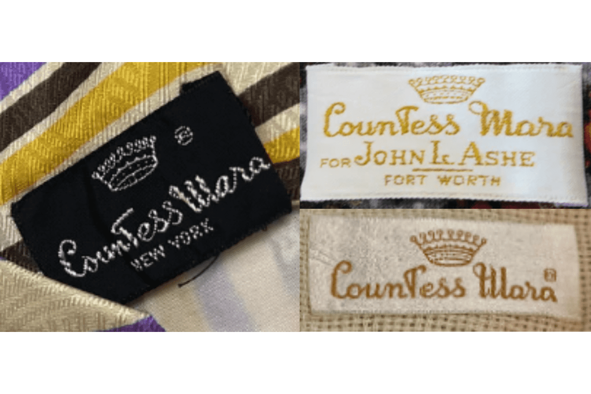
1980s Corporate Co-Branding Tags
More standardized block lettering. Crown logo consistently placed above brand name. Tags include additional lines like 'FOR JOHN L. ASHE' indicating retail partnerships.
- Standardized block lettering.
- Crown logo consistently above brand name.
- Retail partner names like 'FOR JOHN L. ASHE' on tags.
How to spot it
'FOR [retailer name]' text on Countess Mara tag = 1980s corporate era.
Value signal
Moderate.
1990–1999
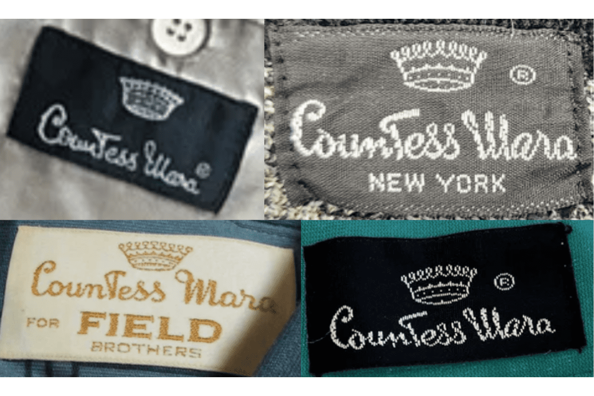
1990s Bold Modern Tags
Modern and bold fonts with a sleek black and white color scheme. Increased use of collaborations noted directly on the tags, such as 'FOR FIELD BROTHERS' or 'FOR REYNOLDS PENLAND'.
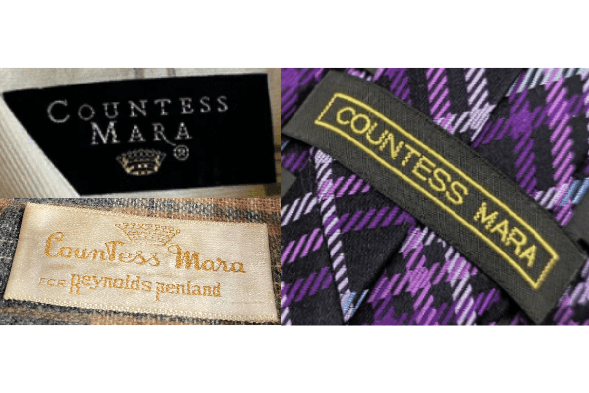
- Bold modern fonts in black and white.
- Collaboration partner names on tags.
- Sleek contemporary presentation.
How to spot it
Bold black-and-white 'Countess Mara' with collaboration text = 1990s.
Value signal
Moderate.