Debenhams
British department store chain. Tags with 'Debenham & Freebody' and cursive script date to the 1960s; transition to 'Debenhams' alone in bold modern font marks the 1970s; sub-brand tags like 'Debenhams Classics', '1778', and 'Black Tie' identify specific decades.
- Origin
- England
- Founded
- 1778
- Category
- Designer & Casual
- Documented eras
- 6
How Debenhams labels evolved over time. Match the markers below against the tag in hand to place a garment in its era.
1960–1969
1960s Debenham & Freebody Tags
Tags often featured the full 'Debenham & Freebody' name. Elegant cursive scripts and 'Linen Drapers to H.M. the Queen' indicating the royal appointment. Prestigious luxury presentation.
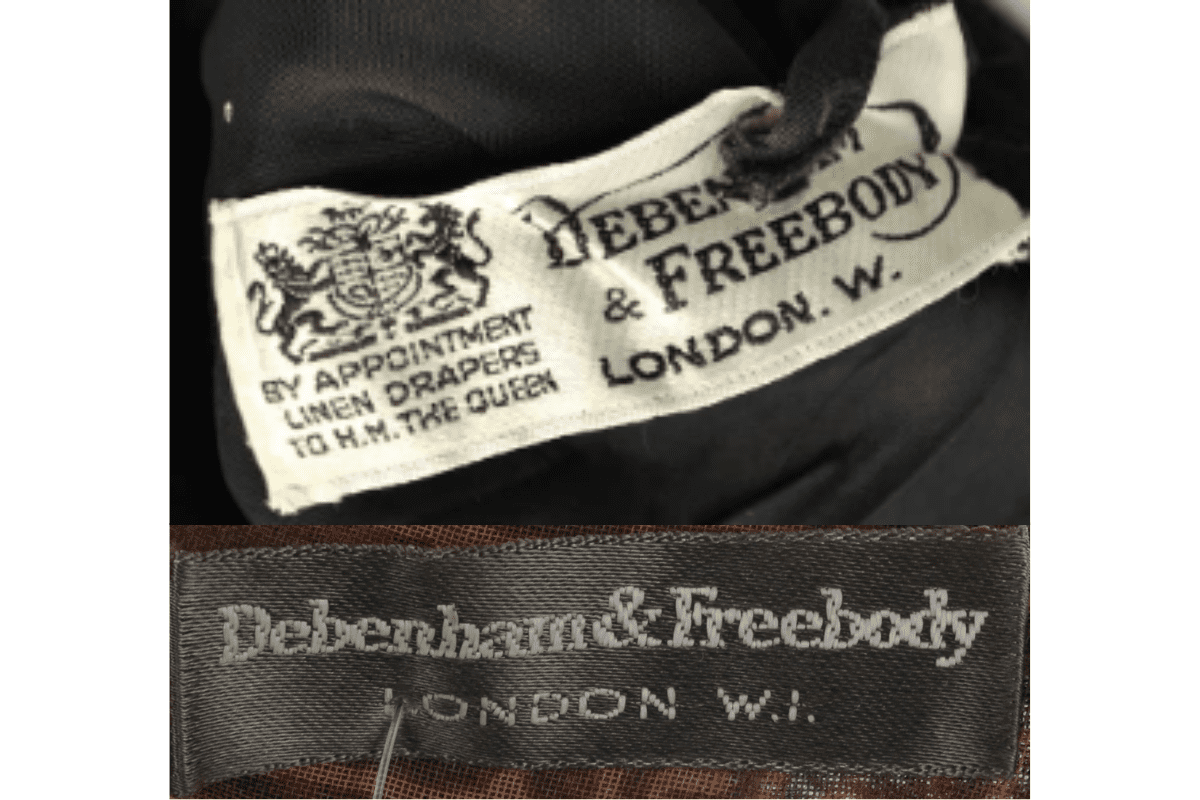
- Full 'Debenham & Freebody' name on tag.
- Elegant cursive script typography.
- 'Linen Drapers to H.M. the Queen' royal appointment text.
How to spot it
'Debenham & Freebody' name on tag = pre-1970s royal appointment era.
Value signal
High — Debenham & Freebody with royal appointment text is very collectible.
1970–1979
1970s Transition to Debenhams Tags
Transition from 'Debenham & Freebody' to simply 'Debenhams.' Tags typically had a more modern, bold font. Colors including bright shades like red alongside traditional black and white.
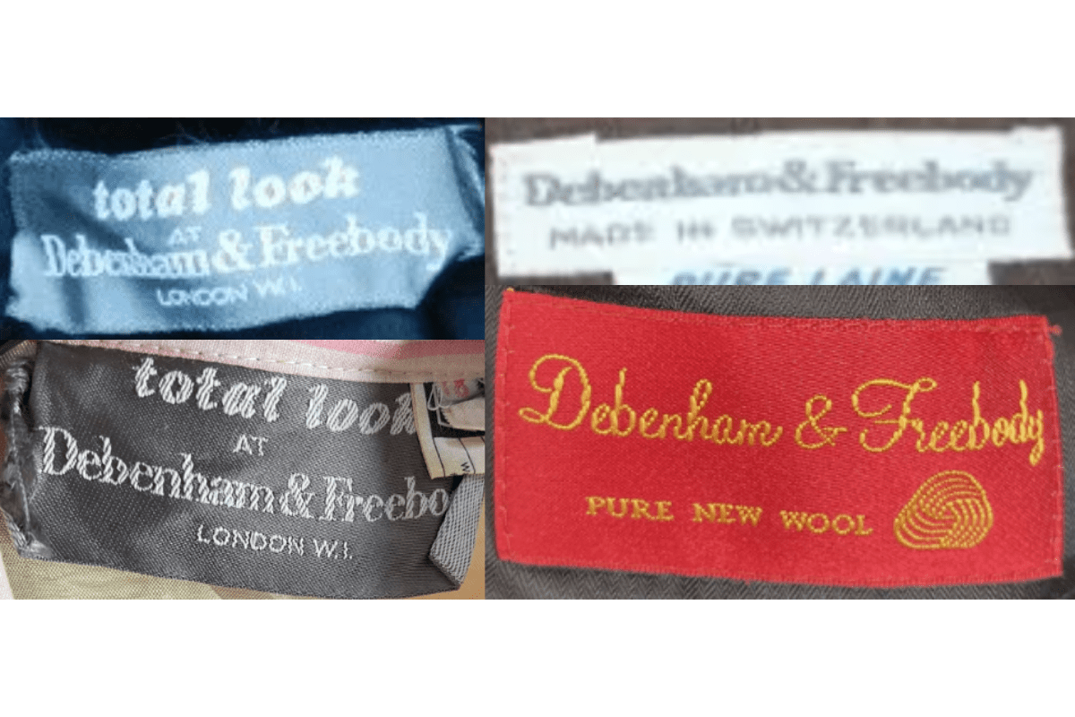
- Transition to 'Debenhams' branding.
- More modern bold font.
- Bright colors like red introduced.
How to spot it
Just 'Debenhams' without '& Freebody' = 1970s rebrand.
Value signal
Moderate.
1980–1989
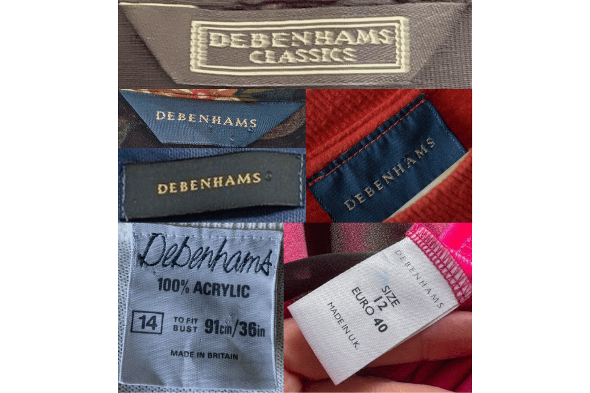
1980s Classics Line Tags
Contemporary fonts and minimalist designs. Tags began to emphasize specific lines like 'Debenhams Classics.' Materials and country of origin frequently listed.
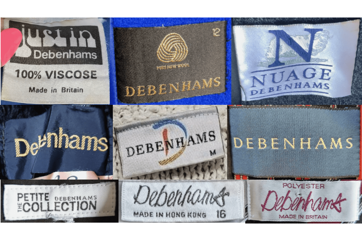
- 'Debenhams Classics' sub-line identified on tag.
- Contemporary minimalist fonts.
- Materials and country of origin listed.
How to spot it
'Debenhams Classics' text or contemporary minimalist design = 1980s.
Value signal
Lower.
1990–1999
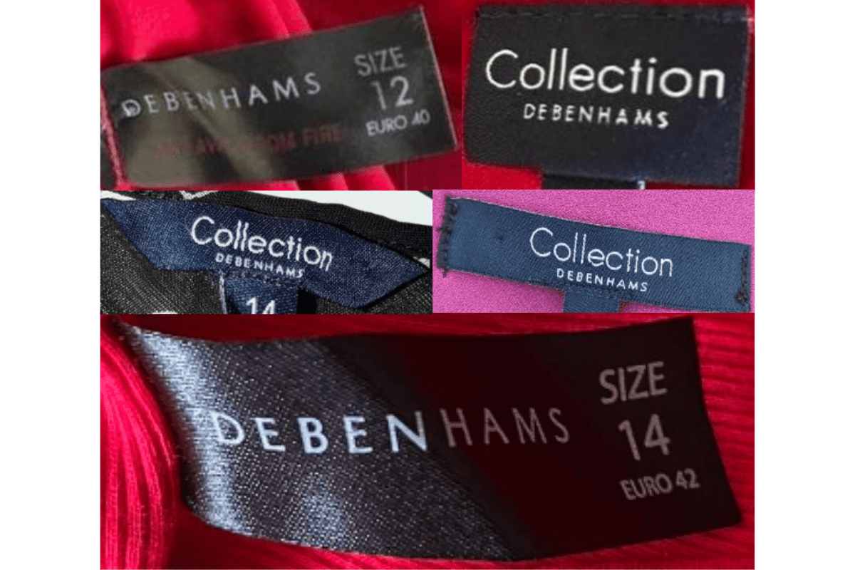
1990s Multi-Brand Tags
Distinct branding for different collections such as 'Collection' and 'Nuage.' Wider variety of fonts and styles from classic to modern. Clear size information commonly included.
- 'Collection' and 'Nuage' sub-brand identifiers.
- Wide variety of fonts and styles.
- Clear size information on tags.
How to spot it
'Collection' or 'Nuage' sub-brand on Debenhams tag = 1990s.
Value signal
Lower.
2000–2009
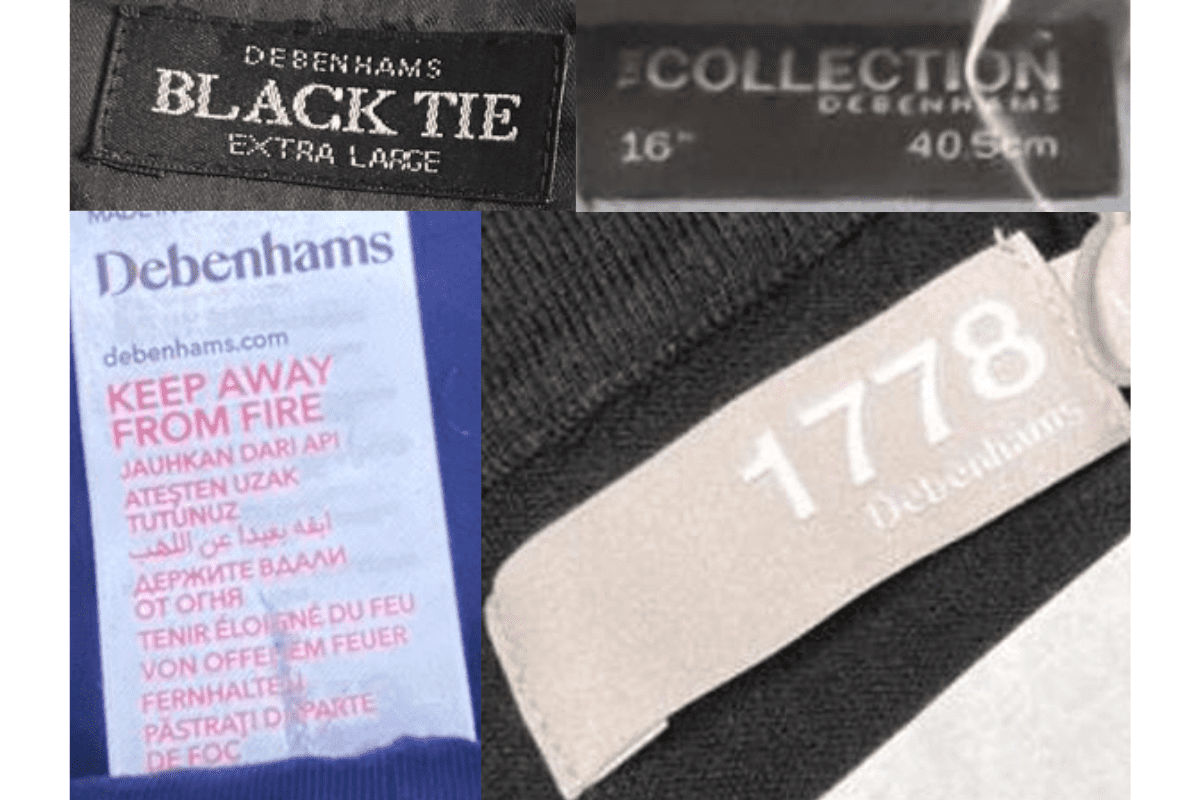
2000s Sans-Serif Sleek Tags
Tags became more simplified and sleek, featuring just the 'Debenhams' name in a clean sans-serif font. Continued use of distinct sub-brands like '1778' and 'Black Tie.'
- Clean sans-serif 'Debenhams' text.
- '1778' and 'Black Tie' sub-brand identifiers.
- Simplified sleek tag design.
How to spot it
'1778' or 'Black Tie' on a sleek Debenhams tag = 2000s.
Value signal
Lower.
2010–present
2010s Modern Final Era Tags
Continued modernization with clean contemporary design before the brand's eventual administration. Sub-brand identifiers continued, reflecting diverse own-brand collections.
- Clean contemporary design.
- Diverse own-brand collection identifiers.
- Modern final era typography.
How to spot it
Modern clean Debenhams tag = 2010s final trading years.
Value signal
Lower.