Dorothy Perkins
British women's retailer founded 1909 as H.P. Newman, renamed Dorothy Perkins in 1919. Bold uppercase 'DOROTHY' with smaller 'PERKINS' below marks 1980s tags; colorful tags identify the 1990s; cleaner script defines the 2000s.

- Origin
- England
- Founded
- 1909
- Category
- Designer & Casual
- Documented eras
- 4
How Dorothy Perkins labels evolved over time. Match the markers below against the tag in hand to place a garment in its era.
1980–1989
1980s Bold Monochrome Tags
Acquired by the Burton Group in 1979, Dorothy Perkins used clean, no-frills tags through the 1980s. The bold uppercase stacked layout reflected the decade's straightforward high-street aesthetic.
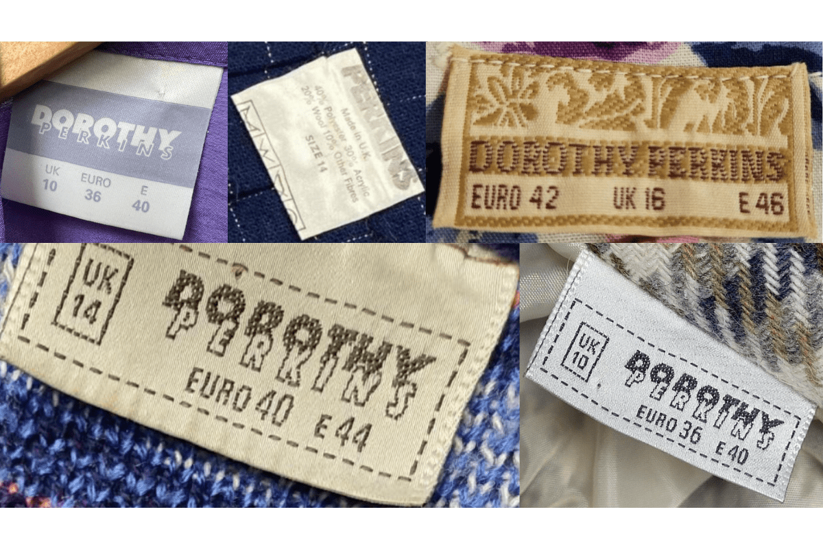
- Bold uppercase 'DOROTHY' with smaller 'PERKINS' underneath.
- Monochrome black-and-white color scheme.
- Simple, utilitarian tag format.
How to spot it
Stacked 'DOROTHY PERKINS' in solid uppercase = 1980s Burton Group era.
Value signal
Moderate — 1980s DP pieces are collectable for their pre-Arcadia design.
1990–1999
1990s Colorful Retail Tags
Under Arcadia Group ownership, Dorothy Perkins updated its tags to match the brighter, more colorful retail environment of the 1990s.
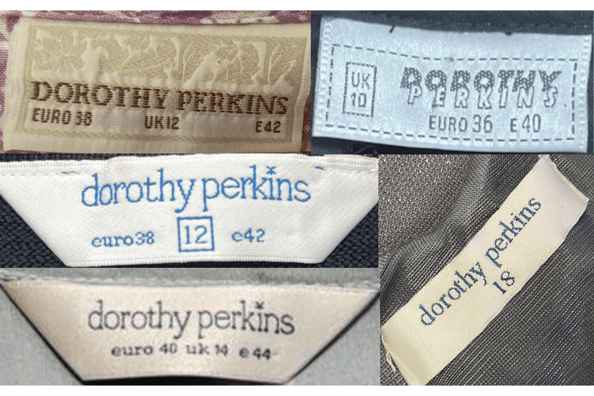
- Introduction of color elements on the label.
- Bolder lettering with updated typography.
- High-street retail standard tag format.
How to spot it
Color on the label and updated font = 1990s Arcadia-era piece.
Value signal
Low to moderate — common high-street pieces.
2000–2009
2000s Modernized Script
The 2000s brought a cleaner, lighter script to Dorothy Perkins tags as the brand continued to evolve within Arcadia Group.
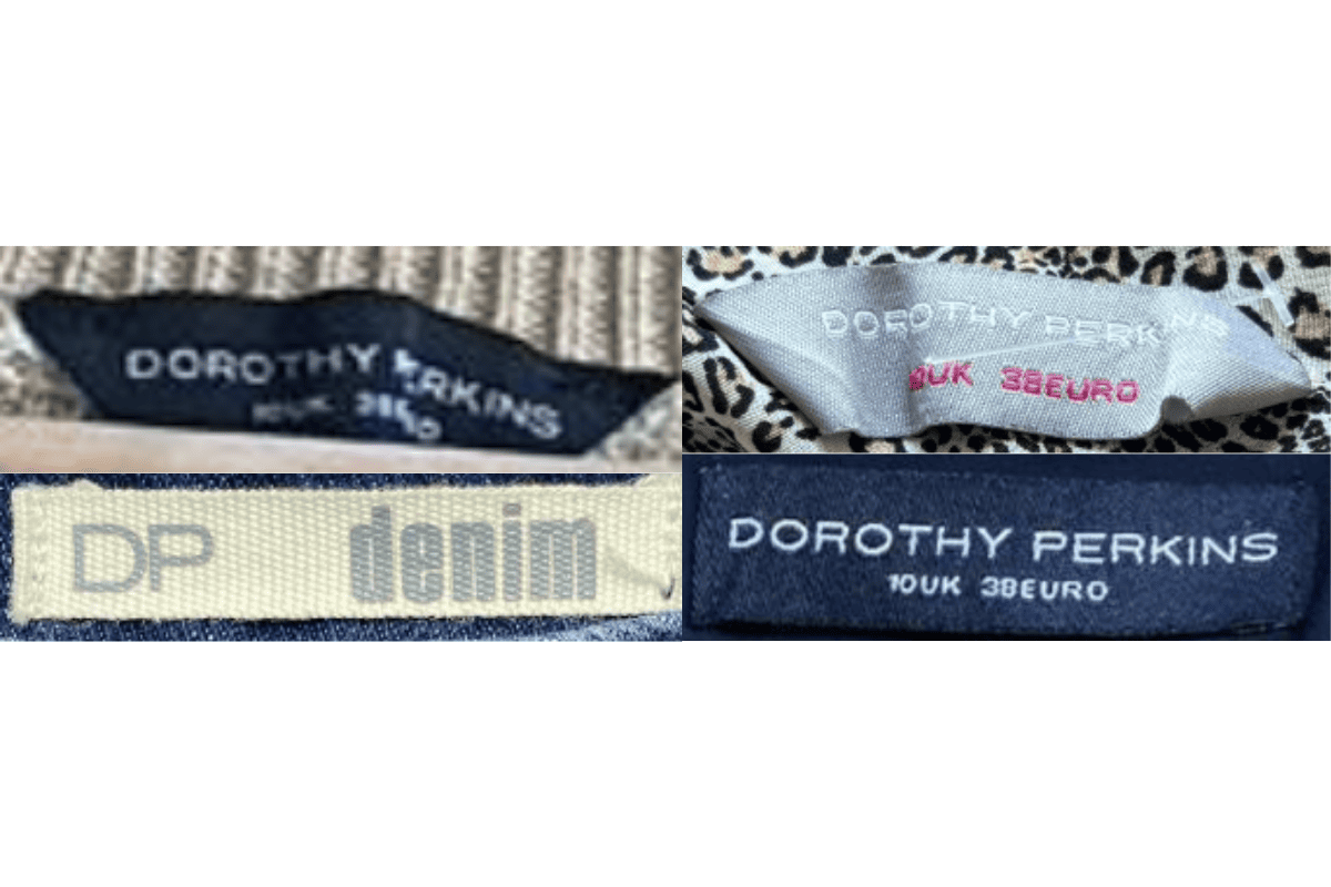
- Cleaner, lighter cursive or script lettering.
- Modernized color palette.
- Standardized Arcadia care label format.
How to spot it
Lighter script logo with Arcadia back-of-tag indicators = 2000s.
Value signal
Low — recent high-street era.
2010–2020
2010s Pre-Collapse Era
Final decade before Arcadia Group's 2020 collapse. Tags are minimal and modern, with the DP logo in a streamlined format.
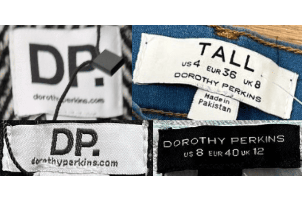
- Minimalist modern 'DP' or 'Dorothy Perkins' wordmark.
- Reduced color usage.
- Digital-age care label with QR or barcode elements.
How to spot it
Streamlined 'DP' logo or digital elements = 2010s pre-Arcadia collapse.
Value signal
Low — very recent pieces.