Harvey Nichols
London luxury department store founded in Knightsbridge in 1831. 1940s-60s tags use decorative cursive script in brown; 1970s-80s modernize; 1990s adopt the contemporary bold wordmark that followed the Dickson Poon acquisition.

- Origin
- England
- Founded
- 1831
- Category
- High Fashion
- Documented eras
- 6
How Harvey Nichols labels evolved over time. Match the markers below against the tag in hand to place a garment in its era.
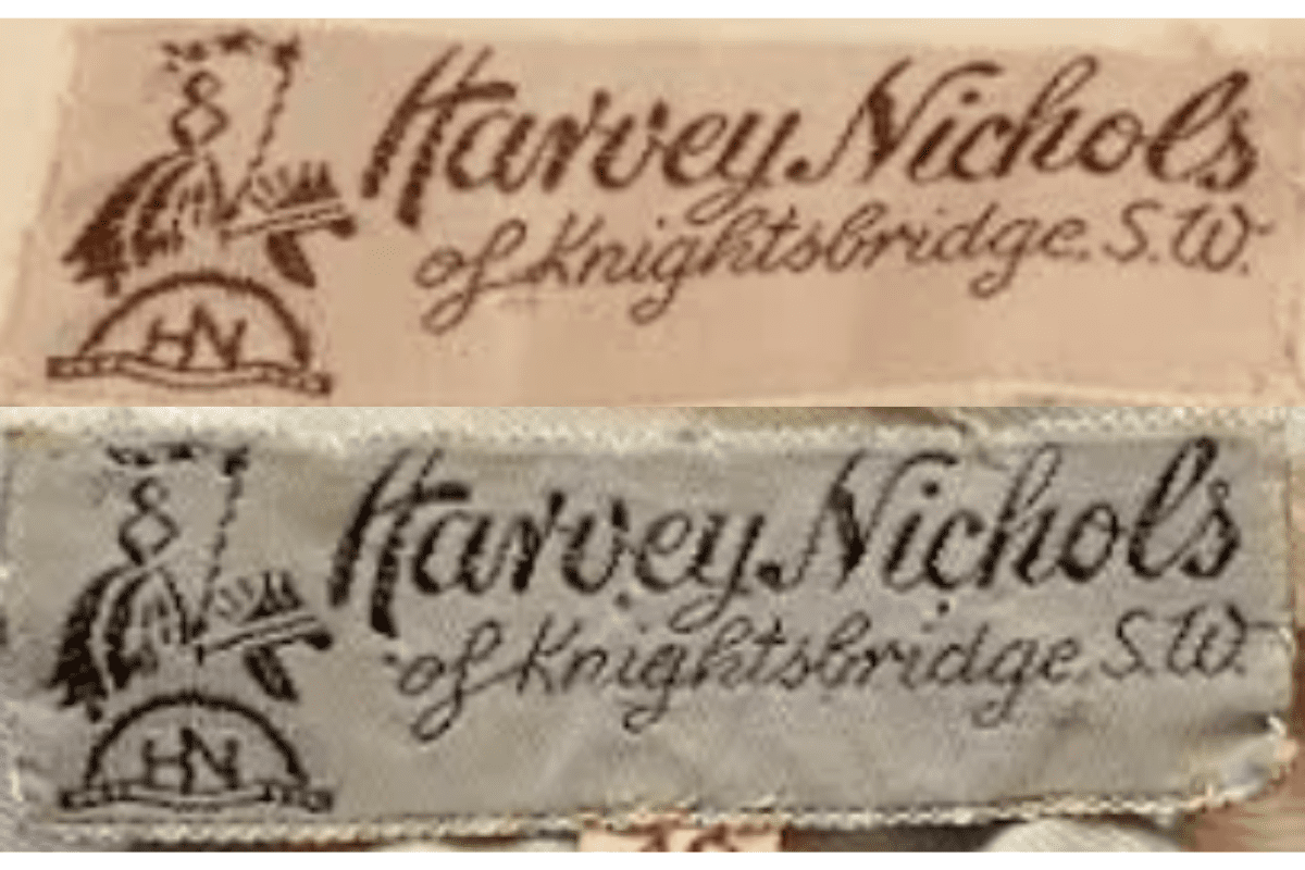
1940–1949
1940s vintage Harvey Nichols tags
Simple, elegant script with “Harvey Nichols of Knightsbridge, S.W.” embroidered Often includes an illustration of a knight, adding a touch of tradition to the design.
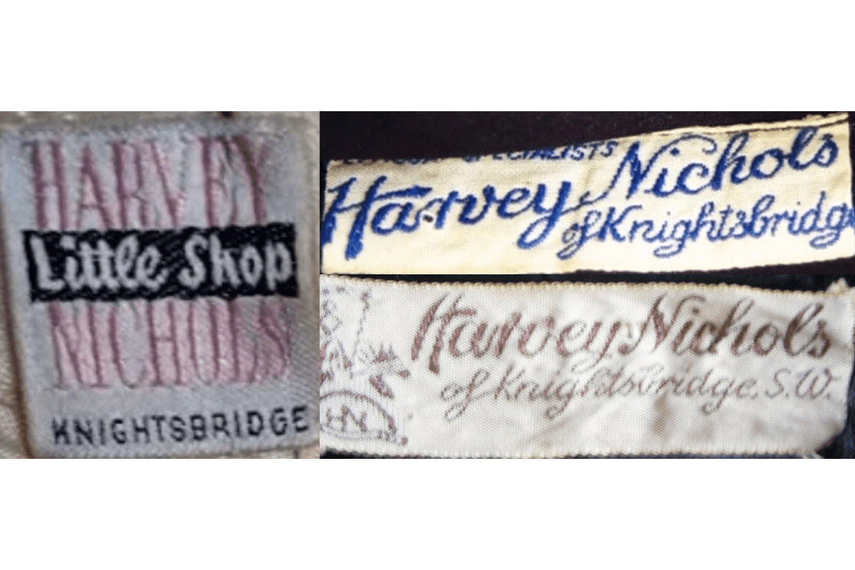
- Simple, elegant script with “Harvey Nichols of Knightsbridge, S.W.” embroidered.
- Often includes an illustration of a knight, adding a touch of tradition to the design.
- The logo uses a classic serif typeface with a hand-drawn style.
How to spot it
Simple, elegant script with “Harvey Nichols of Knightsbridge, S.W.” embroidered — confirms this label era.
Value signal
Rare; pre-1960 examples are collector-grade and seldom surface.
1950–1959
1950s vintage Harvey Nichols tags
Retains the “Harvey Nichols of Knightsbridge, S.W.” branding with a serif typeface Illustrations of knights remain present, maintaining continuity with the earlier designs.
- Retains the “Harvey Nichols of Knightsbridge, S.W.” branding with a serif typeface.
- Illustrations of knights remain present, maintaining continuity with the earlier designs.
- The tags start using darker tones and heavier embroidery compared to the 1940s.
How to spot it
Retains the “Harvey Nichols of Knightsbridge, S.W.” branding with a serif typeface — confirms this label era.
Value signal
Rare; pre-1960 examples are collector-grade and seldom surface.
1960–1969
1960s vintage Harvey Nichols tags
The font becomes more defined and sharper, with the “Harvey Nichols” branding clearly standing out The knights and other illustrations are less prominent but still exist on some tags.
- The font becomes more defined and sharper, with the “Harvey Nichols” branding clearly standing out.
- The knights and other illustrations are less prominent but still exist on some tags.
- Incorporation of SW1 into the Knightsbridge address adds a modern touch for the era.
How to spot it
The font becomes more defined and sharper, with the “Harvey Nichols” branding clearly standing out — confirms this label era.
Value signal
Strong collector demand; 1960s examples command premiums in good condition.
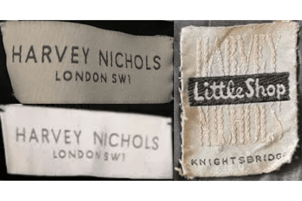
1970–1979
1970s vintage Harvey Nichols tags
Introduction of “Harvey Nichols London SW1” in simple, bold fonts Some tags feature “Little Shop,” a reference to a specific Harvey Nichols store section.
- Introduction of “Harvey Nichols London SW1” in simple, bold fonts.
- Some tags feature “Little Shop,” a reference to a specific Harvey Nichols store section.
- Color palettes vary but primarily use neutral shades with black and white detailing.
How to spot it
Introduction of “Harvey Nichols London SW1” in simple, bold fonts — confirms this label era.
Value signal
Solid vintage interest; 1970s pieces in clean condition attract steady demand.
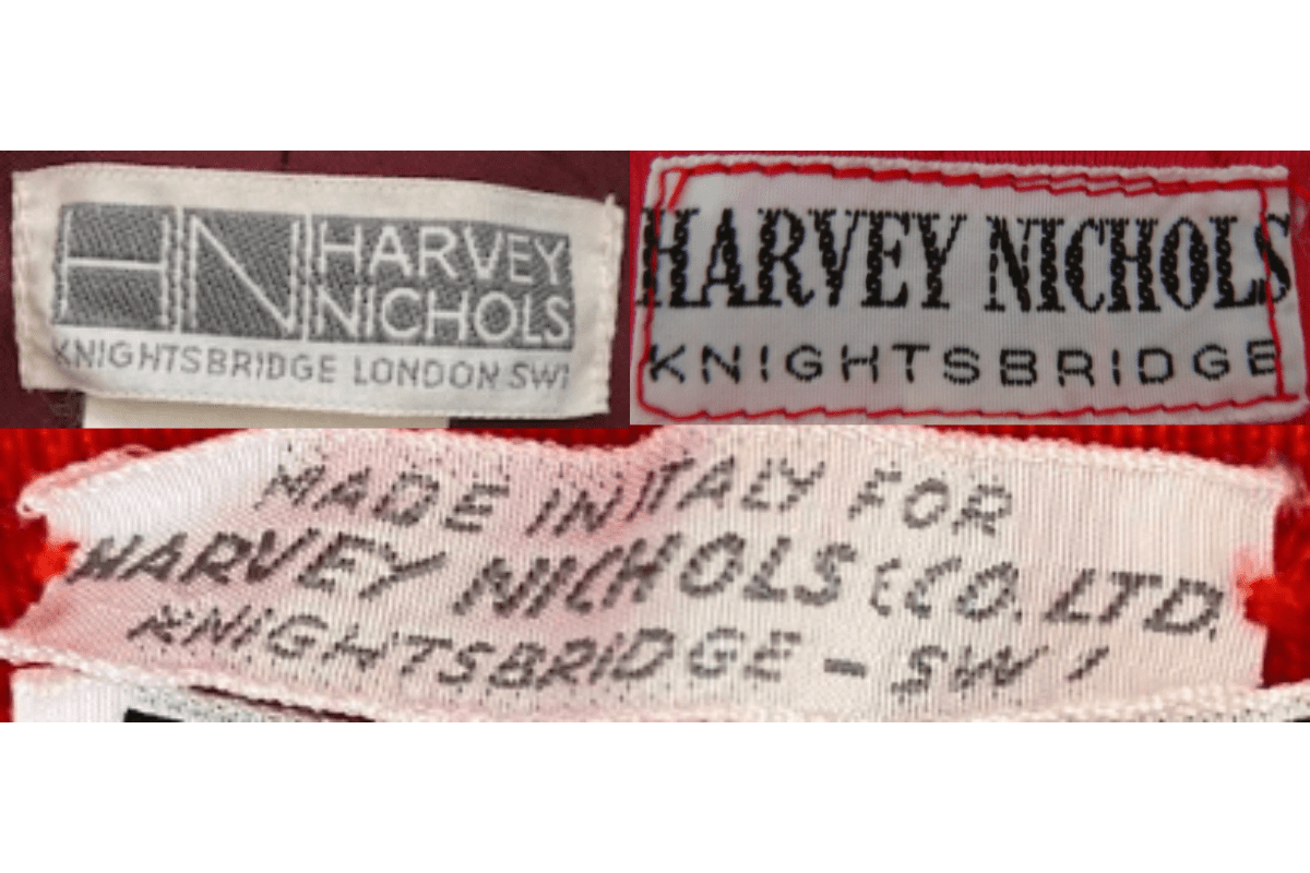
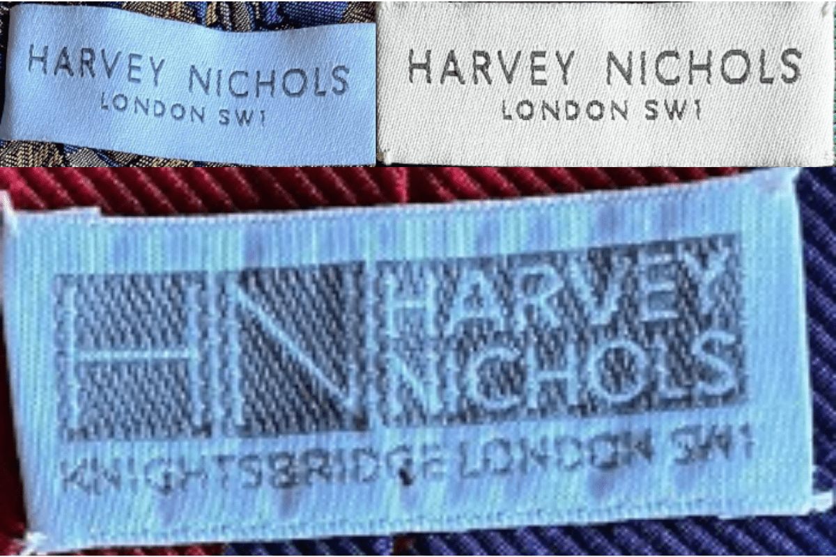
1980–1989
1980s vintage Harvey Nichols tags
Modern serif typography for “Harvey Nichols” paired with a minimalistic design Tags often feature “Knightsbridge London SW1,” with more contemporary layouts.
- Modern serif typography for “Harvey Nichols” paired with a minimalistic design.
- Tags often feature “Knightsbridge London SW1,” with more contemporary layouts.
- The brand logo becomes more geometric and simplified, emphasizing the letters “HN” in some designs.
How to spot it
Modern serif typography for “Harvey Nichols” paired with a minimalistic design — confirms this label era.
Value signal
Good vintage demand; 1980s label detail is a key value driver.
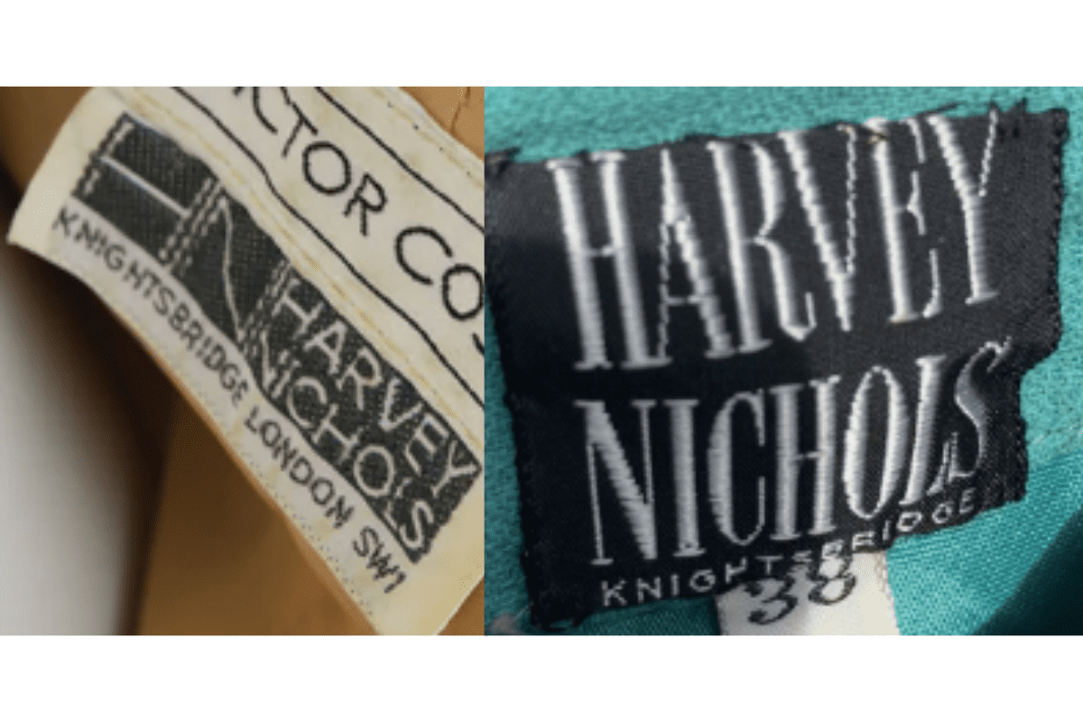
1990–1999
1990s vintage Harvey Nichols tags
Typography remains simple and bold with “Harvey Nichols London SW1.” Tags shift toward a more minimalist design, with fewer decorative elements.
- Typography remains simple and bold with “Harvey Nichols London SW1.”.
- Tags shift toward a more minimalist design, with fewer decorative elements.
- Some versions emphasize the “HN” logo, reflecting a shift toward more branding-focused designs.
How to spot it
Typography remains simple and bold with “Harvey Nichols London SW1.” — confirms this label era.
Value signal
Moderate collector interest; condition and completeness determine value.