Herman Marcus
Dallas, Texas women's fashion brand by Herman Marcus. 1960s-80s tags feature elegant cursive with 'DALLAS' in clean sans-serif below; the 'DALLAS' provenance text is the key identifier.
- Origin
- USA
- Founded
- 1957
- Category
- Designer & Casual
- Documented eras
- 3
How Herman Marcus labels evolved over time. Match the markers below against the tag in hand to place a garment in its era.
1960–1969
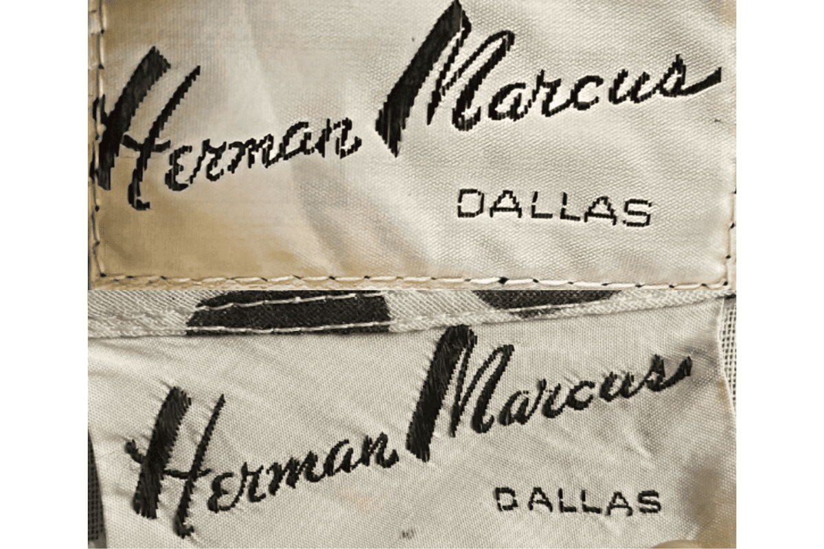
1960s vintage Herman Marcus tags
Classic cursive font for “Herman Marcus,” with an elegant and flowing script style Tags prominently feature “Dallas” beneath the brand name, signifying the location.
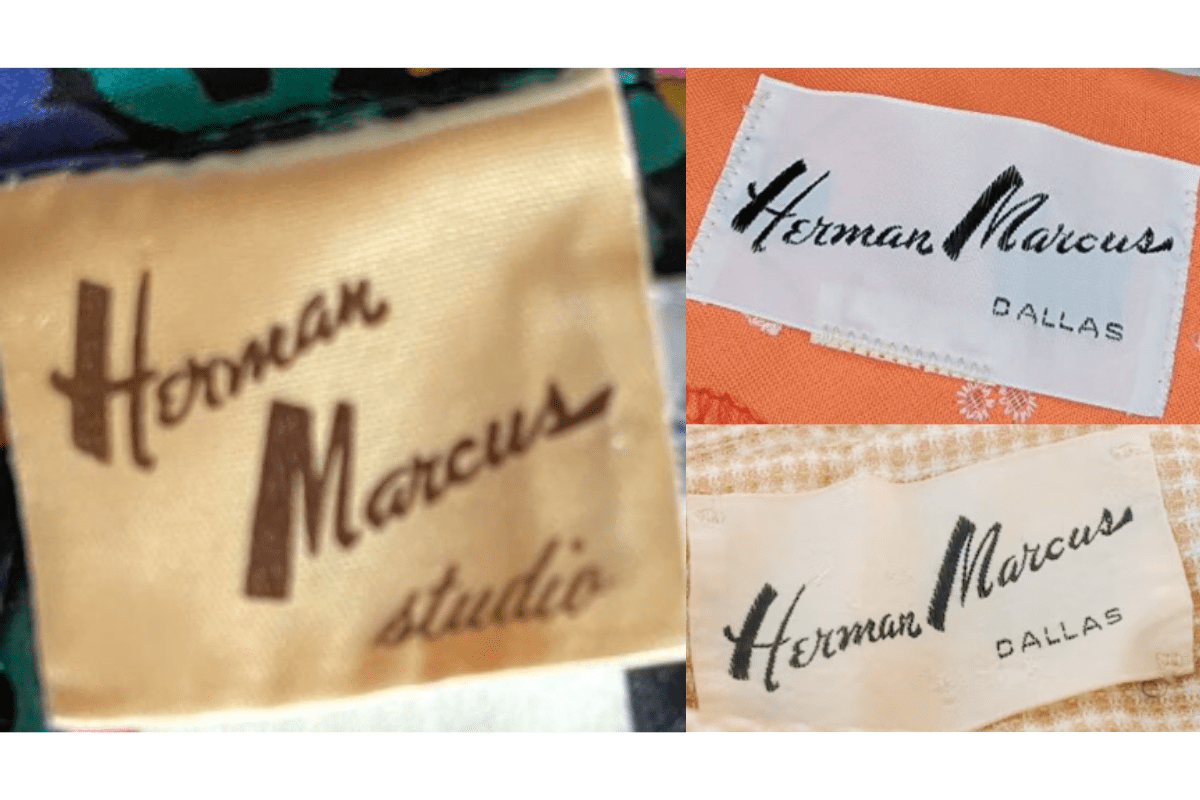
- Classic cursive font for “Herman Marcus,” with an elegant and flowing script style.
- Tags prominently feature “Dallas” beneath the brand name, signifying the location.
- Stitched onto light fabric backgrounds, often with subtle tonal stitching around the borders.
How to spot it
Classic cursive font for “Herman Marcus,” with an elegant and flowing script style — confirms this label era.
Value signal
Strong collector demand; 1960s examples command premiums in good condition.
1970–1979
1970s vintage Herman Marcus tags
Continuation of the cursive “Herman Marcus” signature style, maintaining brand consistency Often features “Dallas” in a clean, sans-serif font underneath the brand name.
- Continuation of the cursive “Herman Marcus” signature style, maintaining brand consistency.
- Often features “Dallas” in a clean, sans-serif font underneath the brand name.
- Tags typically have a more pronounced border stitching, adding a sturdy look to the design.
How to spot it
Continuation of the cursive “Herman Marcus” signature style, maintaining brand consistency — confirms this label era.
Value signal
Solid vintage interest; 1970s pieces in clean condition attract steady demand.
1980–1989
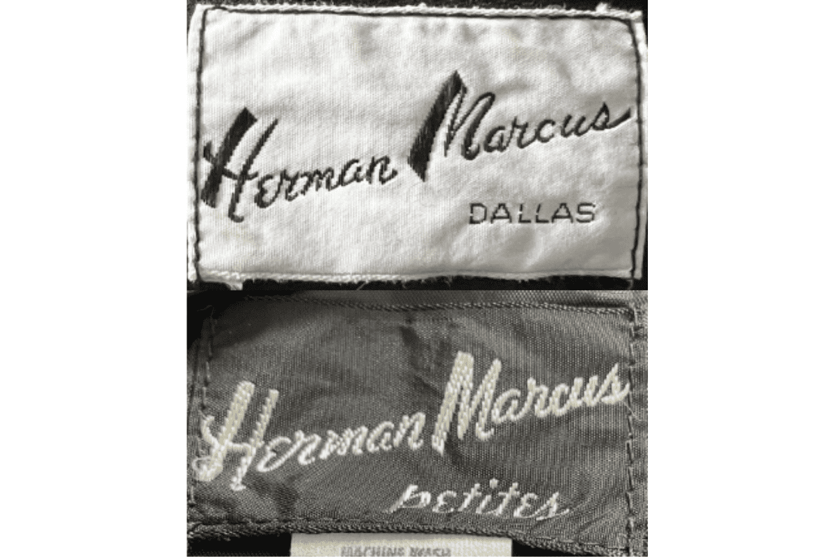
1980s vintage Herman Marcus tags
Introduction of a more refined and thicker cursive font, enhancing brand identity Some tags include additional descriptors like “Petites,” indicating garment size variations.
- Introduction of a more refined and thicker cursive font, enhancing brand identity.
- Some tags include additional descriptors like “Petites,” indicating garment size variations.
- Use of darker backgrounds and contrasting white or light stitching for a bolder presentation.
How to spot it
Introduction of a more refined and thicker cursive font, enhancing brand identity — confirms this label era.
Value signal
Good vintage demand; 1980s label detail is a key value driver.