Hubert Latimer
California-based designer who continued Irene's legacy and led Lilli Ann. 1960s-80s tags use a classic elongated serif font with distinct serifs; the elegant serif wordmark is consistent across all decades.
- Origin
- USA
- Founded
- 1965
- Category
- High Fashion
- Documented eras
- 3
How Hubert Latimer labels evolved over time. Match the markers below against the tag in hand to place a garment in its era.
1960–1969
1960s vintage Hubert Latimer tags
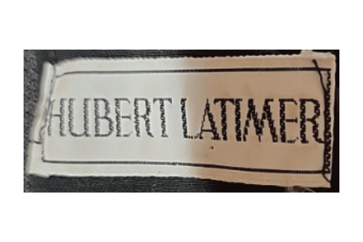
Features the name “Hubert Latimer” in an elegant, serif typeface, showcasing the refined style of the era Typically includes minimalistic design elements with a focus on readability and sophistication.
- Features the name “Hubert Latimer” in an elegant, serif typeface, showcasing the refined style of the era.
- Typically includes minimalistic design elements with a focus on readability and sophistication.
- The tag has a simple layout without additional borders or decoration, highlighting the brand name prominently.
How to spot it
Features the name “Hubert Latimer” in an elegant, serif typeface, showcasing the refined style of the era — confirms this label era.
Value signal
Strong collector demand; 1960s examples command premiums in good condition.
1970–1979
1970s vintage Hubert Latimer tags
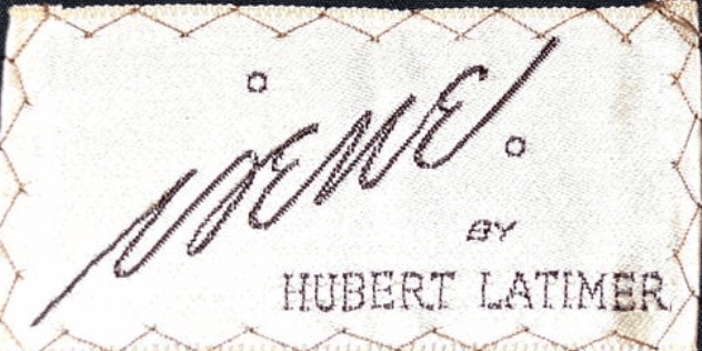
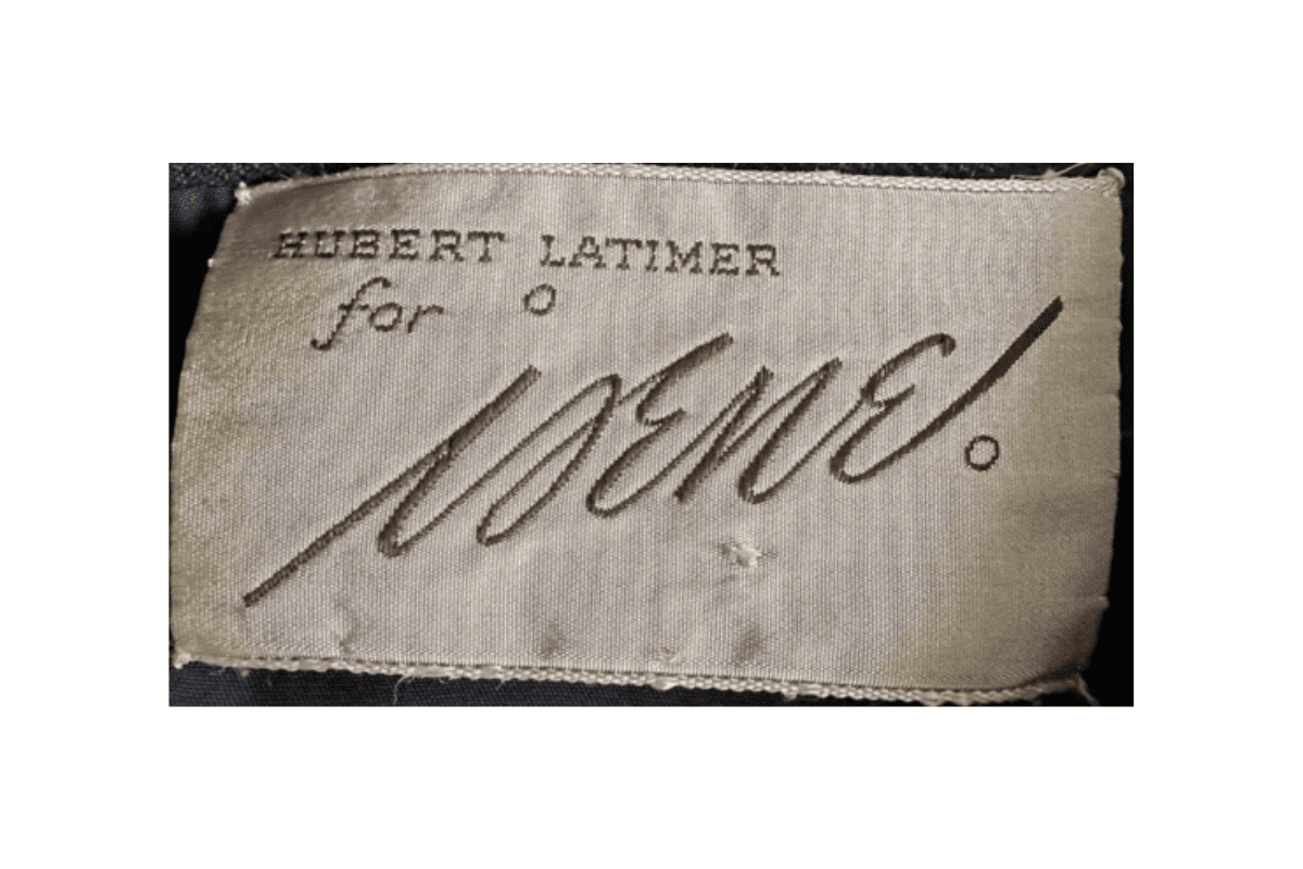
Continues to emphasize the “Hubert Latimer” name, now with a bolder serif font to stand out Design shifts slightly to a more structured appearance, reflecting the fashion trends of the 1970s.
- Continues to emphasize the “Hubert Latimer” name, now with a bolder serif font to stand out.
- Design shifts slightly to a more structured appearance, reflecting the fashion trends of the 1970s.
- Tags may include additional embellishments or accents, such as the “for Irene” script, indicating special collections or collaborations.
How to spot it
Continues to emphasize the “Hubert Latimer” name, now with a bolder serif font to stand out — confirms this label era.
Value signal
Solid vintage interest; 1970s pieces in clean condition attract steady demand.
1980–1989
1980s vintage Hubert Latimer tags
Maintains the “Hubert Latimer” name with a refined serif font, enclosed in a rectangular border for a polished look Tags appear more durable with higher quality material, indicating a shift towards long-lasting branding elements.
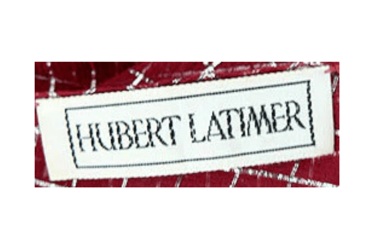
- Maintains the “Hubert Latimer” name with a refined serif font, enclosed in a rectangular border for a polished look.
- Tags appear more durable with higher quality material, indicating a shift towards long-lasting branding elements.
- The overall design is clean and structured, focusing on a modern yet timeless appeal.
How to spot it
Maintains the “Hubert Latimer” name with a refined serif font, enclosed in a rectangular border for a polished look — confirms this label era.
Value signal
Good vintage demand; 1980s label detail is a key value driver.