I. Magnin
San Francisco luxury department store founded by Mary Ann Magnin in 1876. 1950s tags use formal serif 'I. Magnin & Co.' with elegant spacing; each decade updates the presentation; closed in 1994 making 1990s tags the final era.

- Origin
- USA
- Founded
- 1876
- Category
- High Fashion
- Documented eras
- 5
How I. Magnin labels evolved over time. Match the markers below against the tag in hand to place a garment in its era.
1950–1959
1950s vintage I. Magnin tags
Classic serif font with “I. MAGNIN & CO.” prominently displayed Tags are usually sewn onto garments with visible stitching, providing a handmade feel.
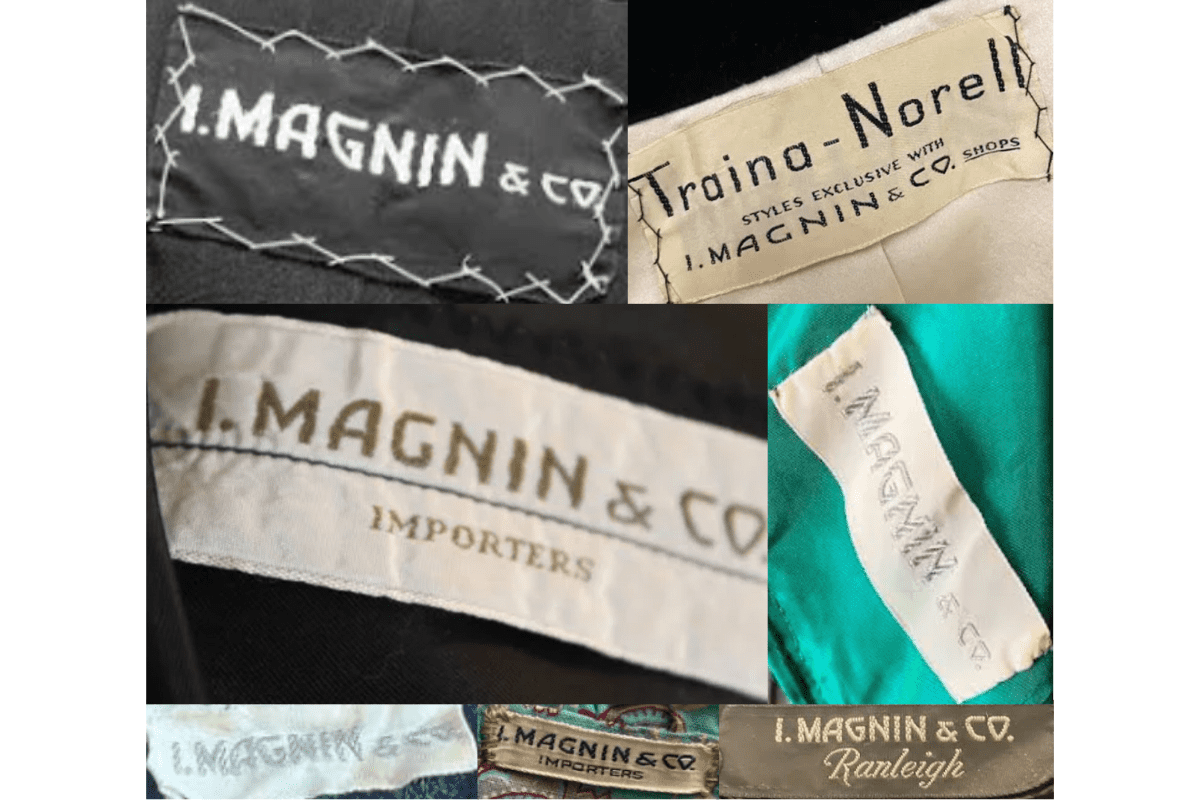
- Classic serif font with “I. MAGNIN & CO.” prominently displayed.
- Tags are usually sewn onto garments with visible stitching, providing a handmade feel.
- Some tags include “IMPORTERS,” indicating the brand’s international sourcing and prestige.
- Materials often feel thicker, showcasing quality and durability.
How to spot it
Classic serif font with “I. MAGNIN & CO.” prominently displayed — confirms this label era.
Value signal
Rare; pre-1960 examples are collector-grade and seldom surface.
1960–1969
1960s vintage I. Magnin tags
Continued use of “I. MAGNIN & CO.” with clean, bold lettering Some tags are collaborative, mentioning designers like “Traina-Norell,” highlighting exclusive styles.
- Continued use of “I. MAGNIN & CO.” with clean, bold lettering.
- Some tags are collaborative, mentioning designers like “Traina-Norell,” highlighting exclusive styles.
- Tags may be on a neutral fabric with visible stitching, emphasizing craftsmanship.
- Unique placements of logos and collaborative branding reflect the exclusivity of certain collections.
How to spot it
Continued use of “I. MAGNIN & CO.” with clean, bold lettering — confirms this label era.
Value signal
Strong collector demand; 1960s examples command premiums in good condition.
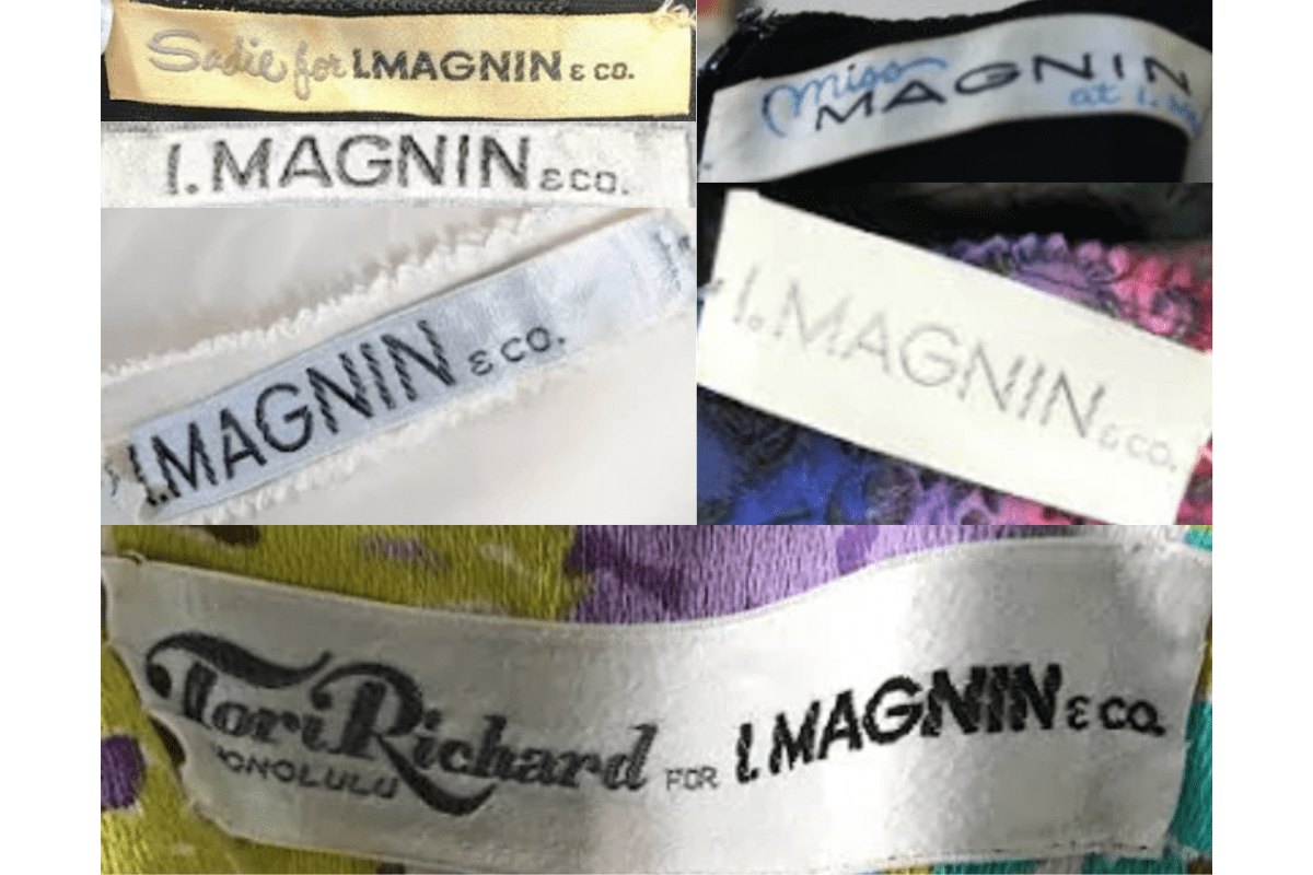
1970–1979
1970s vintage I. Magnin tags
More refined font, sometimes in italicized or stylized designs, like “Miss Magnin” for special lines Collaborations continue, with mentions of exclusive lines such as “Ranleigh.”.
- More refined font, sometimes in italicized or stylized designs, like “Miss Magnin” for special lines.
- Collaborations continue, with mentions of exclusive lines such as “Ranleigh.”.
- Color variations appear, with tags sometimes featuring colored text or borders.
- Focus on branding, often displaying “I. MAGNIN & CO.” in a distinct, bold style on simpler backgrounds.
How to spot it
More refined font, sometimes in italicized or stylized designs, like “Miss Magnin” for special lines — confirms this label era.
Value signal
Solid vintage interest; 1970s pieces in clean condition attract steady demand.
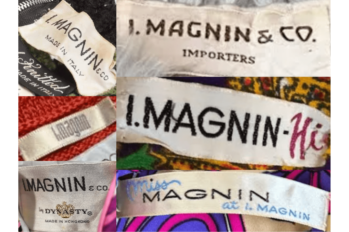
1980–1989
1980s vintage I. Magnin tags
Tags feature simple yet bold “I. MAGNIN” text, sometimes accompanied by “eco.” indicating the brand’s eco-conscious shifts Introduction of lighter and sometimes pastel-colored tags, reflecting 1980s fashion trends.
- Tags feature simple yet bold “I. MAGNIN” text, sometimes accompanied by “eco.” indicating the brand’s eco-conscious shifts.
- Introduction of lighter and sometimes pastel-colored tags, reflecting 1980s fashion trends.
- Some tags are embroidered, with a refined and modern look compared to earlier decades.
- Occasional designer collaborations mentioned on the tags, emphasizing unique fashion partnerships.
How to spot it
Tags feature simple yet bold “I. MAGNIN” text, sometimes accompanied by “eco.” indicating the brand’s eco-conscious shifts — confirms this label era.
Value signal
Good vintage demand; 1980s label detail is a key value driver.
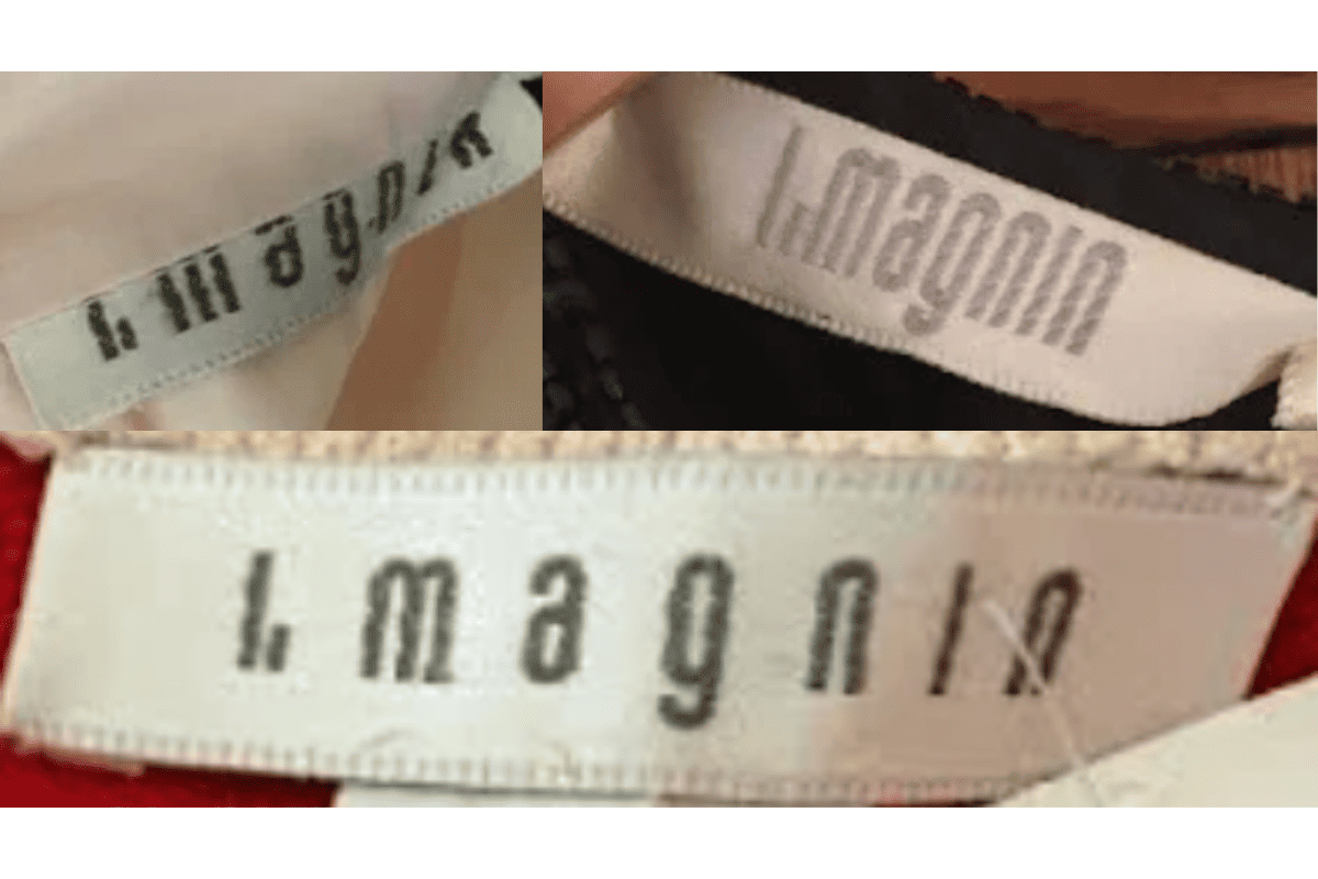
1990–1999
1990s vintage I. Magnin tags
Modernized look with sleeker fonts, retaining “I. MAGNIN” branding with a minimalist approach Tags are often smaller and more subtle, focusing on brand name without additional text.
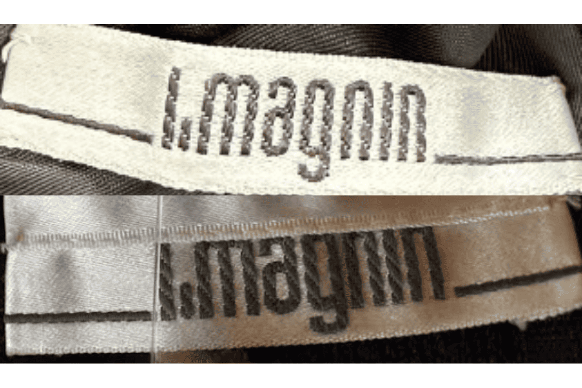
- Modernized look with sleeker fonts, retaining “I. MAGNIN” branding with a minimalist approach.
- Tags are often smaller and more subtle, focusing on brand name without additional text.
- Neutral colors dominate, aligning with the 1990s minimalistic aesthetic.
- Some tags reflect a more international influence, marking a shift in production styles and materials.
How to spot it
Modernized look with sleeker fonts, retaining “I. MAGNIN” branding with a minimalist approach — confirms this label era.
Value signal
Moderate collector interest; condition and completeness determine value.