Jacques Esterel
Parisian couture house founded by Charles Martin under the name Jacques Esterel. 'Création Jacques Esterel' on a detailed serif label with 'Paris' wording marks the 1950s–60s; the bold geometric 'JE' monogram in red is the unmistakable 1970s–80s marker.

- Origin
- France
- Founded
- 1951
- Category
- High Fashion
- Documented eras
- 4
How Jacques Esterel labels evolved over time. Match the markers below against the tag in hand to place a garment in its era.
1950–1959
1950s vintage Jacques Esterel tags
Tags from the 1950s often feature bold serif fonts that were popular during this period The brand name “Jacques Esterel” is prominently displayed, usually with “Paris” beneath it, indicating its origins.
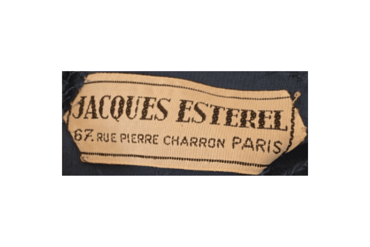
- Tags from the 1950s often feature bold serif fonts that were popular during this period.
- The brand name “Jacques Esterel” is prominently displayed, usually with “Paris” beneath it, indicating its origins.
- Tags are typically square or rectangular with a simplistic design, reflecting the minimalistic style of the era.
- Some tags also include the address “67 Rue Pierre Charron Paris,” emphasizing the brand’s Parisian roots.
How to spot it
Tags from the 1950s often feature bold serif fonts that were popular during this period — confirms this label era.
Value signal
Rare; pre-1960 examples are collector-grade and seldom surface.
1960–1969
1960s vintage Jacques Esterel tags
Tags from the 1960s continue to use serif fonts but may also include additional branding elements “Création” is often included above the brand name, highlighting the creative aspect of the designs.
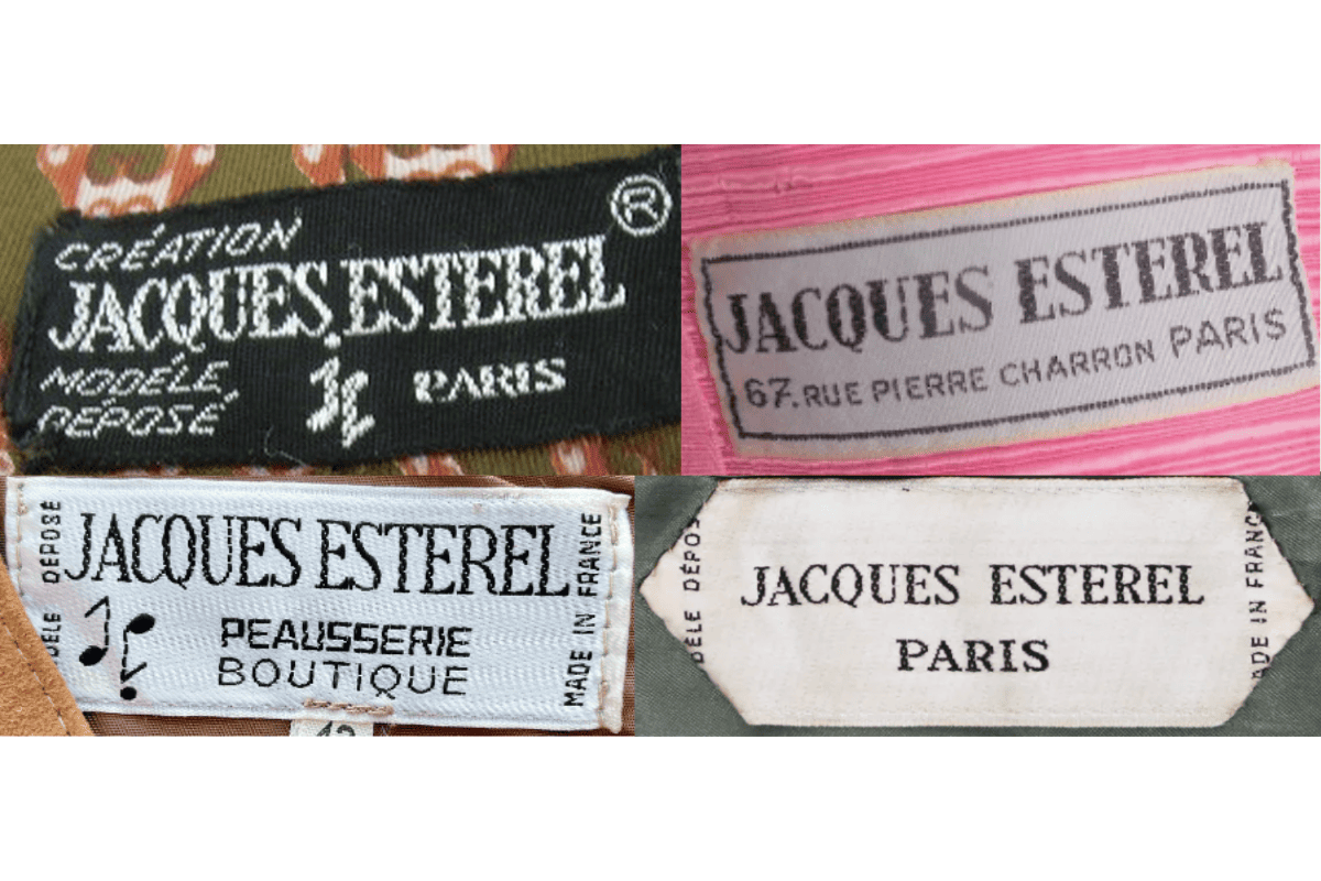
- Tags from the 1960s continue to use serif fonts but may also include additional branding elements.
- “Création” is often included above the brand name, highlighting the creative aspect of the designs.
- The address “67 Rue Pierre Charron Paris” is still present on some tags, further establishing the brand’s location.
- Tags might also include the term “Modèle Déposé,” indicating the registered design of the item.
How to spot it
Tags from the 1960s continue to use serif fonts but may also include additional branding elements — confirms this label era.
Value signal
Strong collector demand; 1960s examples command premiums in good condition.
1970–1979
1970s vintage Jacques Esterel tags
In the 1970s, tags began to incorporate more detailed designs, with “Création Jacques Esterel” becoming a common format Tags from this era often include a logo, such as the stylized “J” or other unique design elements, reflecting the brand’s growing identity.
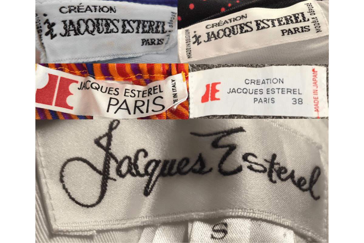
- In the 1970s, tags began to incorporate more detailed designs, with “Création Jacques Esterel” becoming a common format.
- Tags from this era often include a logo, such as the stylized “J” or other unique design elements, reflecting the brand’s growing identity.
- The text is typically bold, with “Paris” prominently displayed, and “Modèle Déposé” indicating a registered design.
- Tags might be either black or white, with contrasting text, giving them a distinct, high-contrast appearance.
How to spot it
In the 1970s, tags began to incorporate more detailed designs, with “Création Jacques Esterel” becoming a common format — confirms this label era.
Value signal
Solid vintage interest; 1970s pieces in clean condition attract steady demand.
1980–1989
1980s vintage Jacques Esterel tags
The 1980s saw a shift towards more modern and varied designs, with tags often featuring a mix of serif and sans-serif fonts Branding elements such as logos became more prominent, with the “Création Jacques Esterel” format continuing.
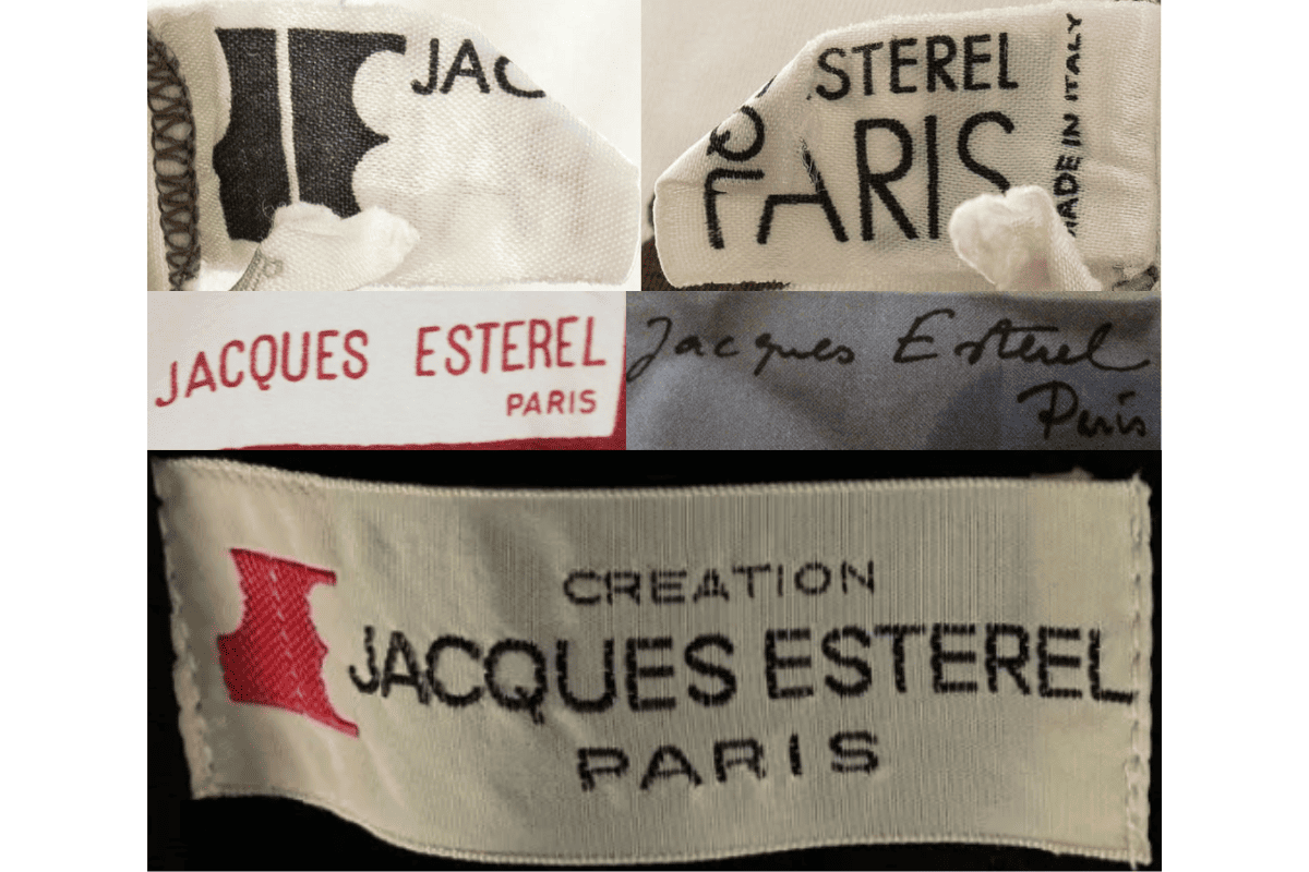
- The 1980s saw a shift towards more modern and varied designs, with tags often featuring a mix of serif and sans-serif fonts.
- Branding elements such as logos became more prominent, with the “Création Jacques Esterel” format continuing.
- Tags may include more intricate designs, like the addition of a color logo or more stylized fonts.
- The presence of the “Made in France” label on some tags highlights the authenticity and origin of the garments.
How to spot it
The 1980s saw a shift towards more modern and varied designs, with tags often featuring a mix of serif and sans-serif fonts — confirms this label era.
Value signal
Good vintage demand; 1980s label detail is a key value driver.