Jonathan Logan
New York mid-century women's fashion empire founded by David Schwartz. The handwritten cursive logo on minimal tags marks the 1940s; the refined stitched oval with 'New York' dates the 1950s–60s; sub-lines like 'Act III', 'Villager', and 'Rose Marie Reid' do the later dating.
- Origin
- USA
- Founded
- 1940
- Category
- Designer & Casual
- Documented eras
- 5
How Jonathan Logan labels evolved over time. Match the markers below against the tag in hand to place a garment in its era.
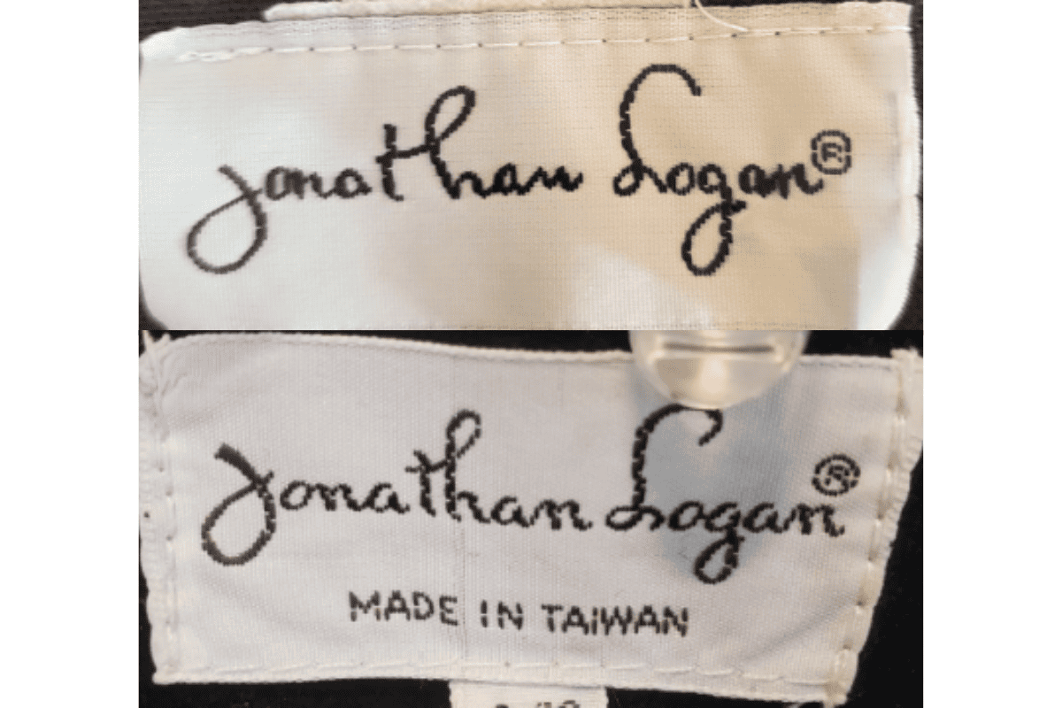
1940–1949
1940s vintage Jonathan Logan tags
Simple and elegant design, often featuring a handwritten-style logo Tags were typically minimal, reflecting the understated style of the 1940s.
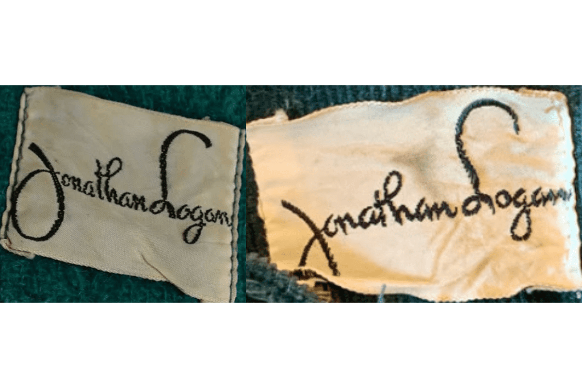
- Simple and elegant design, often featuring a handwritten-style logo.
- Tags were typically minimal, reflecting the understated style of the 1940s.
- The brand name was the sole focus, with no additional information or embellishments.
How to spot it
Simple and elegant design, often featuring a handwritten-style logo — confirms this label era.
Value signal
Rare; pre-1960 examples are collector-grade and seldom surface.
1950–1959
1950s vintage Jonathan Logan tags
The handwritten-style logo remained prominent but became more refined Tags often included stitched borders for a clean and polished look.
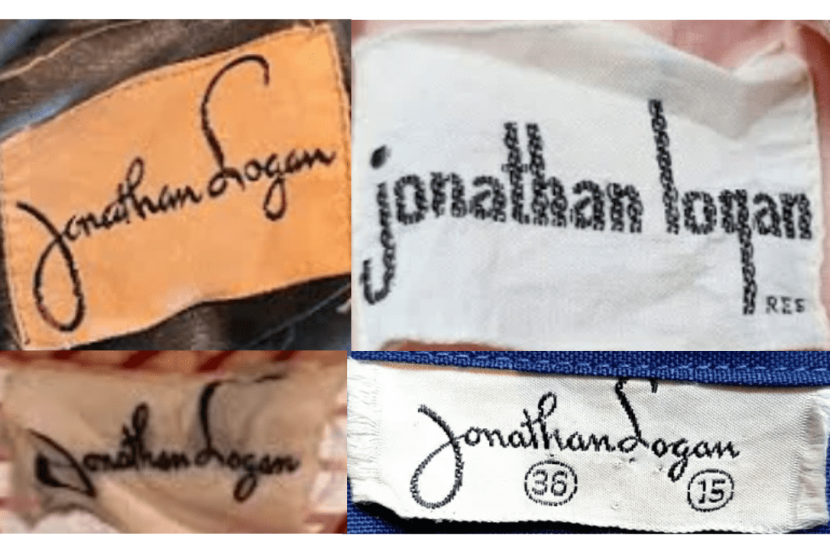
- The handwritten-style logo remained prominent but became more refined.
- Tags often included stitched borders for a clean and polished look.
- Some tags featured additional brand-related text, indicating growth and identity reinforcement.
How to spot it
The handwritten-style logo remained prominent but became more refined — confirms this label era.
Value signal
Rare; pre-1960 examples are collector-grade and seldom surface.
1960–1969
1960s vintage Jonathan Logan tags
The tags reflected a playful yet polished aesthetic, in line with the fashion trends of the 1960s More use of serif fonts and bold lettering for specific lines such as “Bleeker Street.”.
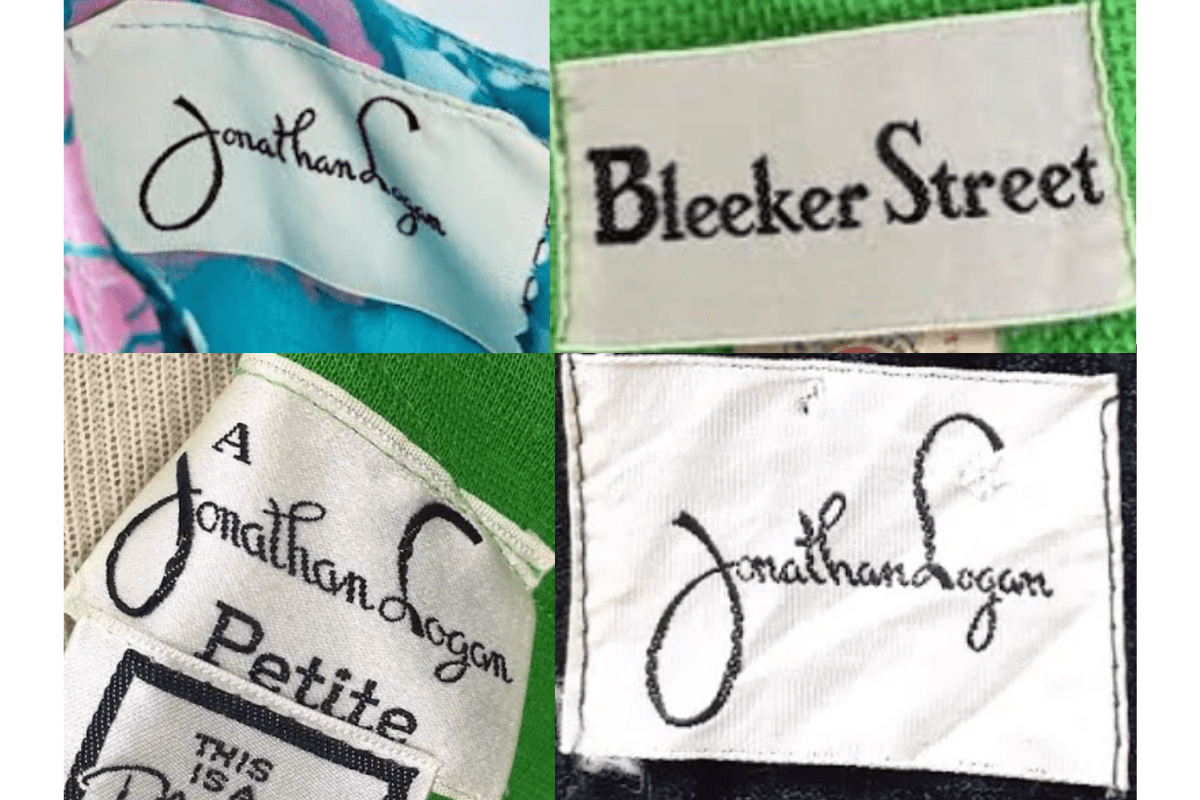
- The tags reflected a playful yet polished aesthetic, in line with the fashion trends of the 1960s.
- More use of serif fonts and bold lettering for specific lines such as “Bleeker Street.”.
- Occasionally featured sub-labels like “A Jonathan Logan Petite.”.
How to spot it
The tags reflected a playful yet polished aesthetic, in line with the fashion trends of the 1960s — confirms this label era.
Value signal
Strong collector demand; 1960s examples command premiums in good condition.
1970–1979
1970s vintage Jonathan Logan tags
Handwritten-style logo continued as a hallmark of the brand Some tags were paired with size indicators, often in a circular or rectangular layout.
- Handwritten-style logo continued as a hallmark of the brand.
- Some tags were paired with size indicators, often in a circular or rectangular layout.
- Sub-brands or collaborations began appearing on the tags, adding to their variety.
How to spot it
Handwritten-style logo continued as a hallmark of the brand — confirms this label era.
Value signal
Solid vintage interest; 1970s pieces in clean condition attract steady demand.
1980–1989
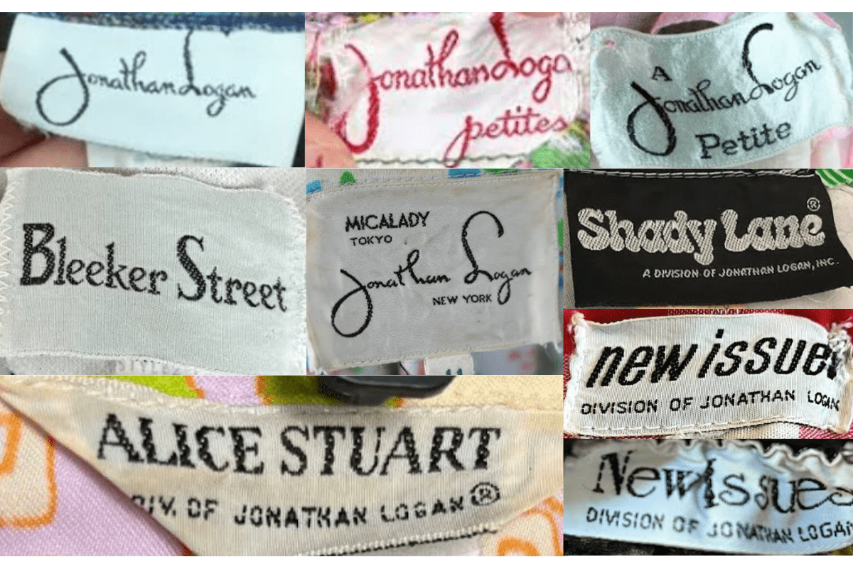
1980s vintage Jonathan Logan tags
The tags began to adopt a more modern design, sometimes including location details like “New York.” Sub-labels such as “Alice Stuart” or “Shady Lane” appeared more frequently, indicating expanded product lines.
- The tags began to adopt a more modern design, sometimes including location details like “New York.”.
- Sub-labels such as “Alice Stuart” or “Shady Lane” appeared more frequently, indicating expanded product lines.
- Bold and varied fonts were used, reflecting the experimental nature of 1980s fashion.
How to spot it
The tags began to adopt a more modern design, sometimes including location details like “New York.” — confirms this label era.
Value signal
Good vintage demand; 1980s label detail is a key value driver.