Jos. A. Bank
Baltimore menswear clothier founded in 1905. 'Clothiers' in serif font beneath the brand name marks the 1970s–80s heritage era; block-style fonts without the subtitle track the 1990s modernisation; the 'Stays Cool' and 'Traveler' sub-lines date 2000s-era pieces.

- Origin
- USA
- Founded
- 1905
- Category
- Designer & Casual
- Documented eras
- 4
How Jos. A. Bank labels evolved over time. Match the markers below against the tag in hand to place a garment in its era.
1970–1979
1970s vintage Jos. A. Bank tags
Tags often featured “Clothiers” prominently in serif fonts, emphasizing the brand’s heritage as a classic menswear provider Bold stitching details around the tag, often rectangular in shape, were common during this era.
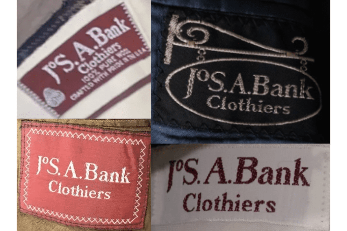
- Tags often featured “Clothiers” prominently in serif fonts, emphasizing the brand’s heritage as a classic menswear provider.
- Bold stitching details around the tag, often rectangular in shape, were common during this era.
- Rich colors such as maroon and white were frequently used, highlighting the brand’s traditional aesthetic.
How to spot it
Tags often featured “Clothiers” prominently in serif fonts, emphasizing the brand’s heritage as a classic menswear provider — confirms this label era.
Value signal
Solid vintage interest; 1970s pieces in clean condition attract steady demand.
1980–1989
1980s vintage Jos. A. Bank tags
The brand leaned into cleaner, bolder designs while maintaining the “Clothiers” subtitle on many tags Tags began to introduce additional descriptors such as “Crafted with Pride in the USA,” showcasing a focus on American manufacturing.
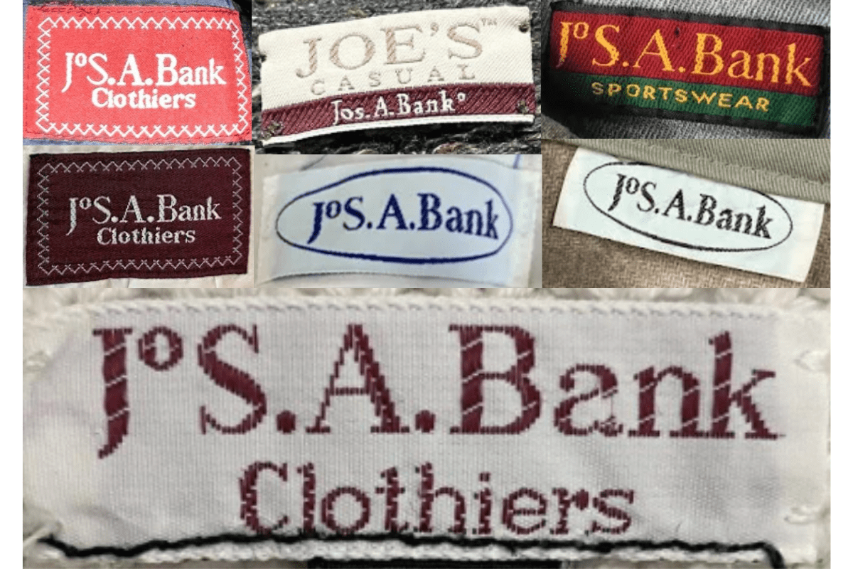
- The brand leaned into cleaner, bolder designs while maintaining the “Clothiers” subtitle on many tags.
- Tags began to introduce additional descriptors such as “Crafted with Pride in the USA,” showcasing a focus on American manufacturing.
- Decorative stitching, such as zigzag borders, added a unique touch to some tags during this period.
How to spot it
The brand leaned into cleaner, bolder designs while maintaining the “Clothiers” subtitle on many tags — confirms this label era.
Value signal
Good vintage demand; 1980s label detail is a key value driver.
1990–1999
1990s vintage Jos. A. Bank tags
The design of tags became more refined, with the use of block-style fonts and sleek color schemes like black and white Collections such as “Traveler’s Collection” and “Traveler” appeared on tags, signifying the introduction of new product lines tailored for functionality and style.
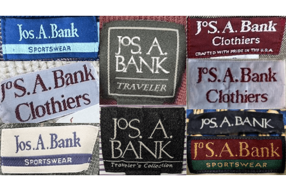
- The design of tags became more refined, with the use of block-style fonts and sleek color schemes like black and white.
- Collections such as “Traveler’s Collection” and “Traveler” appeared on tags, signifying the introduction of new product lines tailored for functionality and style.
- Tags often included minimalist designs, removing decorative borders for a sleeker presentation.
How to spot it
The design of tags became more refined, with the use of block-style fonts and sleek color schemes like black and white — confirms this label era.
Value signal
Moderate collector interest; condition and completeness determine value.
2000–2009
2000s vintage Jos. A. Bank tags
Tags from this era introduced more modern and versatile branding, such as the “Stays Cool” line with functional descriptors Gold detailing appeared on collections like “Reserve,” indicating premium offerings from the brand.
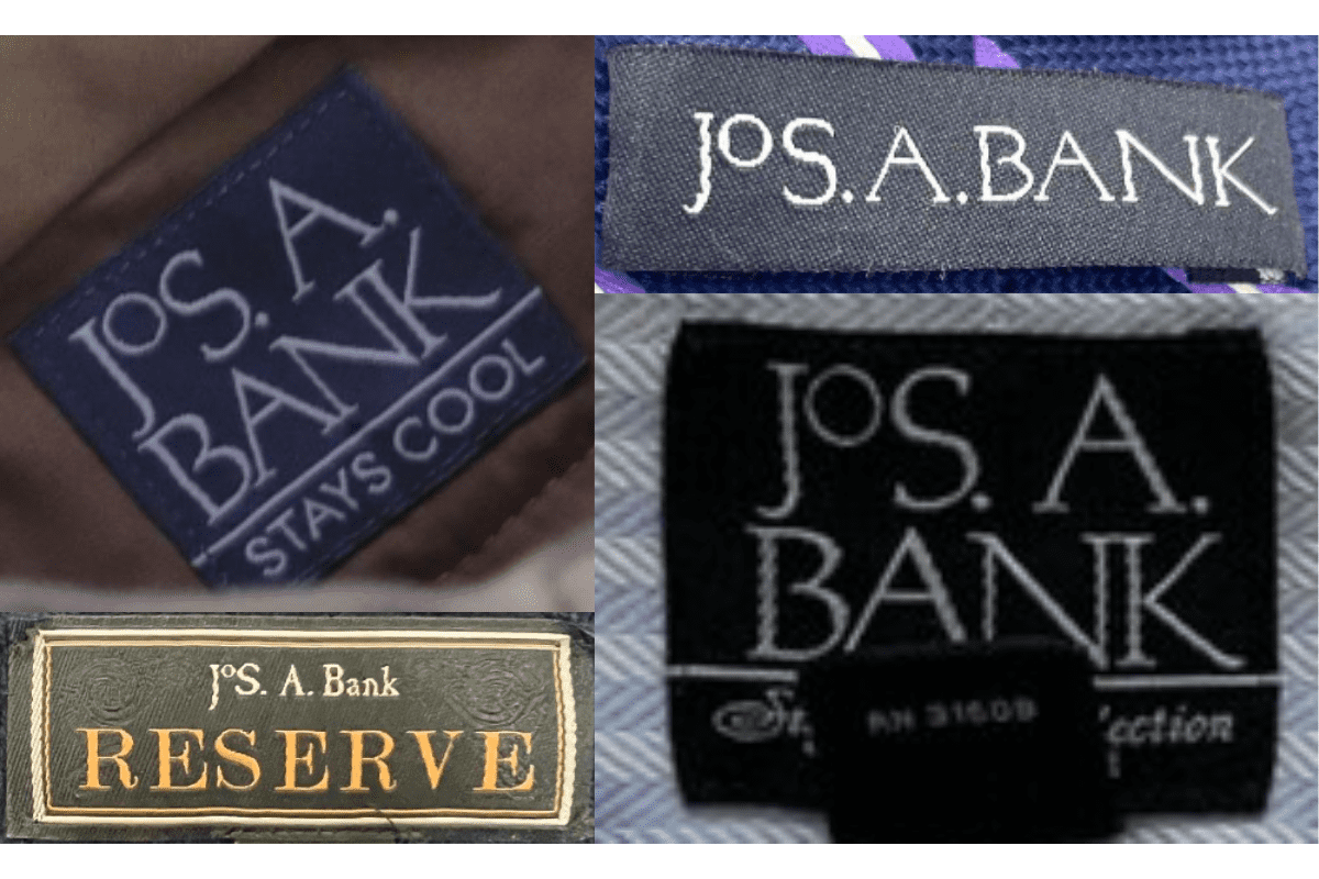
- Tags from this era introduced more modern and versatile branding, such as the “Stays Cool” line with functional descriptors.
- Gold detailing appeared on collections like “Reserve,” indicating premium offerings from the brand.
- Dark backgrounds with sharp, contrasting fonts were frequently used, showcasing the shift to contemporary branding elements.
How to spot it
Tags from this era introduced more modern and versatile branding, such as the “Stays Cool” line with functional descriptors — confirms this label era.
Value signal
Entry-level vintage; value driven by brand recognition and condition.