Liz Claiborne
New York working-woman's fashion empire founded by Liz Claiborne in 1976. Simple bold 'Liz Claiborne' in minimalist fonts marks the early years; the triangular logo introduced in the 1980s and sub-lines like 'LIZSPORT' and 'LIZWEAR' do the decade dating.

- Origin
- USA
- Founded
- 1976
- Category
- Designer & Casual
- Documented eras
- 4
How Liz Claiborne labels evolved over time. Match the markers below against the tag in hand to place a garment in its era.
1970–1979
1970s vintage Liz Claiborne tags
Early Liz Claiborne tags typically featured simple, bold fonts with minimalistic design The brand name “Liz Claiborne” was often displayed in a clear, sans-serif font, emphasizing readability and simplicity.
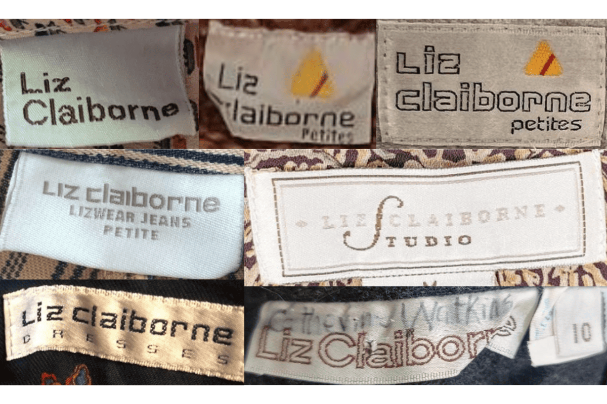
- Early Liz Claiborne tags typically featured simple, bold fonts with minimalistic design.
- The brand name “Liz Claiborne” was often displayed in a clear, sans-serif font, emphasizing readability and simplicity.
- Tags were usually white or off-white, reflecting the minimalistic aesthetic of the era.
- Some tags from this period include “Petites” indicating specific sizing categories.
How to spot it
Early Liz Claiborne tags typically featured simple, bold fonts with minimalistic design — confirms this label era.
Value signal
Solid vintage interest; 1970s pieces in clean condition attract steady demand.
1980–1989
1980s vintage Liz Claiborne tags
Tags from the 1980s began to incorporate more branding elements, such as the introduction of the recognizable triangular logo The font used for “Liz Claiborne” remained bold but became slightly more stylized, reflecting the evolving fashion trends of the decade.
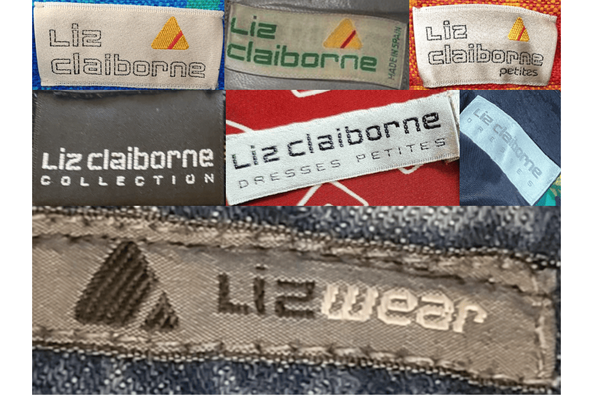
- Tags from the 1980s began to incorporate more branding elements, such as the introduction of the recognizable triangular logo.
- The font used for “Liz Claiborne” remained bold but became slightly more stylized, reflecting the evolving fashion trends of the decade.
- In this era, different sub-lines like “Liz Claiborne Petites” were introduced, often indicated on the tags.
- Colors like beige, grey, and light blue started to appear on tags, adding a subtle touch of differentiation between collections.
How to spot it
Tags from the 1980s began to incorporate more branding elements, such as the introduction of the recognizable triangular logo — confirms this label era.
Value signal
Good vintage demand; 1980s label detail is a key value driver.
1990–1999
1990s vintage Liz Claiborne tags
Tags from the 1990s often showcased a more refined and consistent use of the Liz Claiborne logo, with a modern serif font Sub-brands such as “Liz Claiborne Studio” and “Liz Claiborne Collection” appeared, reflecting the brand’s expansion into various fashion segments.
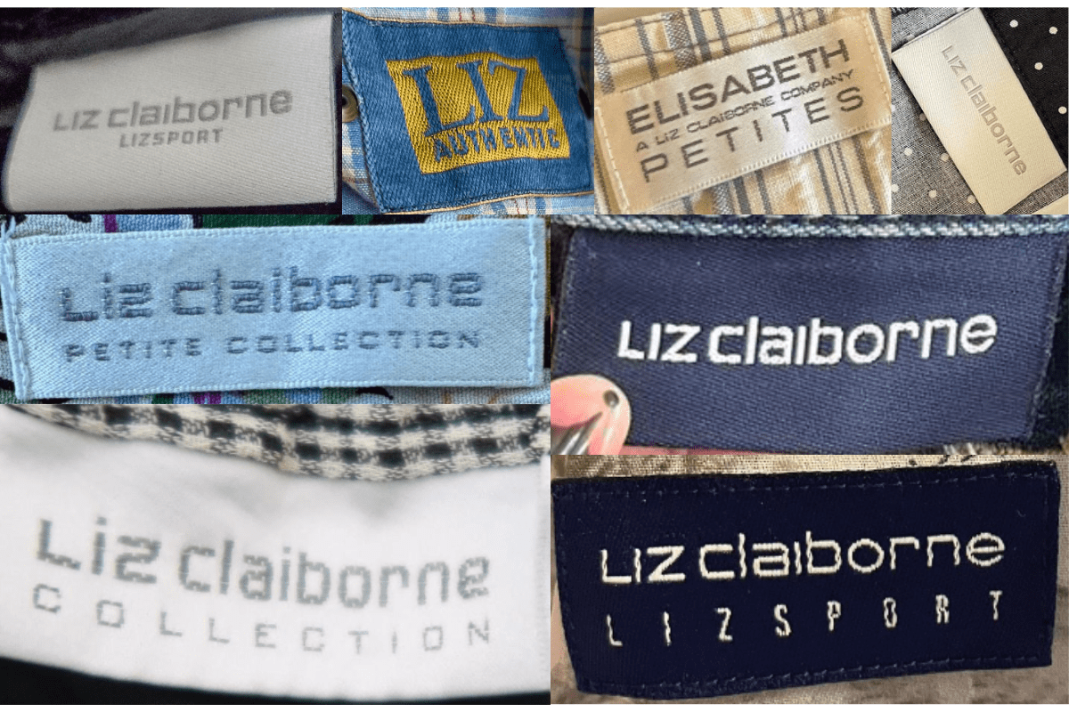
- Tags from the 1990s often showcased a more refined and consistent use of the Liz Claiborne logo, with a modern serif font.
- Sub-brands such as “Liz Claiborne Studio” and “Liz Claiborne Collection” appeared, reflecting the brand’s expansion into various fashion segments.
- The tags from this period commonly used darker colors and were made from higher-quality materials, indicative of the brand’s premium positioning.
- Logo placement and design became more uniform across different clothing lines, emphasizing brand recognition.
How to spot it
Tags from the 1990s often showcased a more refined and consistent use of the Liz Claiborne logo, with a modern serif font — confirms this label era.
Value signal
Moderate collector interest; condition and completeness determine value.
2000–2009
2000s vintage Liz Claiborne tags
During the 2000s, Liz Claiborne tags adopted a more contemporary and polished appearance Tags often featured bold, white text against a darker background, maintaining the brand’s classic elegance while appealing to modern tastes.
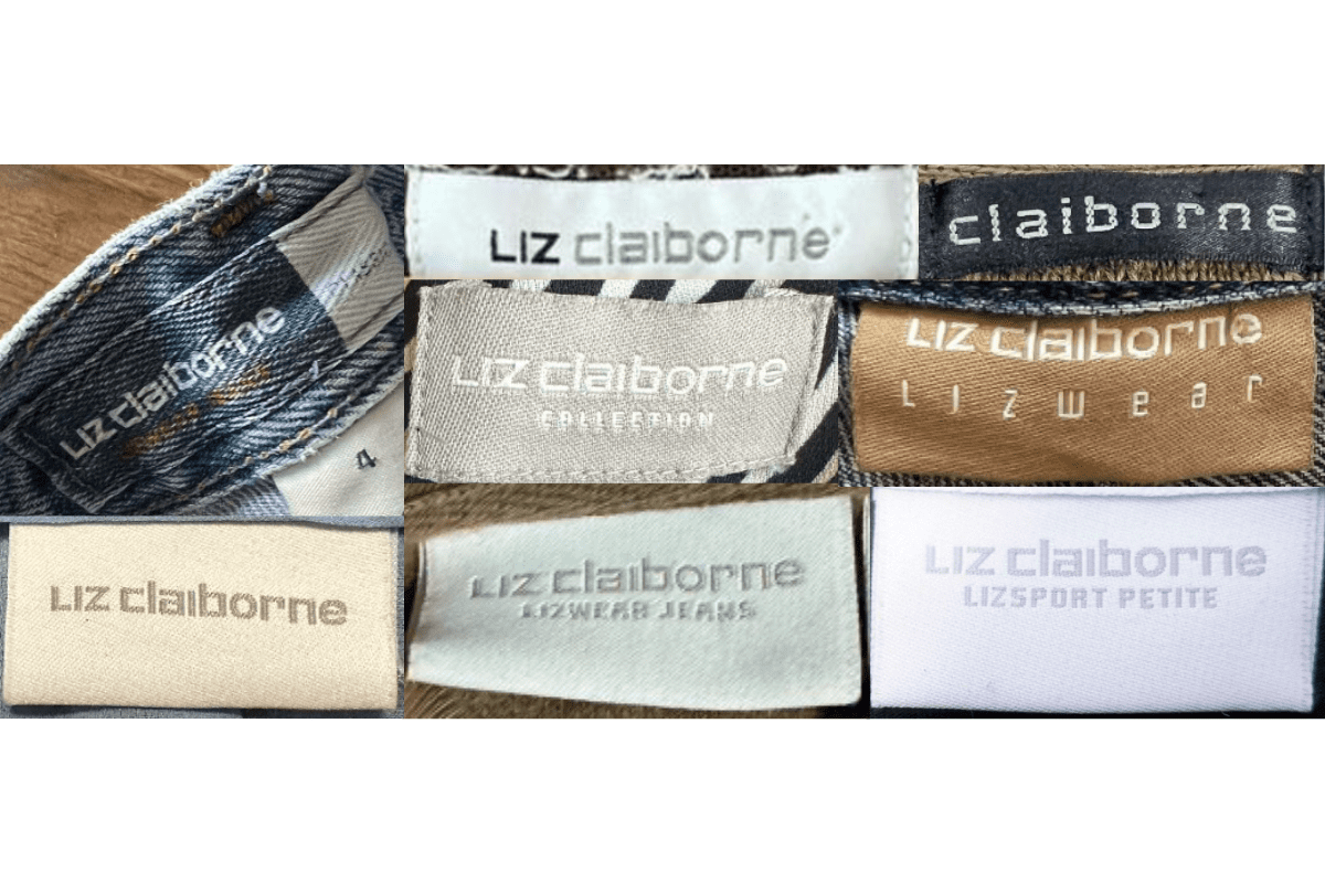
- During the 2000s, Liz Claiborne tags adopted a more contemporary and polished appearance.
- Tags often featured bold, white text against a darker background, maintaining the brand’s classic elegance while appealing to modern tastes.
- Sub-lines like “Lizwear” and “Lizsport” became prominent, with tags specifically indicating these collections.
- The use of new materials and printing techniques gave the tags a more durable and sophisticated look, suitable for the global market the brand was targeting.
How to spot it
During the 2000s, Liz Claiborne tags adopted a more contemporary and polished appearance — confirms this label era.
Value signal
Entry-level vintage; value driven by brand recognition and condition.