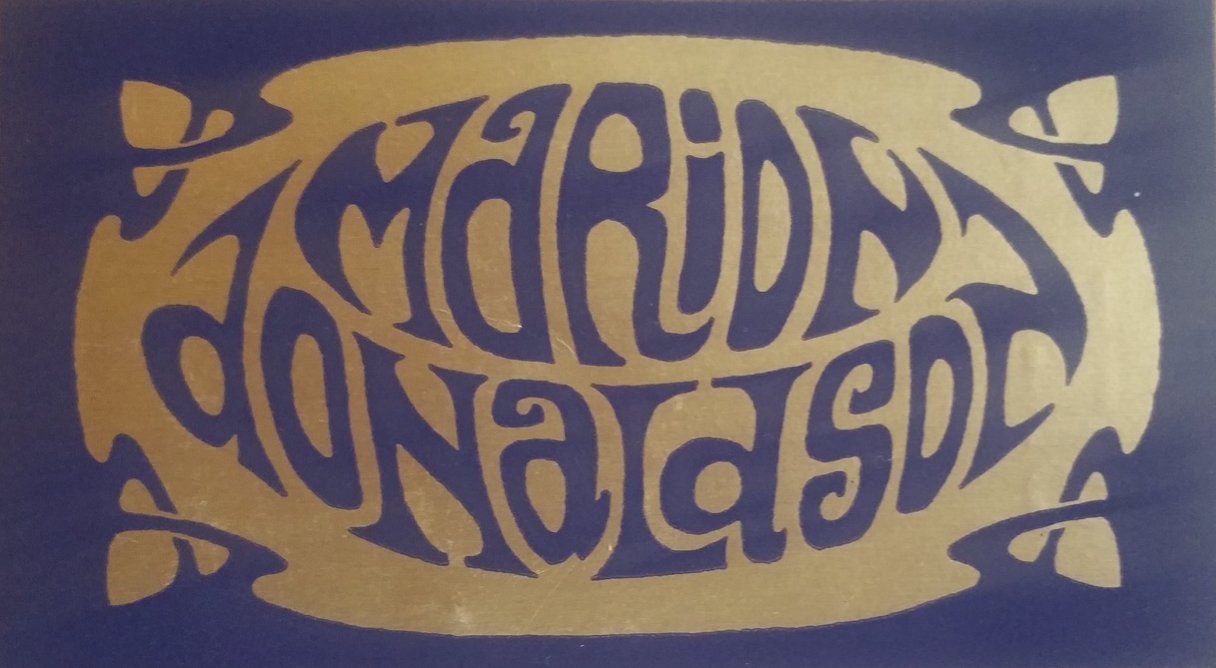
Marion Donaldson
Swinging London designer known for vibrant Carnaby Street-era fashion. The stylised ornate swirling-script logo in pink or purple on simple grounds marks the 1960s–70s; bolder darker colourways — black and deep purple — with the same ornate font track the 1980s.
- Origin
- England
- Founded
- 1960
- Category
- High Fashion
- Documented eras
- 4
How Marion Donaldson labels evolved over time. Match the markers below against the tag in hand to place a garment in its era.
1960–1969
1960s vintage Marion Donaldson tags
Tags from the 1960s often feature a simple design with the brand’s name in a stylized, swirling font The tags typically use earthy colors like brown and beige, reflecting the bohemian vibe of the era.
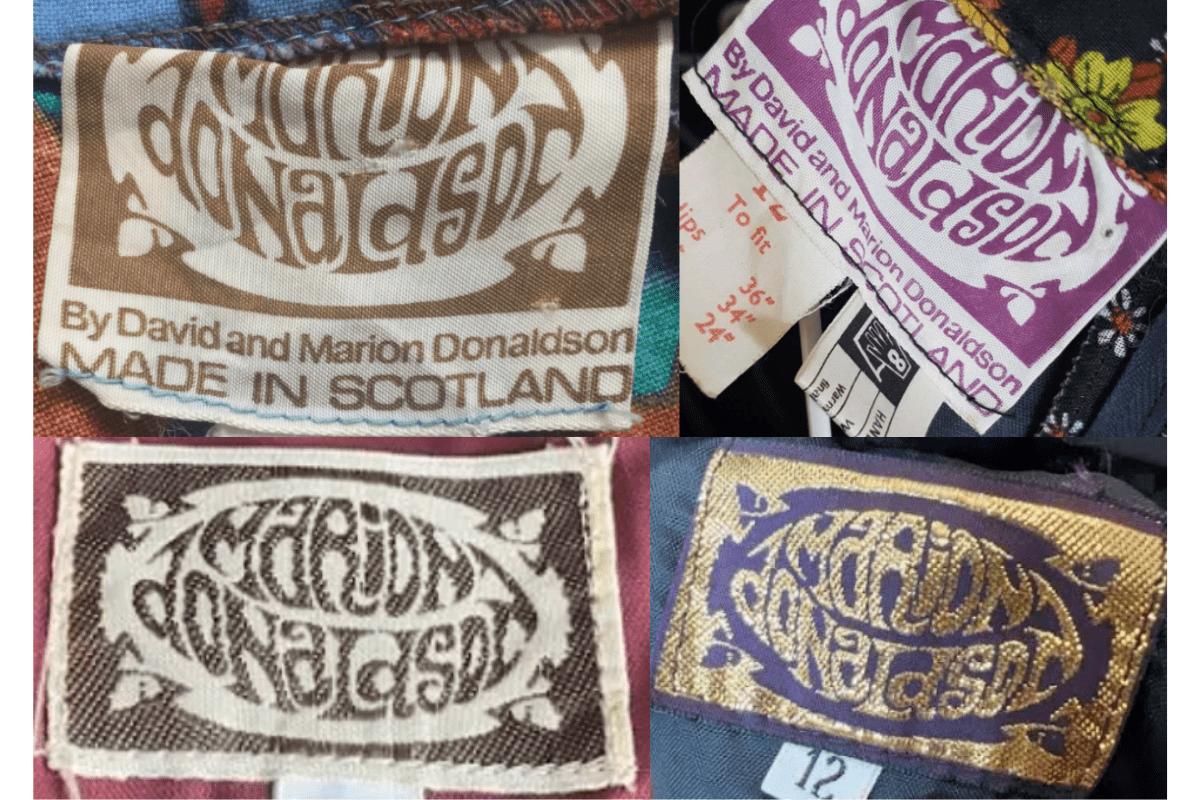
- Tags from the 1960s often feature a simple design with the brand’s name in a stylized, swirling font.
- The tags typically use earthy colors like brown and beige, reflecting the bohemian vibe of the era.
- Includes additional information such as “By David and Marion Donaldson” and “Made in Scotland.”.
- Some tags from this era are printed on fabric, which has a softer, more worn appearance over time.
How to spot it
Tags from the 1960s often feature a simple design with the brand’s name in a stylized, swirling font — confirms this label era.
Value signal
Strong collector demand; 1960s examples command premiums in good condition.
1970–1979
1970s vintage Marion Donaldson tags
The 1970s tags continue with the ornate font but with a more elaborate background design, often using contrasting colors Gold and purple combinations are prevalent, giving the tags a luxurious, vibrant look.
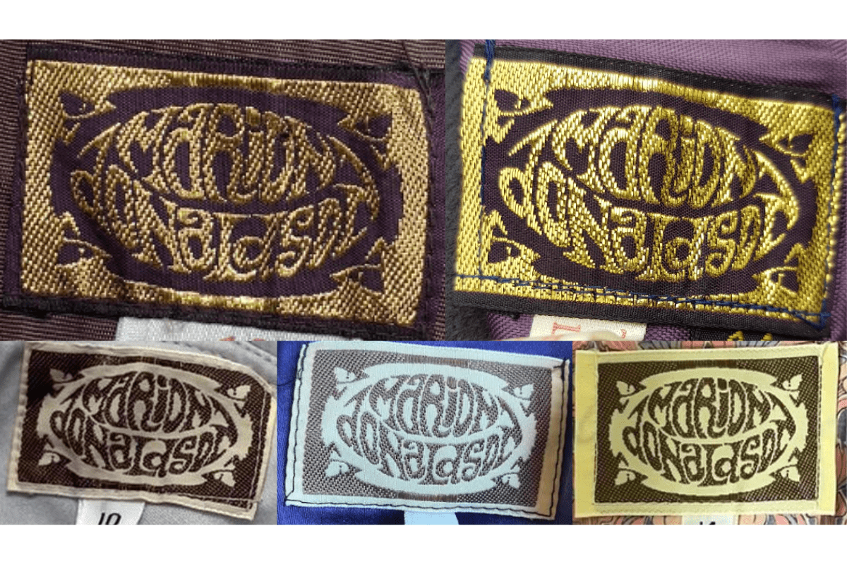
- The 1970s tags continue with the ornate font but with a more elaborate background design, often using contrasting colors.
- Gold and purple combinations are prevalent, giving the tags a luxurious, vibrant look.
- Some tags include a secondary tag beneath, showing size indicators or care instructions.
How to spot it
The 1970s tags continue with the ornate font but with a more elaborate background design, often using contrasting colors — confirms this label era.
Value signal
Solid vintage interest; 1970s pieces in clean condition attract steady demand.
1980–1989
1980s vintage Marion Donaldson tags
In the 1980s, the tags become slightly more modern with darker colors such as black and deep purple, often paired with metallic gold threads The font remains consistent with previous decades but is more prominently displayed against a contrasting background.
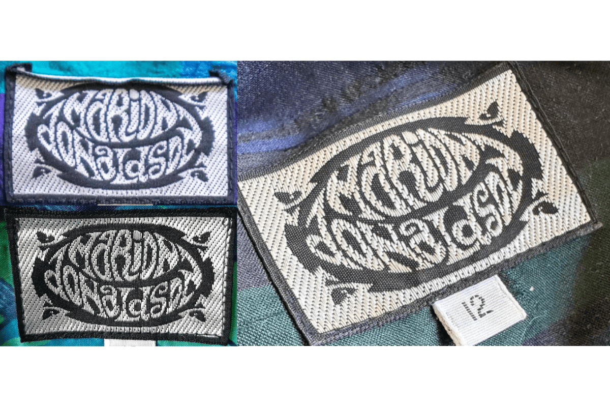
- In the 1980s, the tags become slightly more modern with darker colors such as black and deep purple, often paired with metallic gold threads.
- The font remains consistent with previous decades but is more prominently displayed against a contrasting background.
- These tags are usually more rectangular, with a sturdier fabric and a sharper, more defined logo.
How to spot it
In the 1980s, the tags become slightly more modern with darker colors such as black and deep purple, often paired with metallic gold threads — confirms this label era.
Value signal
Good vintage demand; 1980s label detail is a key value driver.
1990–1999
1990s vintage Marion Donaldson tags
The 1990s tags feature a more minimalist design while retaining the brand’s signature ornate font The color palette shifts to a more monochromatic scheme, often using black and white combinations.
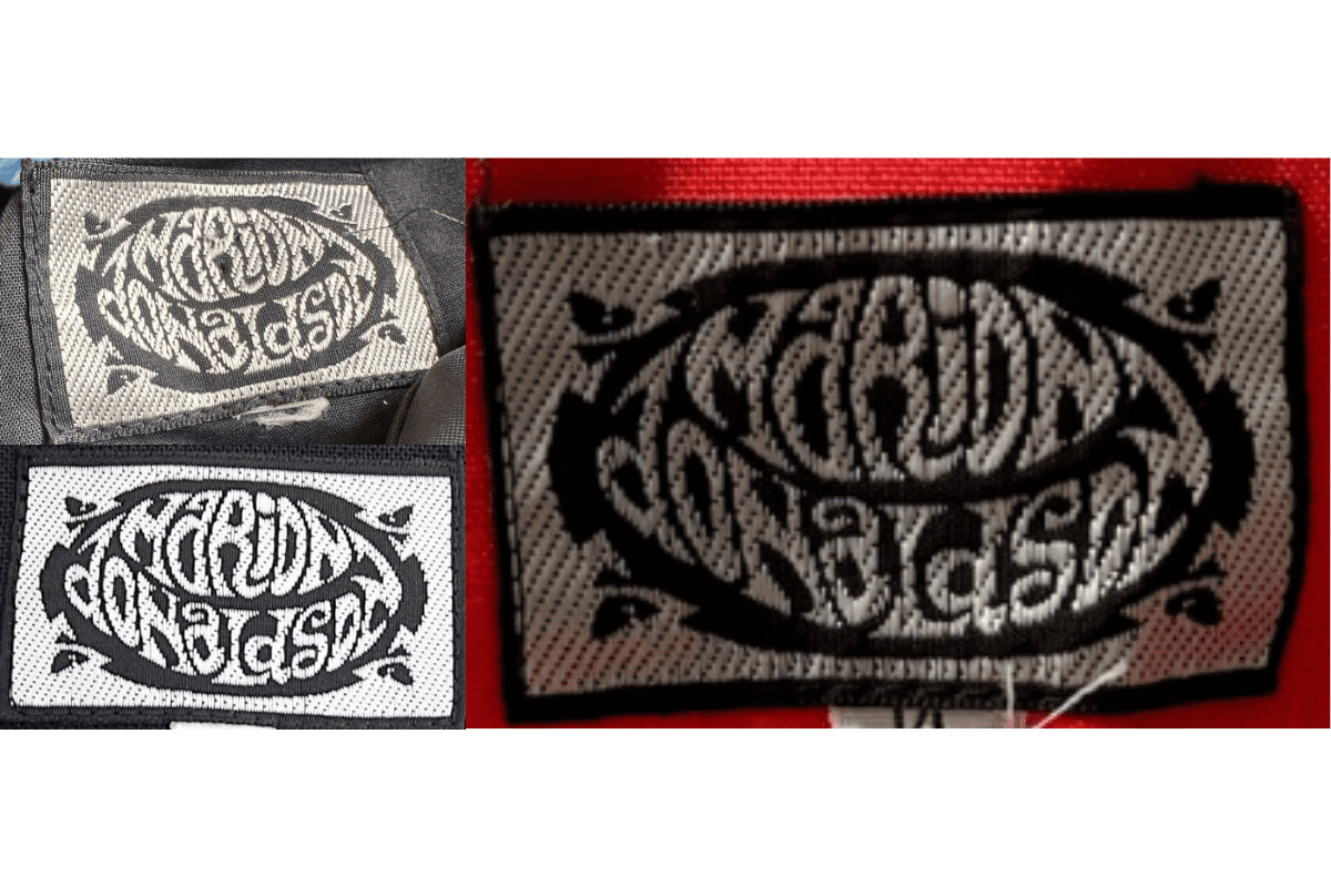
- The 1990s tags feature a more minimalist design while retaining the brand’s signature ornate font.
- The color palette shifts to a more monochromatic scheme, often using black and white combinations.
- Tags from this era are more streamlined, with cleaner lines and a less textured fabric compared to the previous decades.
How to spot it
The 1990s tags feature a more minimalist design while retaining the brand’s signature ornate font — confirms this label era.
Value signal
Moderate collector interest; condition and completeness determine value.