Reebok
British-born athletic brand that exploded in the 1980s aerobics boom. The Union Jack emblem, the starburst 'vector' logo, and the kicked-down 'R' chart its tags decade by decade.
- Origin
- England
- Founded
- 1958
- Category
- Athletic & Streetwear
- Documented eras
- 6
How Reebok labels evolved over time. Match the markers below against the tag in hand to place a garment in its era.
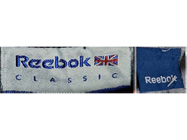
1980–1989
Union Jack, Kicked-Down R
Eighties tags use the old typeface where the kick of the R drops below the text, with the Union Jack emblem or no emblem at all.
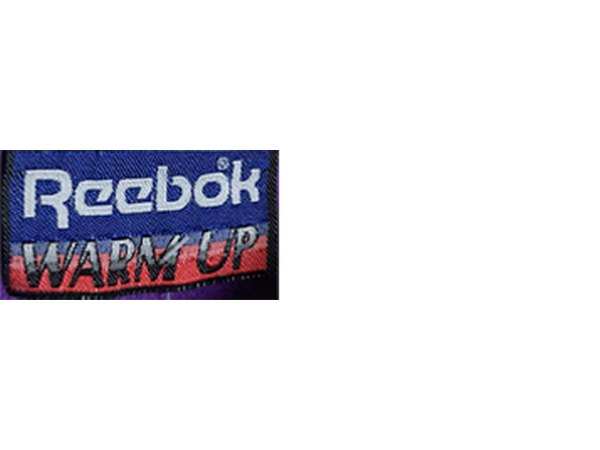
- Tags from the 80s used the old font where the kick of the R goes below the line of text
- The Union Jack was used as an emblem, or no emblem was added to the tags as shown in the Reebok Warm Up tags
How to spot it
The R kicking below the baseline, often beside a Union Jack.
Value signal
Desirable; 80s Reebok with the Union Jack is a sought era.
1990–1995
Vector Emblem Arrives
The font held steady but the e's curved slightly, and the starburst 'vector' track emblem was introduced to the tags.
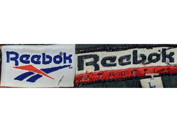
- The font remained mostly the same, however the e’s became slightly more curved
- The track emblem was introduced to the tags
How to spot it
The vector/track emblem added next to a near-80s wordmark.
Value signal
Strong 90s vintage; the vector era is a reseller favourite.
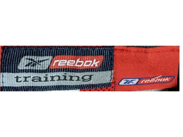
1996–1999
Slimmer Wordmark
The wordmark grew less blocky and the R fell into line with the rest of the text; the vector often appeared as a single solid colour.
- The font was updated, becoming slightly less blocky with the kick of the R moving in line with the rest of the text
- The track emblem was frequently included, however would often be a solid colour instead of the combination of red and blue used in previous designs
How to spot it
A slimmer R level with the text, plus a solid-colour vector.
Value signal
Solid; value driven by the garment and graphic.
2000–2005
Lowercase Tech Font
A thinner all-lowercase tech font took over, often in red or white-on-red, with script and vector fused into a badge.
- The font was once again updated to a more tech like, thinner font, which is all in lower case
- The text incorporated on the tags was also often in red, or in white with a red background
- The script and track emblem were combined into a badge like design on these tags
How to spot it
All-lowercase red 'reebok' in a badge with the vector.
Value signal
Common; modest resale outside specific collabs.
2006–2009
Rbk Shorthand
Some tags reverted to blockier fonts while others ran the shortened tech wordmark, the vector set inside a badge outline.
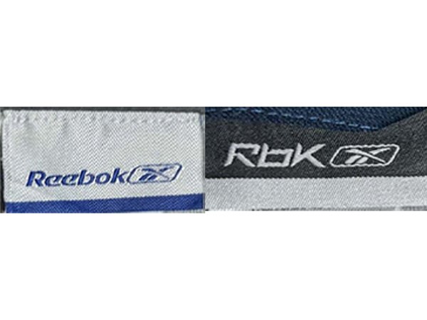
- Two changes occurred to the font at this time, firstly a shortened version of the tech font with the R being capitalised again
- Some of the tags reverted to older blockier fonts
- The track logo was set in a badge like outline
How to spot it
A capitalised tech R, vector framed in a badge.
Value signal
Low; a quiet period for collector interest.
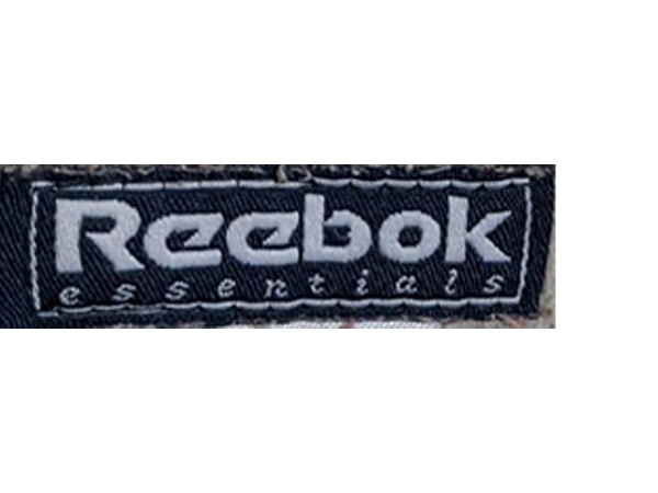
2010–2019
Triangle Era, Printed Tags
The new blocky font debuted and the triangle emblem was often left off entirely; many tags were printed straight onto the garment.
- The new font was debuted on the neck tags, and they would often leave the new triangle emblem off
- Tags from this time would sometimes be printed on the inside of the garment
How to spot it
The blocky 2010s font, frequently printed rather than woven.
Value signal
Modern; not vintage, priced on the piece.