Topman
British men's fashion retailer established in 1978 as part of the Burton Group. Detailed brand-emphasis tags mark the 1980s; a slightly modernised serif aesthetic tracks the 1990s; loop tags with minimalist 'Topman' wordmark mark the 2000s streetwear era.
- Origin
- England
- Founded
- 1978
- Category
- Designer & Casual
- Documented eras
- 4
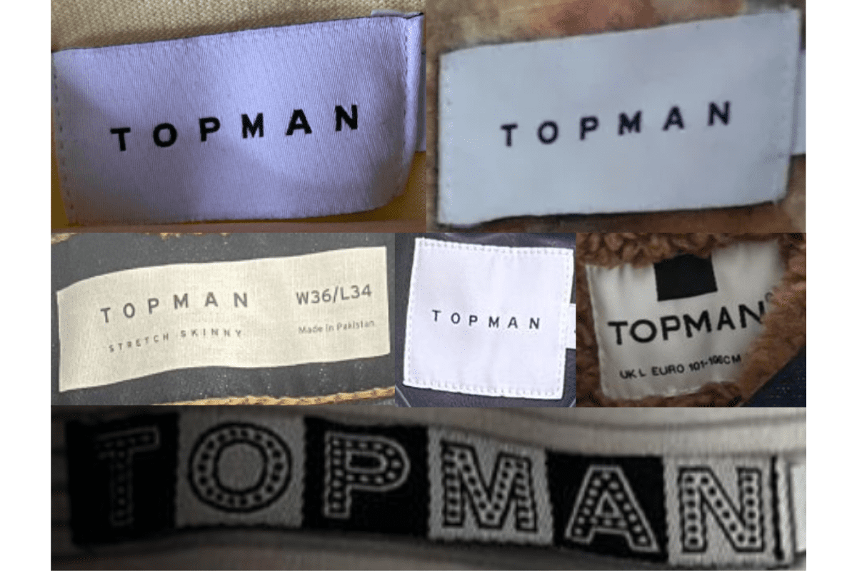
How Topman labels evolved over time. Match the markers below against the tag in hand to place a garment in its era.
1980–1989
1980s vintage Topman tags
Early Topman tags from the 1980s often feature a more intricate design with a strong emphasis on branding The tags frequently include the “Top Man” name with a distinct font, sometimes accompanied by decorative elements like swirls and the “TM” emblem.
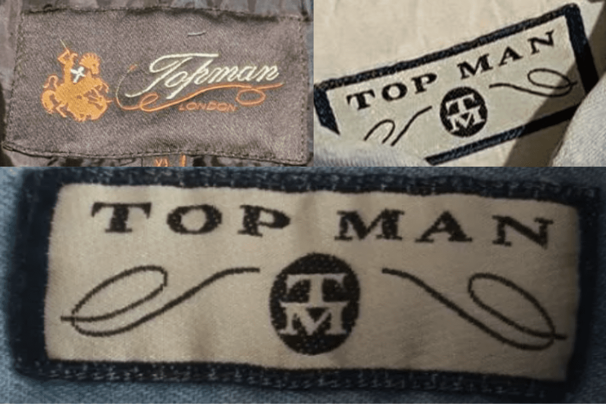
- Early Topman tags from the 1980s often feature a more intricate design with a strong emphasis on branding.
- The tags frequently include the “Top Man” name with a distinct font, sometimes accompanied by decorative elements like swirls and the “TM” emblem.
- Tags are typically rectangular and might include additional design elements, such as the Topman logo alongside a detailed emblem, indicating a more formal or traditional approach to branding.
How to spot it
Early Topman tags from the 1980s often feature a more intricate design with a strong emphasis on branding — confirms this label era.
Value signal
Good vintage demand; 1980s label detail is a key value driver.
1990–1999
1990s vintage Topman tags
During the 1990s, Topman tags began to adopt a slightly more modern aesthetic, though they retained some of the classic design elements from the previous decade These tags often feature the “Top Man” name with a stylized font, maintaining the use of decorative swirls and the “TM” emblem, but with a cleaner and more streamlined look.
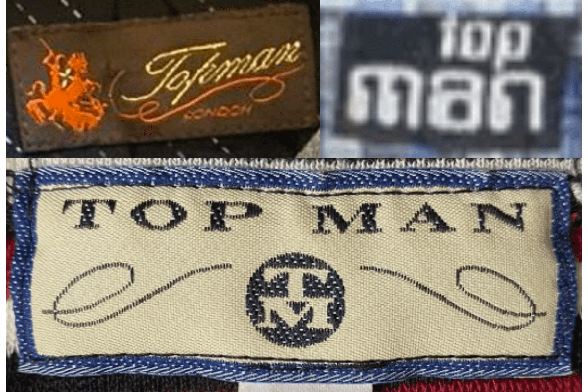
- During the 1990s, Topman tags began to adopt a slightly more modern aesthetic, though they retained some of the classic design elements from the previous decade.
- These tags often feature the “Top Man” name with a stylized font, maintaining the use of decorative swirls and the “TM” emblem, but with a cleaner and more streamlined look.
- Some tags from this era also started to simplify, focusing more on the brand name with less intricate detailing, signifying the transition towards a more contemporary brand identity.
How to spot it
During the 1990s, Topman tags began to adopt a slightly more modern aesthetic, though they retained some of the classic design elements from the previous decade — confirms this label era.
Value signal
Moderate collector interest; condition and completeness determine value.
2000–2009
2000s vintage Topman tags
The 2000s marked a significant shift in Topman’s branding towards minimalism, with tags often featuring bold, simple lettering Tags from this era are usually rectangular or square, with a strong focus on the “Topman” name in a clean, sans-serif font.
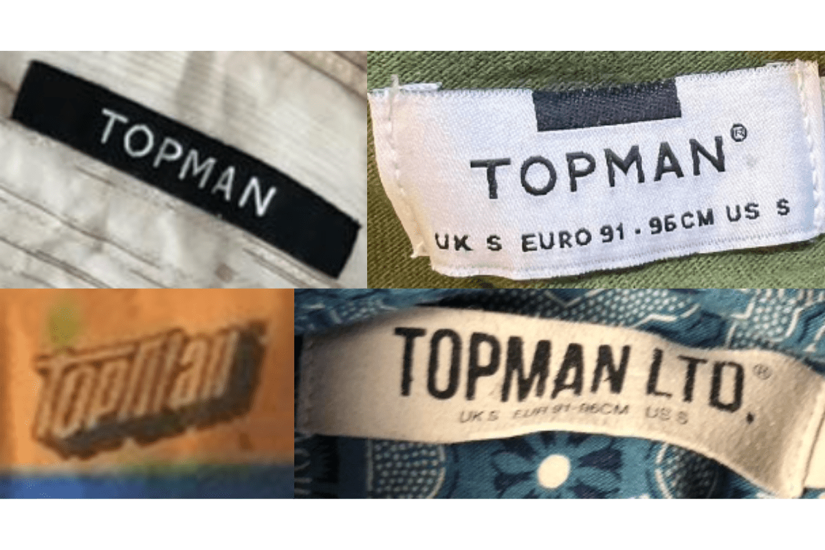
- The 2000s marked a significant shift in Topman’s branding towards minimalism, with tags often featuring bold, simple lettering.
- Tags from this era are usually rectangular or square, with a strong focus on the “Topman” name in a clean, sans-serif font.
- This period saw the introduction of more diverse color schemes and materials, reflecting the brand’s modern and versatile image.
How to spot it
The 2000s marked a significant shift in Topman’s branding towards minimalism, with tags often featuring bold, simple lettering — confirms this label era.
Value signal
Entry-level vintage; value driven by brand recognition and condition.
2010–2019
2010s vintage Topman tags
In the 2010s, Topman continued its minimalist trend, with tags becoming even more streamlined and straightforward These tags typically feature the “Topman” name in a bold, clean font with little to no additional design elements.
- In the 2010s, Topman continued its minimalist trend, with tags becoming even more streamlined and straightforward.
- These tags typically feature the “Topman” name in a bold, clean font with little to no additional design elements.
- The use of neutral colors and high-quality materials became more prominent, aligning with Topman’s focus on contemporary fashion.
How to spot it
In the 2010s, Topman continued its minimalist trend, with tags becoming even more streamlined and straightforward — confirms this label era.
Value signal
Entry-level vintage; value driven by brand recognition and condition.