Warehouse
British contemporary women's fashion chain founded in 1976 in London as the Warehouse Utility Clothing Company, a pioneer of affordable trend-led high-street style. Bold block 'Warehouse' woven labels with 'Made in Great Britain' wording date pre-1990 production; offshore manufacture notes and updated label typography track the 1990s–2000s.
- Origin
- UK
- Founded
- 1976
- Category
- Designer & Casual
- Documented eras
- 4
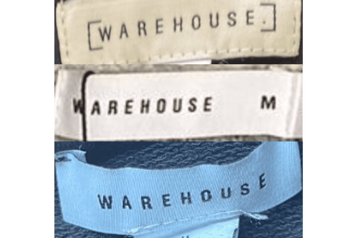
How Warehouse labels evolved over time. Match the markers below against the tag in hand to place a garment in its era.
1980–1989
1980s vintage Warehouse tags
Tags often featured bold, serif-style lettering that was straightforward and easy to read Usually placed on a simple, rectangular fabric tag with minimal additional details.
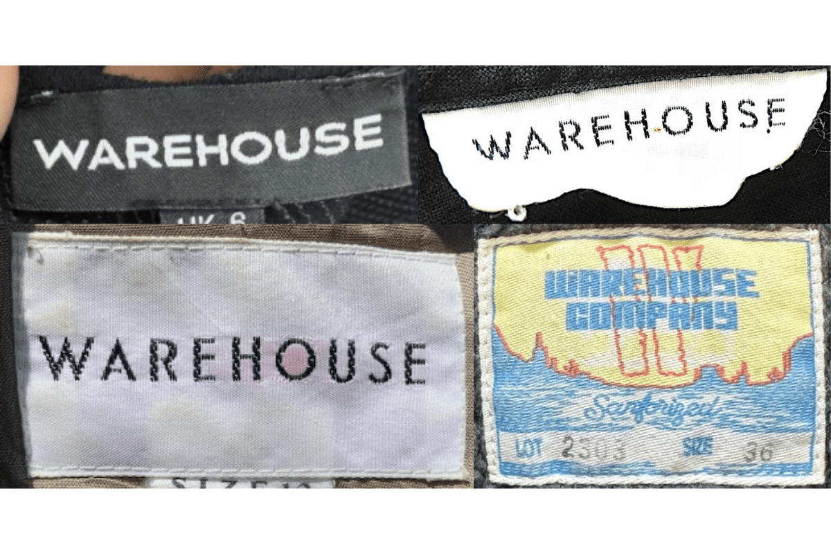
- Tags often featured bold, serif-style lettering that was straightforward and easy to read.
- Usually placed on a simple, rectangular fabric tag with minimal additional details.
- Some tags may have a box outline around the brand name, enhancing its visual presence.
How to spot it
Tags often featured bold, serif-style lettering that was straightforward and easy to read — confirms this label era.
Value signal
Good vintage demand; 1980s label detail is a key value driver.
1990–1999
1990s vintage Warehouse tags
The font remained bold but started to shift towards a slightly more modern sans-serif style Tags were still primarily rectangular, with some variations in fabric and texture.
- The font remained bold but started to shift towards a slightly more modern sans-serif style.
- Tags were still primarily rectangular, with some variations in fabric and texture.
- The brand name was often centered on the tag, maintaining a minimalist aesthetic.
How to spot it
The font remained bold but started to shift towards a slightly more modern sans-serif style — confirms this label era.
Value signal
Moderate collector interest; condition and completeness determine value.
2000–2009
2000s vintage Warehouse tags
Introduction of darker colors and more refined tag designs, with smoother edges and stitching The font used became more contemporary, often with a subtle sheen to the text.
- Introduction of darker colors and more refined tag designs, with smoother edges and stitching.
- The font used became more contemporary, often with a subtle sheen to the text.
- Tags often included additional information such as size, either on the main tag or on a secondary smaller tag.
How to spot it
Introduction of darker colors and more refined tag designs, with smoother edges and stitching — confirms this label era.
Value signal
Entry-level vintage; value driven by brand recognition and condition.
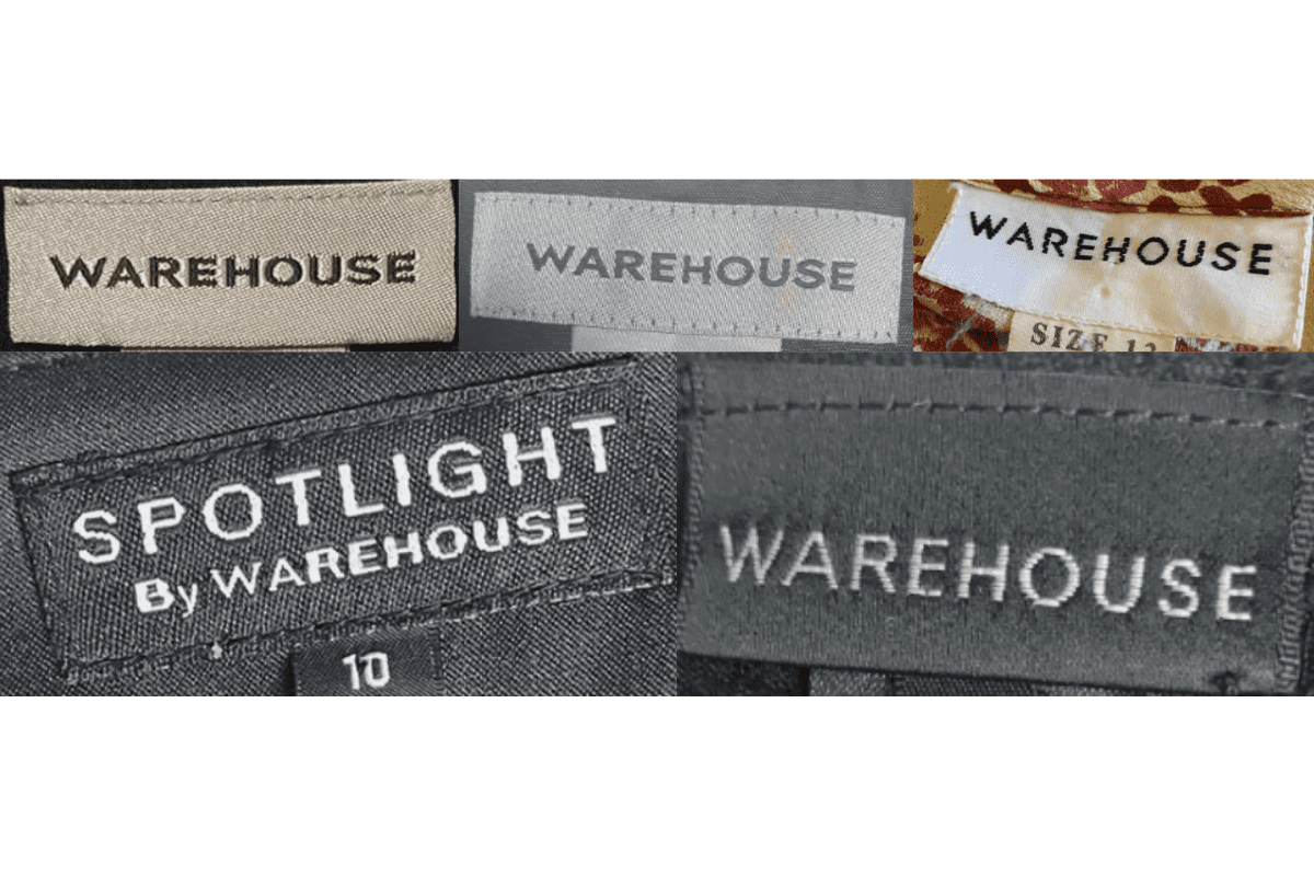
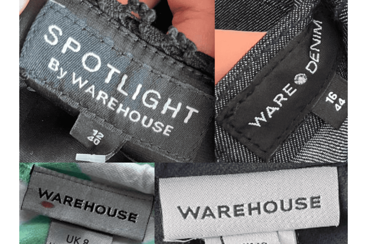
2010–2019
2010s vintage Warehouse tags
Tags became more varied, with different shapes and sizes reflecting the brand’s modern appeal Introduction of new sub-brands or lines like “Spotlight by Warehouse,” with distinct tags featuring these names.
- Tags became more varied, with different shapes and sizes reflecting the brand’s modern appeal.
- Introduction of new sub-brands or lines like “Spotlight by Warehouse,” with distinct tags featuring these names.
- Use of high-quality materials for the tags, often with a focus on durability and a sleek finish.
How to spot it
Tags became more varied, with different shapes and sizes reflecting the brand’s modern appeal — confirms this label era.
Value signal
Entry-level vintage; value driven by brand recognition and condition.